
Landing pages’ common role is marketing some type of product or service. An effective landing page will be one that’s target oriented, it will serve as one of the most powerful, precise tools in a professional digital marketer’s arsenal. Since a landing page’s job is so narrowly defined, how well it performs can be deduced from its conversion rate (CR).
So far as landing pages go, CR is the single most important variable attention should be focused on. A landing page’s CR is the ratio between how many potential customers were exposed to it and how many of them ultimately took the step you aim for (filling a “contact us” form for instance). If 100 people visited your landing page and 3 of them contacted you, the CR is 3:100 = 3%.
Lets imagine that you’re investing 1,000$ a month in pay per click advertising driving traffic to a certain landing page and as a direct result are gaining 2,000$ of revenue while the landing page’s CR is 3%, if you could raise the CR to 4% your revenue will rise to 2,660$. In order to obtain the same results with a 3% CR you will have to increase your monthly advertising budget from 1,000$ to 1,332$. So, you can choose to spend 332$ more each month on advertising or you can work to improve the landing page’s CR from 3% to 4%, which of these options would you prefer? 🙂
I’ve gathered for you 11 major aspects you must pay heed to when creating landing pages if you want to maximize their CR.
1. One Single, Clear, Strategically Located Title
The title initializes interest in the service or product you are marketing. A landing page must clearly convey the marketing message around which it is designed, if it’s lacking a main title those first viewing your landing page will have a hard time understanding what things are all about. Also, if there is a clear title but it does not effectively convey the message we’re after, the visitor will get the wrong idea and we may lose them.
The title’s main purpose is to grab the viewer’s attention and once this is accomplished to briefly explain what it is you are offering. It is essential that the title be short, ideally 15-20 words, remember – less is more so far as titles are concerned (Providing, of course, that you still manage to get the message across).
2. Unified Design Principals of Landing Page and Advertising Media
Imagine your next vacation: You visit a hotel’s website and reserve a room. You land at the airport, arrive at the hotel’s lobby, take the elevator to your room and discover that it looks very different than the pictures you saw on the net. Instead of parquet floors there are granite ones, instead of a bath there’s a shower booth and instead of a city skyline view there’s one of a brick wall. Anyone who’s exposed to a banner you post on Google’s media network, takes in the design, clicks on it and enters your website just to discover that its design is completely different than the banner’s will experience feelings similar to those of the above mentioned tourist who receives a hotel room different than the one he was led to believed he was reserving.
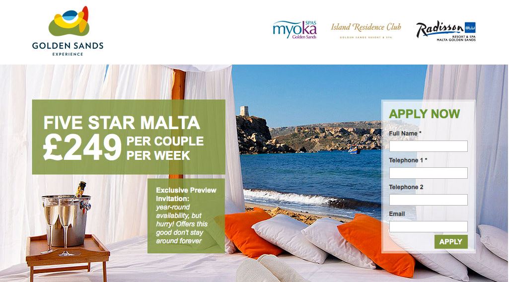
3. Choosing Images Correctly – Doing it Professionally
So far as landing pages go, the well known saying “a picture is worth a thousand words” is undoubtedly true. Our mind processes images much faster than it does words, that’s why the right image at the right moment will have a substantial effect. It is advisable to make use of large, high quality images which are closely related to the product or service you are promoting, use a picture of the product itself whenever possible. Remember that the main role of the image you choose to incorporate into your landing page is to grab the visitor’s attention and explain to them, in a fraction if a second, what it is you are selling.
A common mistake, so far as images in landing pages go, is choosing ones which are ill suited for a local audience, American celebrities on a landing page you intend to use in India for instance.
In the example bellow, a landing page used by “Golden Sands”, you’ll find images which are just right for a visitor planning a vacation, on one side an appealing view and on the other luxurious accommodations complete with chilled champagne.
4. Understanding Target Audience Characteristics and Addressing Them
The main message your landing page conveys must address a basic need common to your target audience. What do we mean? Let’s assume that the product you are selling is a car battery. What are your target audience’s needs? What’s bothering them and what solution do they seek? It is probable that your potential client wants a car battery with several years warranty, one from a well known brand which can be home delivered and returned if they are not satisfied (there are other things we can think of). Once we understand our potential client’s probable expectations we can address each one on our landing page and thus increase chances that they will go ahead and order. It is essential that our message be clear and that it offer an all around solution to everything a potential client may be concerned about.
The best way to learn about what our clients want is to ask them, it is advisable to conduct surveys amongst regular customers or even among potential customers who opted out of your landing page.
5. Proof of Reliability
People like brands they know they can trust, that’s why the largest businesses on the market invest such huge sums in branding. The way to gain the trust of visitors to your landing page or website is by proving your reliability socially, i.e. presenting certain elements which will reassure them and encourage them to leave contact information knowing they will receive the best possible product or service. How can we get our audience to trust us? Social proof of reliability may come in different forms, authentic testimonials from customers for instance, ones where a full name, company and review are presented (incorporating reviewers’ photographs will have a substantial, positive effect on a landing page’s CR).
There are many other ways for enhancing social proof of reliability on your landing page, for example: Sharing data from social networks, incorporating posts from social networks, presenting true figures regarding your business activity (number of regular customers, number of transactions, etc.), you can show logos of companies you work with, icons of data security measures, credit card companies and more.
6. WIFM – What’s In It For Me
I come across many landing pages which announce things like “we are the best brand in the state” or “our product is the best on the market”, what the creators of such landing pages are missing is the fact that visitors are seldom impressed by self praise, what interests a potential customer is how they will profit from contacting you and from buying your product or using your services. People do not buy products for what they are but rather for the good that they bring them.
If the main message on your landing page has to do with how good you are, you’ll lose most visitors right off the bat. Your potential client wants to know how you’re going to solve a problem they are facing or fill a certain void that they are experiencing. How can you convince them? When choosing and phrasing the main points on your landing page ask yourself, as a client, “what’s in it for me?” If the answer is “nothing” discard the point you’re trying to make completely. Another way is to complete the point using conjunctions such as “and so . . . “, “this allows for. . . “, “as a result. . . “. For instance: “Our 30 day no questions asked return policy allows you to try out the product and return it if not satisfied for any reason”.
So, before you sit down to create your landing page, step into your potential customer’s shoes and ask yourself: What’s In It For Me?
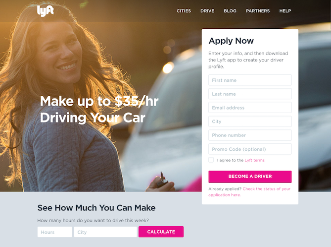
7. Simple, Straight Forward, Easily Found Contact Us Options
You’ve made sure that your landing page is well designed, you’ve carefully chosen the images on it and have incorporated clever, to the point text, your message is clear and well suited to your target audience. Now it’s time to maximize CR potential – You’ve convinced the visitor and they want to try out your product or service, they want to contact you, how are they going to do it?
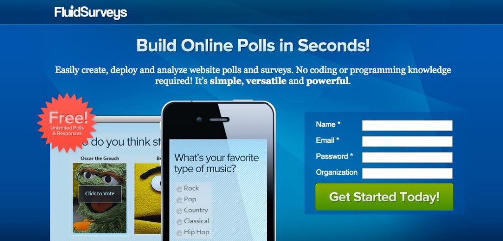
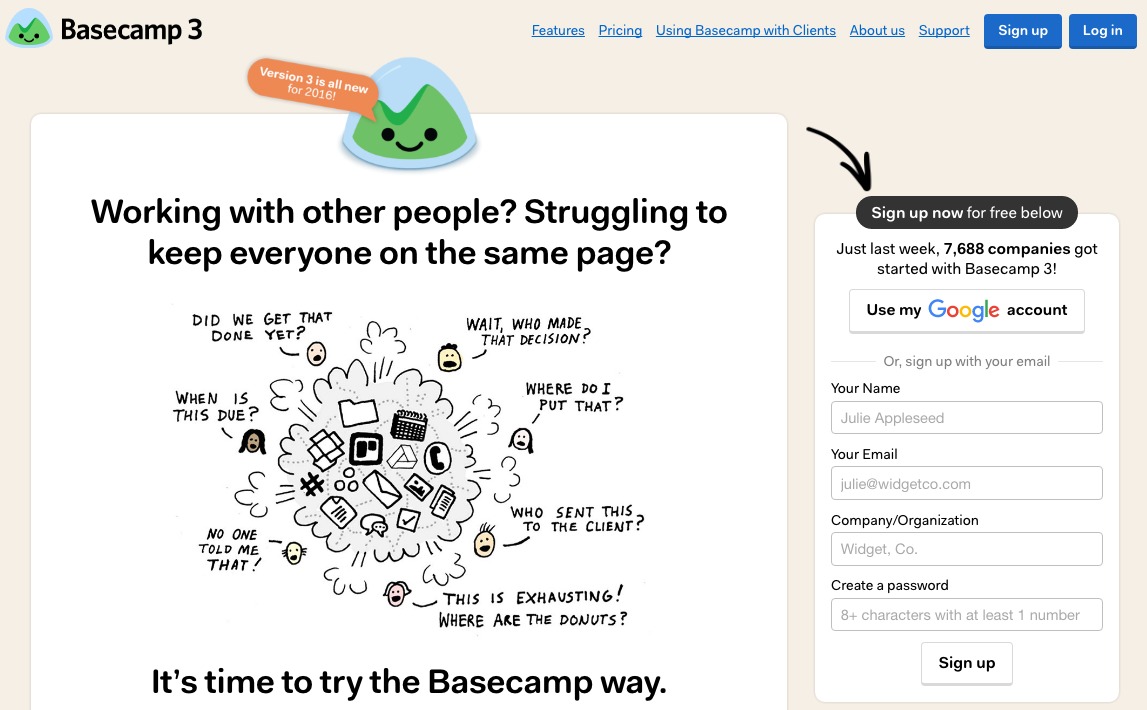
The most common contact us option is filling a short form, one which enables anyone interested to leave details and have a sales representative contact them.
There are cases where contact us forms do not cut it. A potential client may not wish to wait, if a contact us form is the only option provided you are essentially forcing them to. In order to enable a potential customer to contact you immediately provide them with a phone number (a “virtual phone number” will allow you to monitor exactly how many leads your landing page has generated). If you are not constantly available, use an answering service.
Another way to offer immediate assistance is by a virtual chat agent or live chat option, in many cases people prefer to converse with someone verbally and so think twice before deciding not to provide a call by phone option (preferably toll free).
In many cases effective contact us options will make the difference between a potential customer who will contact you immediately or at their own convenience and one who decides to pass and move on to one of your competitors.
8. A Landing Page’s Loading Time
One thing that’s common to most of us is that we crave instant gratification. Potential clients today (even ones not belonging to generation Y) use their smart-phones to get immediate answers to any questions they may have, it is possible to get comprehensive information on any topic at any given time. It is not in vain that huge internet entities such as Google work to “make the internet faster”. If a visitor clicks to enter your website along with several of your competitors’, and your site takes over 5-6 seconds to load chances are they will get tired of waiting, click on the x and move on to the next tab.
A landing page’s loading time should not exceed 2 seconds, if your landing page takes longer than that to load you should optimize it.
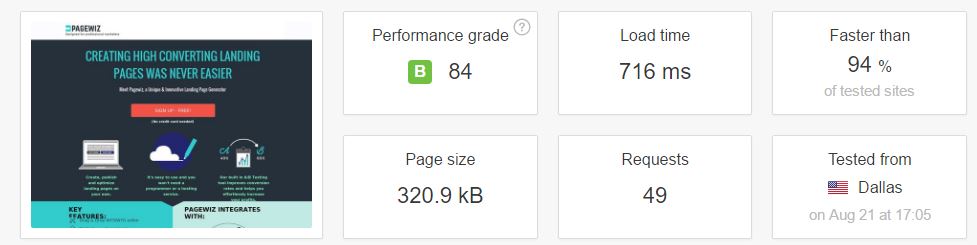
You can use the Pingdom free tool to measure load times of web pages stored on servers located anywhere in the world.
9. Full Responsivity and Mobile Compatibility
What is responsivity (so far as the internet is concerned)? Responsivity has to do with a web page’s ability to adapt to the screen resolution of any end device a visitor may be using, i.e. the web page will look different on computer screens than on the small screens of mobile phones.
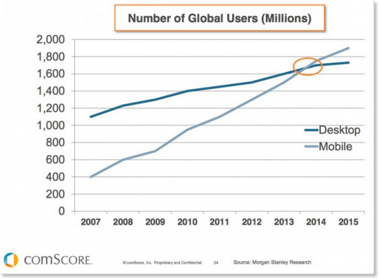
Over 50% of traffic to most web sites comes from mobile. Here’s a graph showing how mobile traffic has grown in recent years:
traffic from mobile end devices, credit – COMSCORE
Digital marketing firms which use image, rather than live text, based landing pages will have a hard time guaranteeing full responsivity, this is because images come as a whole (there are other SEO advantages to using live text). Bottom line, It is essential that your landing page looks good on mobile phones too.
Tip: If you add a click to call option at the top end of your landing page visitors using mobile phones will be further inclined to call you.
10. Call To Action
Your goal is to get visitors to make a certain move, leave contact detail, call you or anything else of the sort, help them understand what you wish them to do using text as well as visual means. Effective CTO will inevitable improve you landing page’s CR. It is important to use large, clear elements, make use of color contrast to highlight CTO related items (the contact us form for instance).
It is quite simple, if you want the visitor to call you add the words “call now” next to the phone number. If you want them to leave their details put down “leave your details and we will contact you shortly” next to the contact us form. You can also use visual CTR means:
Tip: People associate CTR elements with buttons so go with the flow and provide them.
11. A/B Testing
You’ve launched your new landing page, it’s been a week and you’ve had 15 conversions. Is this good or bad?
The answer to this crucial question is determined by many things such as how much you’ve invested in driving traffic to your landing page, the price per lead common to the field you’re in and more. Once you’ve collected enough data regarding landing page performance it is important to try and improve on it. How can you do this? Through use of A/B testing. The idea is simple, create two versions of your landing page, one with a certain element that’s different (a different main title for instance), and then check to see which version performs better. Ongoing A/B testing will allow you to lower the price you pay per lead (Cost Per Lead – CPL). It is important to check only one element at a time, if you try to assess several elements at once it will be difficult to come to coherent conclusions.
How To Proceed From Here?
A good landing page will possess most of the traits discussed above. It is crucial that you have in depth knowledge of characteristics common to the field you are in and your target audience, design your landing page and the marketing message it conveys to fit them – Talk to your potential clients at eye level and in a language that coincides with your brand.
It is important to constantly monitor and work to improve your landing page, test it regularly. Now, the ball is in your court.


