
Popup? Ogni volta che senti questa parola, probabilmente ti starai chiedendo: "Sono utili?" oppure “Sono fastidiosi? Dovrei usarli per il marketing e le vendite oppure no?"
Bene, facevo le stesse domande finché non ho iniziato a ricevere popup belli e creativi con un'offerta irresistibile e un testo straordinario al momento giusto quando ne avevo bisogno.
Per me, popup attivati dal comportamento che sono mostrati al momento giusto sono eccellenti. Se l'offerta del popup è creativa, può essere una bella ciliegina sulla torta per i visitatori del tuo sito web.
Quindi, la risposta alla tua domanda è: “Sì, sono utili e possono sicuramente convertire più persone, ma solo se li usi nel modo giusto”.
In questo articolo vedremo::
- Cose che dovresti considerare prima di creare un messaggio di posta elettronica pop-up
- Un cattivo esempio di popup di posta elettronica che può fare tutto tranne convertire più persone
- Sei offerte ed esempi creativi per aiutarti a far crescere la tua lista e-mail
Cose da considerare prima di creare un popup:
Prima di creare un popup email, dovresti sempre considerare quanto segue:
- Perché mostri un popup e qual è il tuo obiettivo ad esso correlato?
- Chi è il tuo acquirente ideale?
- Dove dovresti attivare il tuo popup? È solo su blog, home page o altre pagine?
- Comprendere le intenzioni dei visitatori: ad esempio, i lettori del blog potrebbero non essere pronti ad acquistare. Quindi non offrire loro uno sconto del 15% se si iscrivono. Tuttavia, nelle pagine con "alto intento", come prenotare una demo, funzionalità, casi d'uso, pagine di prodotti/servizi o qualsiasi altra pagina con "alto intento", potresti offrire un'offerta eccezionale.
- Comprendere il comportamento del visitatore – Assicurati di non mostrare immediatamente un popup non appena il visitatore arriva sul tuo sito web. Utilizza diversi tipi di attivatori legati all'intento, ad esempio tempistica, scorrimento, intento uscita, E altri.
- Il tuo testo e la tua offerta: fa un'enorme differenza se la tua richiesta è eccellente in base al contesto dell'utente. Inoltre, presta attenzione a come sei scrivendo la tua copia. È abbastanza avvincente e intrigante per i tuoi visitatori? Comprendi il contesto del tuo visitatore. Si trova nella parte superiore, centrale o inferiore della canalizzazione? Se è in basso, non è pronto per registrarsi per il tuo prodotto. La creazione di popup diversi per diversi segmenti di visitatori ti aiuterà a fornire l'assistenza adeguata all'esemplare visitatori al momento giusto.
Quali sono i terribili esempi di popup?
Non c'è niente di meglio che imparare dagli altri errori. Quindi voglio condividere con te alcuni dei pessimi esempi di popup che ho scoperto, nonché i motivi per cui sono pessimi. In in questo modo potrai capire cosa non fare.
Per renderlo più comprensibile, i nostri criteri per i cattivi esempi si baseranno su quanto segue:
1 – Offerta
2 – Copywriting
3 – Grafica
4 – Contesto e tempistica
5 – Intenzione e comportamento dei visitatori
Daremo punti in base a ciò in modo che diventi più chiaro. Ognuno ha 5 punti e in totale 25.
Popup n. 1 – Trucchi per la crescita
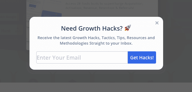
Il popup riportato sopra veniva visualizzato nel blog di un'azienda SaaS legata alla crescita.
È comunque giusto che almeno prendano di mira persone in crescita. E questo popup è apparso nell'intento di uscita.
Cosa non va bene?
- La copia è debole e non offre differenziazione per fornire il mio indirizzo email.
- Anche l'offerta è debole; Potrei semplicemente dare un'occhiata ai loro blog e controllarli. Perché dovrei fornire il mio indirizzo email? Non c'è niente di unico nell'offerta di questo sito web.
- La grafica è debole perché l'addetto al marketing ha utilizzato solo un popup del software esistente e ha modificato la copia. Non c'era molto impegno dietro.
- Contesto e tempistica: si basava esclusivamente sull'intento di uscita. Mi sarebbe piaciuto se l'intento di uscita mi avesse aspettato per 15-30 secondi e poi mi avesse mostrato il popup. L'intento di uscita corrente ti mostra direttamente il popup, che non richiede "tempo". Non vorrei comunque dare la mia email.
- Intento e comportamento dei visitatori: il popup almeno offriva il contenuto invece di chiedere la registrazione. Quindi, buon lavoro.
Ecco i miei punti:
Copia: 2
Offerta: 2
Grafica: 0
Contesto: 2
Intento: 4
Punti totali: 10
Ora che abbiamo parlato di popup schifosi. Passiamo ai popup creativi.
6 offerte ed esempi creativi per aiutarti a far crescere la tua lista e-mail
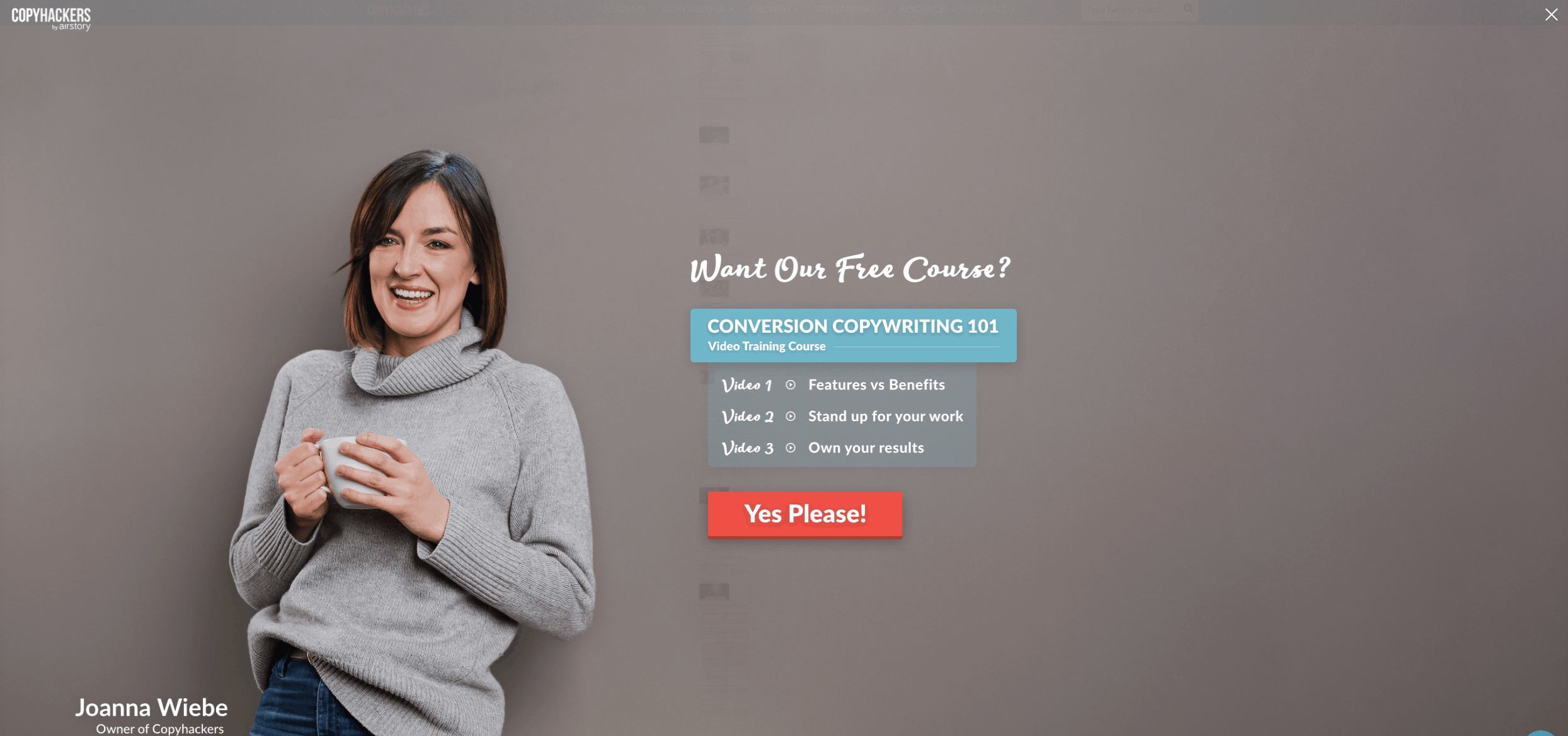
1 – Popup con onestà, creatività, e l'elemento umano
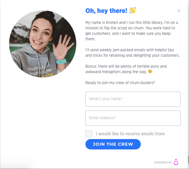
Questo è di gran lunga uno dei miei popup preferiti. Ha tutto ciò di cui hai bisogno per abbonarti immediatamente. Adoro questo popup perché ha un elemento umano dietro. Ecco una responsabile marketing, Kristen LeFrance, che condivide il fatto che gestisce questo blog e vuole ribaltare l'idea dell'abbandono e ha contenuti eccellenti. Mi sta anche facendo aspettare con ansia "giochi di parole e metafore", quindi ha "motivazione incorporata".
Inoltre, adoro l'immagine con un sorriso amichevole e un ottimo CTA. Non sta chiedendo di "iscriversi". Sta chiedendo di unirsi al suo equipaggio nel suo viaggio.
Il contesto era fantastico perché appare solo quando scorro il 90% ed è mostrato solo nella pagina del blog.
Dato che è solo sulla pagina del blog e chiede di migliorare il tasso di abbandono, prenderei in considerazione l'iscrizione alla sua newsletter. Adoro l'intento lì.
Il CTA è allettante ad aderire.
Ecco i miei punti:
Copia: 5
Offerta: 5
Grafica: 5
Contesto: 5
Intento: 5
Punti totali: 25
Suggerimento. Aggiungi un piccolo elemento umano per farti notare e sembrare autentico.
2 – Il popup della pagina dei prezzi
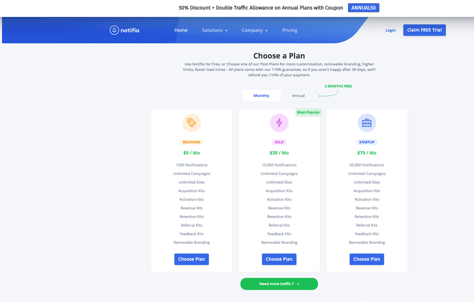
Questo popup viene mostrato dal team Notifia nella sua pagina dei prezzi. La pagina dei prezzi è altamente intenzione e deve essere maneggiato con cura. Questa pagina ti consente di scegliere un piano e ottenere uno sconto se acquisti un "contratto annuale", il che è fantastico gancio.
Quando crei popup nella pagina dei prezzi, dovresti concentrarti interamente sulle esigenze del visitatore. Non pagare anche tu molta attenzione a la grafica: possono solo rovinare la tua fantastica offerta.
La copia e l'offerta sono ragionevoli; mostrano il vantaggio pur chiedendo un aggiornamento.
Dato che sono nella pagina dei prezzi, è al momento giusto e allegato. Ottiene più punti per il contesto e l'intento.
Ecco i miei punti:
Copia: 3
Offerta: 4
Grafica: 3
Contesto: 4
Intento: 4
Punti totali: 18
3 – Il popup dell'offerta istantanea
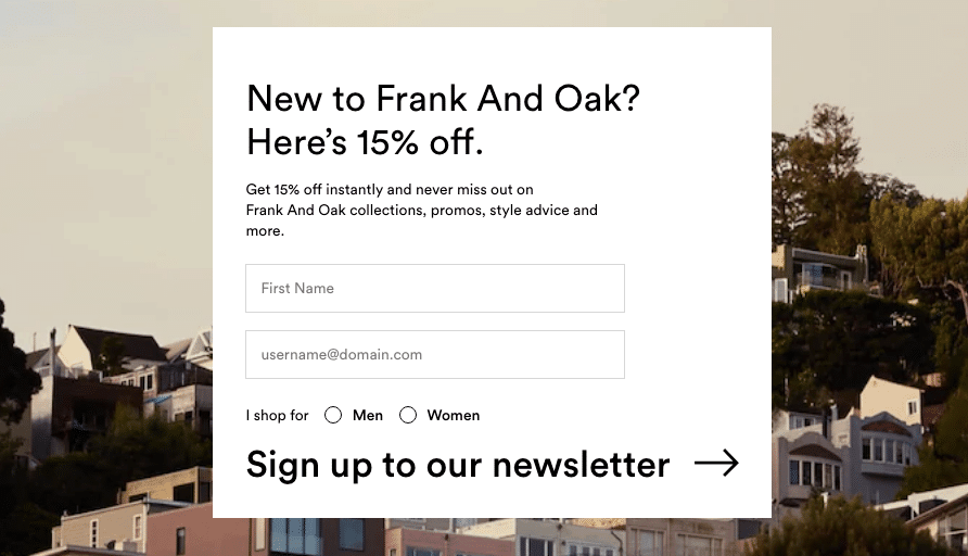
Stavo navigando nel sito di e-commerce di Frank + Oak e ho trovato questo popup. Di solito, l'e-commerce vuole incrementare le vendite e questo è stato ottimo per indirizzare il traffico.
È allegato alla pagina per ogni nuovo utente. Ti danno uno sconto del 15% semplicemente iscrivendoti alla loro newsletter.
Sebbene il La grafica pop-up è carina debole, l'immagine dietro di loro è fantastica.
Il contesto è fantastico dato che sono un nuovo utente, quindi vogliono solo che la mia email mi invii nuove collezioni di prodotti.
Ecco i miei punti:
Copia: 3
Offerta: 4
Grafica: 2
Contesto: 4
Intento: 4
Punti totali: 17
4 – Il popup del corso Exit Intent Free
Sarei onesto; IO adoro copiare gli hacker' blog. Offre risorse gratuite per portare le tue abilità di copywriting al livello successivo.
Perché adoro questo popup? Si basa sull'intento di uscita. Sebbene non mi ha aspettato, la copia è fantastica.
L'offerta è strepitosa. Corso gratuito con esito chiaro che imparerò. Cosa potrei volere di più?
La grafica è mozzafiato: come ho detto, le immagini umane funzionano sempre. Dimostra autenticità e genuinità.
Il CTA parla la mia lingua. Ancora una volta, un'ottima copia.
Ecco i miei punti:
Copia: 5
Offerta: 5
Grafica: 4.5
Contesto: 3
Intento: 4
Punti totali: 21.5
Cosa potrebbe migliorare? Se l'intento di uscita potesse attendere i primi 10-15 secondi. Se l'utente rimbalza dopo 2 secondi, probabilmente non lo salverai comunque.
5 – I popup gamificati interattivi
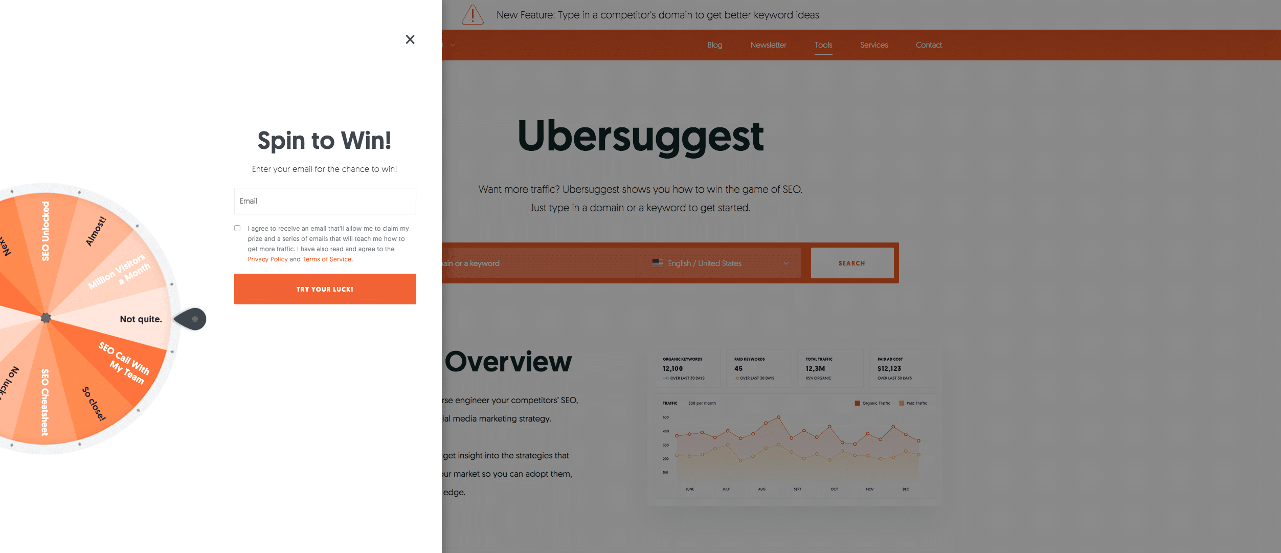
Il guru del marketing digitale Neil Patel utilizza questo popup sul suo sito web. È mozzafiato. Interattivo e giocoso per i visitatori allo stesso tempo. (anche se il popup è fastidioso se continuo a visitare da IP diversi – non copiare tutte le sue strategie come marketer).
Se vincono, forse anche meglio.
A parte la parte interattiva, penso che la copia potrebbe migliorare.
Funziona. Alla fine ho anche dato il mio indirizzo email.
Anche la grafica è sorprendente.
Le offerte sono incredibili. Se qualcuno vince, potrebbe ottenere il massimo Audit SEO o chiamata di squadra gratuitamente.
Quello che non mi è piaciuto è che appare immediatamente, e penso che non dovresti mostrare immediatamente i popup, piuttosto aspettare che l'utente provi prima il sito. In breve, sconvolge l'esperienza dell'utente e ottiene punti bassi nel contesto e nell'intento.
Ecco i miei punti:
Copia: 3
Offerta: 5
Grafica: 4.5
Contesto:2
Intento: 1
Punti totali: 15.5
6 – Il popup del quiz interattivo
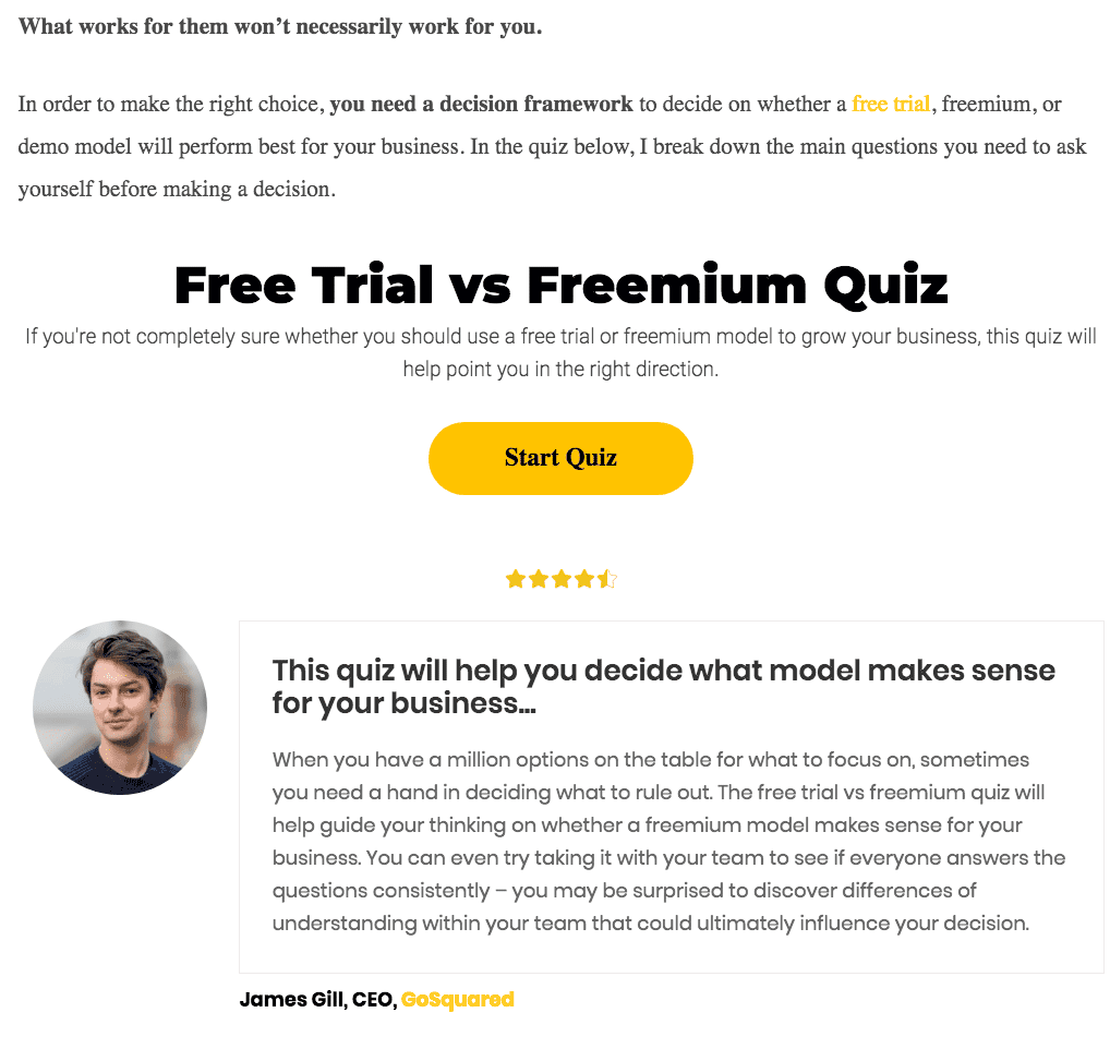
I popup dei quiz interattivi di solito forniscono alcuni contenuti utili e aggiungere valore; In ritorno, raccogli le email.
Adoro questo popup con quiz perché è integrato nel blog sul modello di prezzo di prova gratuita rispetto a quello freemium. COSÌ, il contesto è giustamente impostato.
Non è graficamente gradevole, ma il testo ti obbliga a scoprire quale sia la soluzione migliore per te.
La grafica è migliorata grazie al testimonial e che aumenta ancora una volta la fiducia.
Ecco i miei punti:
Copia: 4
Offerta: 5
Grafica: 4
Contesto: 4
Intento: 5
Punti totali: 22
Protip: utilizzalo sulla home page del tuo sito web nel piè di pagina per aumentare il coinvolgimento.
io spero i popup creativi sopra ti aiutano a far crescere il tuo lista di posta elettronica.
Principali takeaways
Ecco i punti chiave di questo articolo. Sono i tuoi punti di riferimento se vuoi far crescere la tua lista e-mail e convertire più persone.
- I popup dovrebbero essere attivati dal comportamento e dal contesto mostrato al momento giusto.
- Usa immagini umane per aumentare la fiducia.
- Utilizza contenuti interattivi per aumentare il coinvolgimento dei visitatori del sito web.
- Concentrati sul copywriting e sull'offerta. Rendi la tua offerta davvero preziosa in modo che i visitatori può ottenere il valore in cambio del suo indirizzo email.
- Prova a rendere i popup visivamente gradevoli.
Quindi, quale implementerai per far crescere la tua lista e-mail?
Vuoi creare il tuo popup email? Iscriviti gratuitamente a Poptin e crea fantastici popup e-mail in pochi secondi!


