
Optimizing your eCommerce landing page is one of the first things you should do if you want to maximize sales in 2021.
There are tons of ideas online for how you can build effective, high-converting pages.
Unfortunately, a lot of e-commerce owners don’t understand that landing page success depends on creating a design that is matched to the intent for that specific page.
Instead, they simply choose a landing page builder and get to work creating a landing page that ultimately produces mediocre results.
What should they do instead?
Match the landing page to the user’s intent in each of the following categories:
- Top of the Funnel (TOF): Landing pages at this stage are designed to INFORM your audience about your product and brand. They demonstrate your value and the benefit to the customer and are often linked to social media pages so visitors can continue engaging with your brand.
- Middle of the Funnel (MOF): MOF landing pages are designed to ENGAGE with prospects who have already shown an interest in your brand. They are generally lead capture pages that collect visitor information (name, email address, etc.) in exchange for something valuable, such as industry insights, case studies, etc.
- Bottom of the Funnel (BOF): For the most part, landing pages at this stage are sales pages with lots of persuasive copy designed to CONVINCE customers to make a purchase (or upsell products to users who have already closed the sale).
Listed below are 11 eCommerce landing page examples you could emulate so you can give your visitors a great user experience and make more money online.
1. Doodly
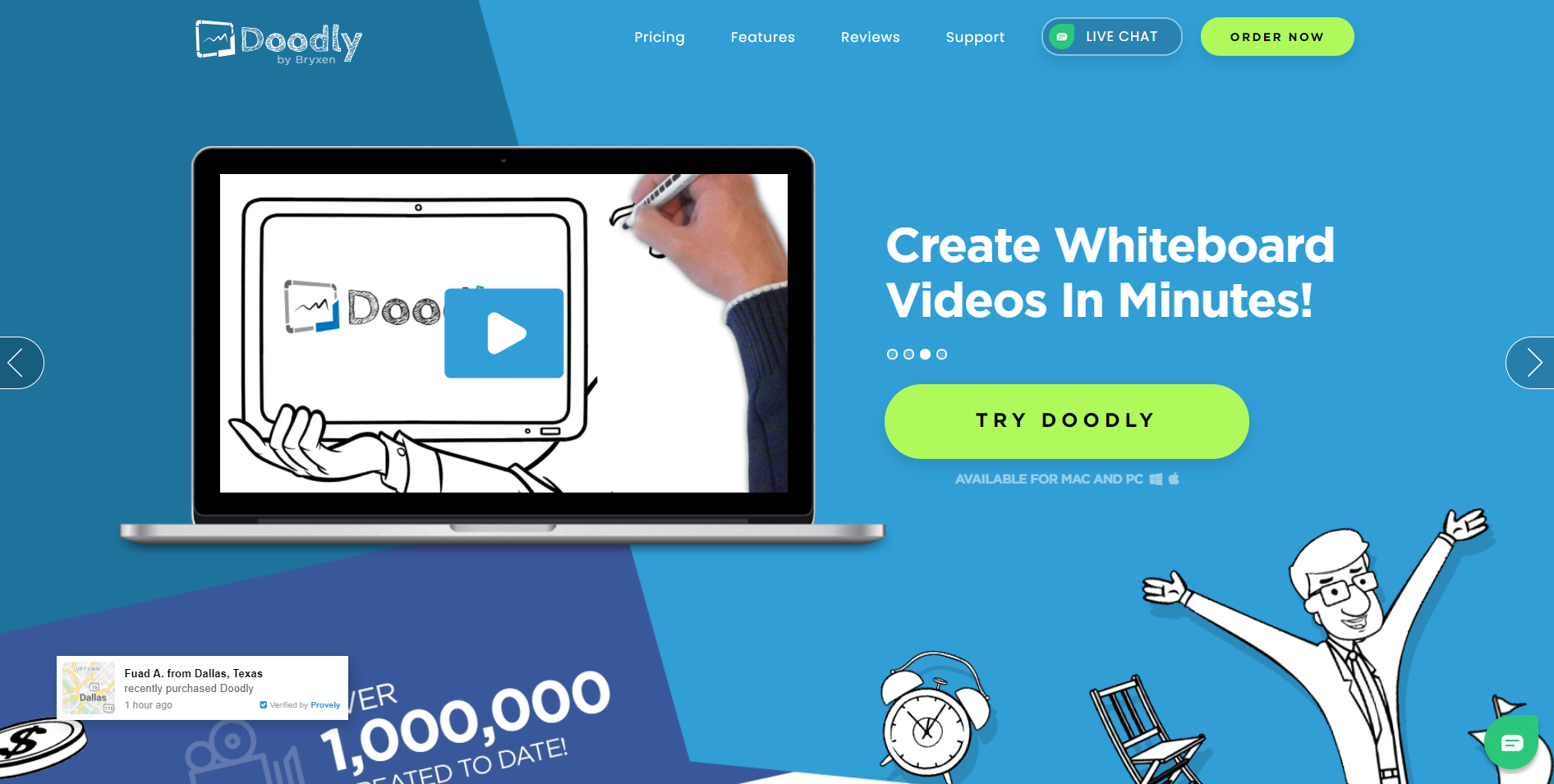
Doodly has an amazing eCommerce landing page that uses a variety of engagement tactics, including videos, to show how simple it is to create visualizations and cartoons with this tool.
Although it’s a rather long landing page, there are clear calls to action (CTAs) sprinkled throughout, and the page provides all the information potential customers might want to know about the software.
There is extreme detail on how the service works, its features, and pricing, and tons of other relevant information.
But perhaps most notably is this section near the bottom of the landing page where the brand showcases a lot of testimonials from happy users.
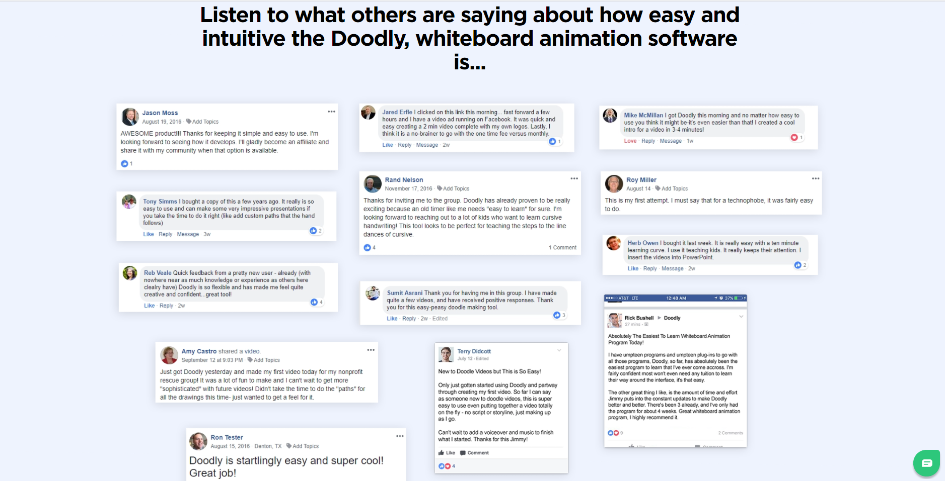
This type of social proof is crucial to have on your landing page as it can be exactly what you need to encourage anyone who is on the fence about purchasing your product or service.
A site like this one that sells a sales enablement tool might benefit greatly from a super-detailed landing page like this one.
The detailed copy would help to inform potential customers about everything they need to know in order to make an informed decision whether or not the software is the right solution for their business.
2. Verizon
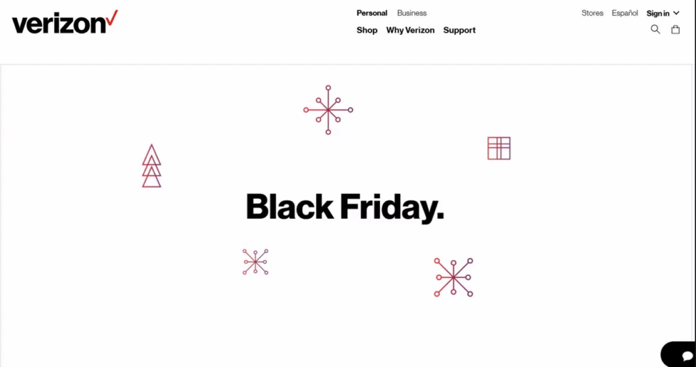
This page from Verizon is a great one to emulate for your next eCommerce landing page design.
It’s simple, with clear and concise calls to action.
You can use some type of animation, such as a GIF, to catch the attention of your users as soon as they land on the page.
On the page, you might offer multiple options for your CTA, such as shopping, learning more, etc. to keep visitors on your site.
Make sure your page is designed with your brand colors and other elements to make it eye-catching and unique.
This company, which sells empty capsules, uses the same tactic effectively to demonstrate how its machine makes different types of empty capsules.
The animation is enough to immediately draw the attention of visitors to the important information on the page.
3. Dollar Shave Club
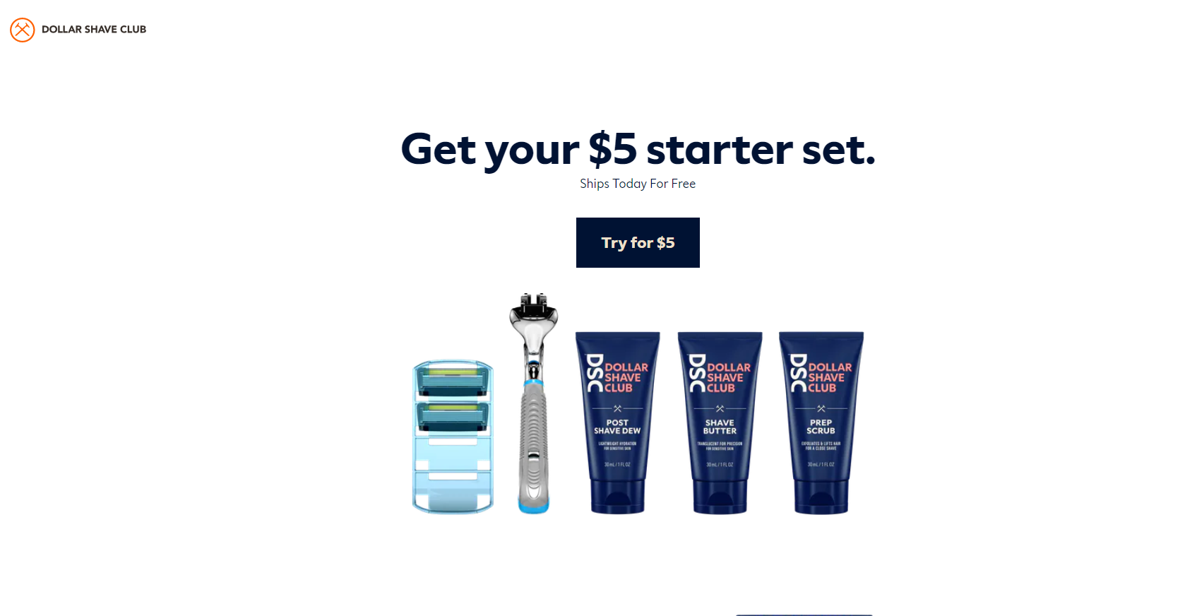
The Dollar Shave Club is yet another example of great eCommerce landing page design.
It has a simple design with lots of white space. The copy is short and concise. Everything is designed to get to the point quickly so visitors who land on the page know EXACTLY what they are getting and what their next step should be.
You can use this landing pages inspiration for your own by doing the following:
- Clearly state your product price and shipping costs
- Use product ratings or client reviews to allay doubts
- Include an FAQ section on the page to address concerns
The great thing about using a simple landing page like this one is that you don’t need any fancy software to build it.
You can simply use whatever tools you normally employ for building other pages on your website to create a well-performing page like the one above.
4. Winc
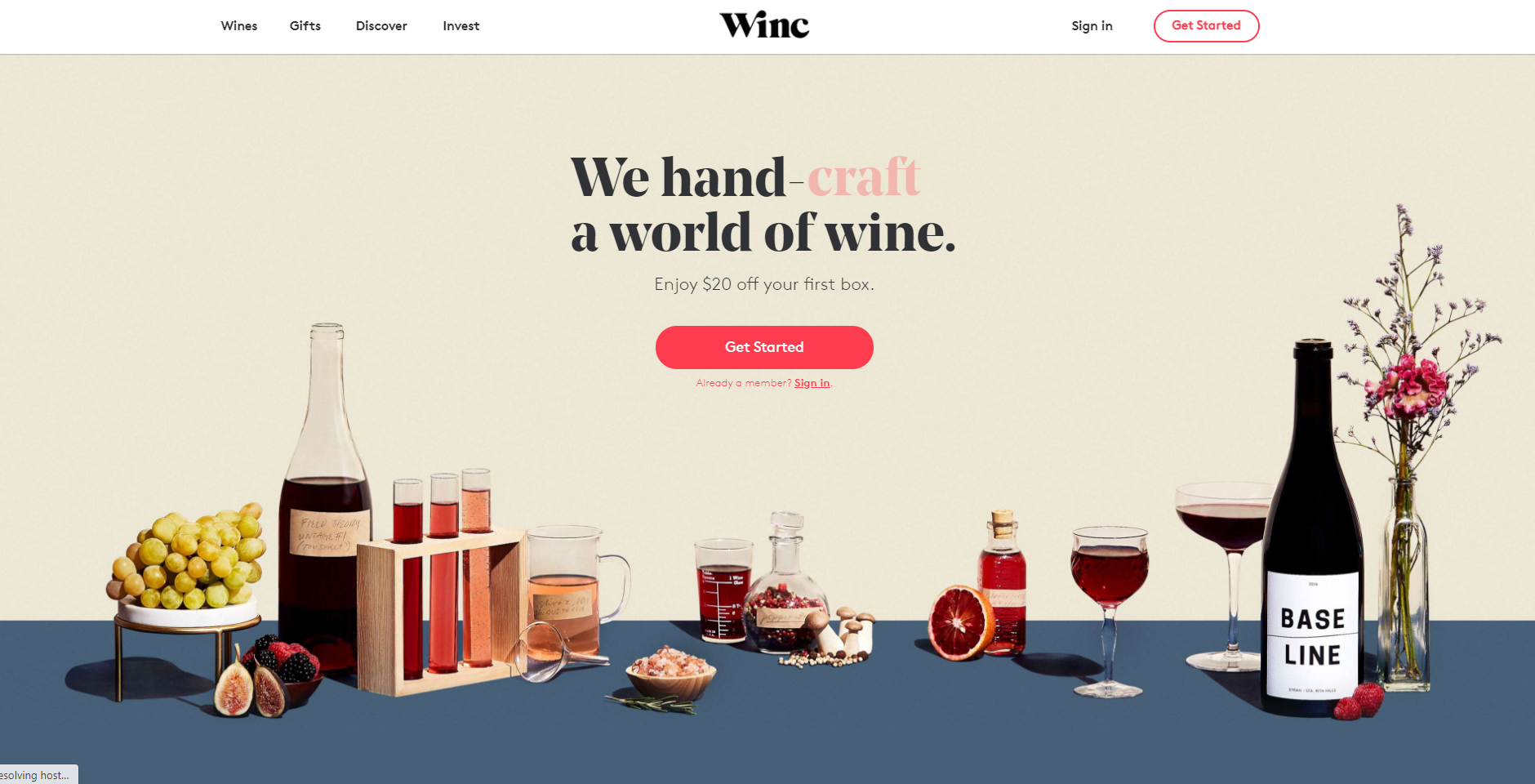
Winc is a winery that created a very successful landing page using elements such as:
- Short, interesting headlines
- A clear call to action button
- High-quality photos of different wines
- Concise, well-crafted copy
Another factor contributing to the success of this page is that the products are visually pleasing.
They are also self-explanatory which means the page creators can afford to depend more on images than text.
In your own business, you might take the strategy a bit further by including social proof as a way to make your page more impactful.
5. Hello Fresh
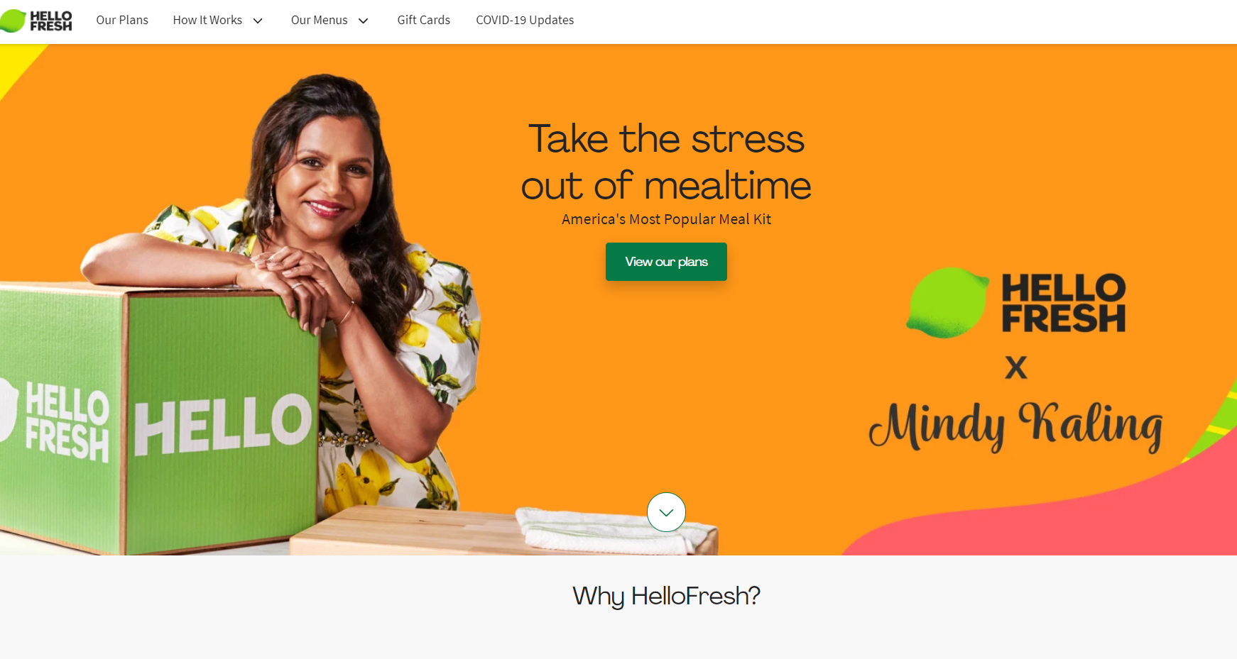
This landing page from Hello Fresh is an awesome example of a well-designed page that is a huge asset to the sales funnel.
The warm, friendly tone of the content, as well as the vibrant colors, introduce the product in a memorable way.
After landing on the page, the visitor is shown the different plans and then led to a cheerful CTA where they can create their own personalized meal plan.
There is a clear and concise explanation of what the service is about, as well as different pricing plans to appeal to different users.
The third fold of the landing page shows that customers might find in the Hello Fresh box, and there is a very prominent call to action to visit the pricing plan and pick the most suitable one.
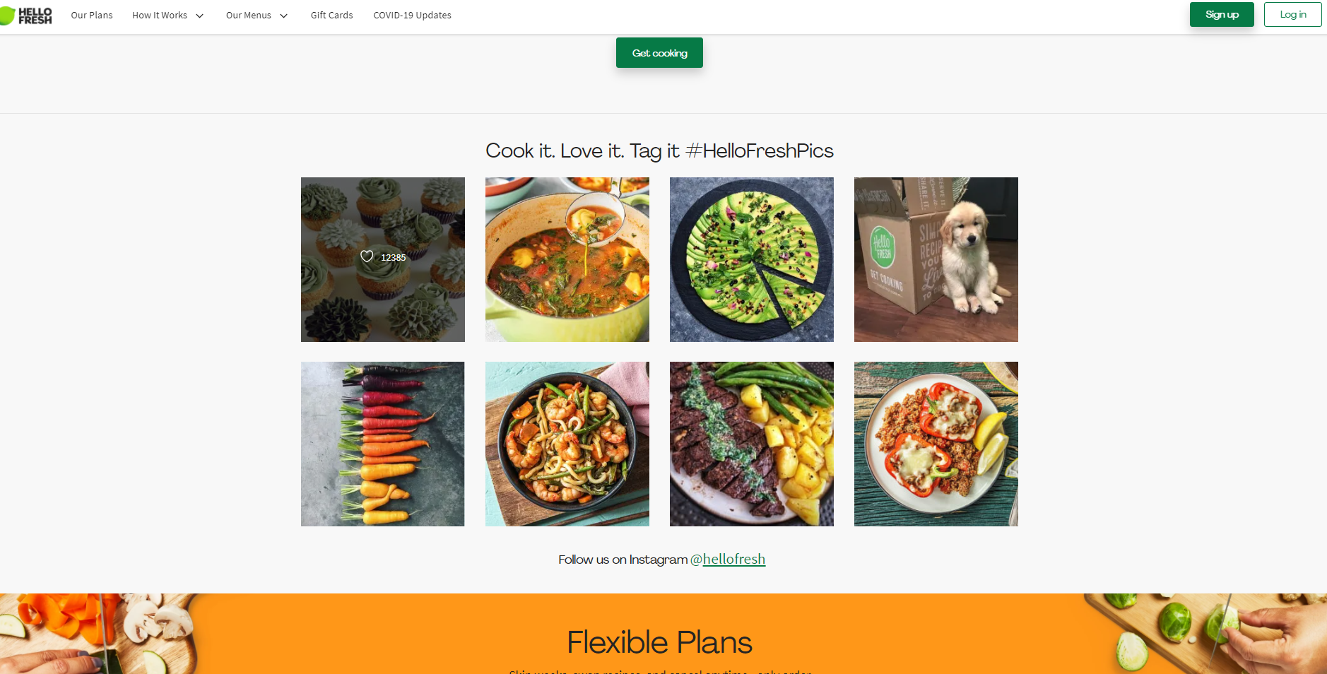
To improve on this strategy when creating your own landing page, you might use an online video maker to create short videos of people making meals with the ingredients from their box.
This would not only serve as social proof, but it would also help to show potential customers how easy it is to use the product.
6. 3Wishes
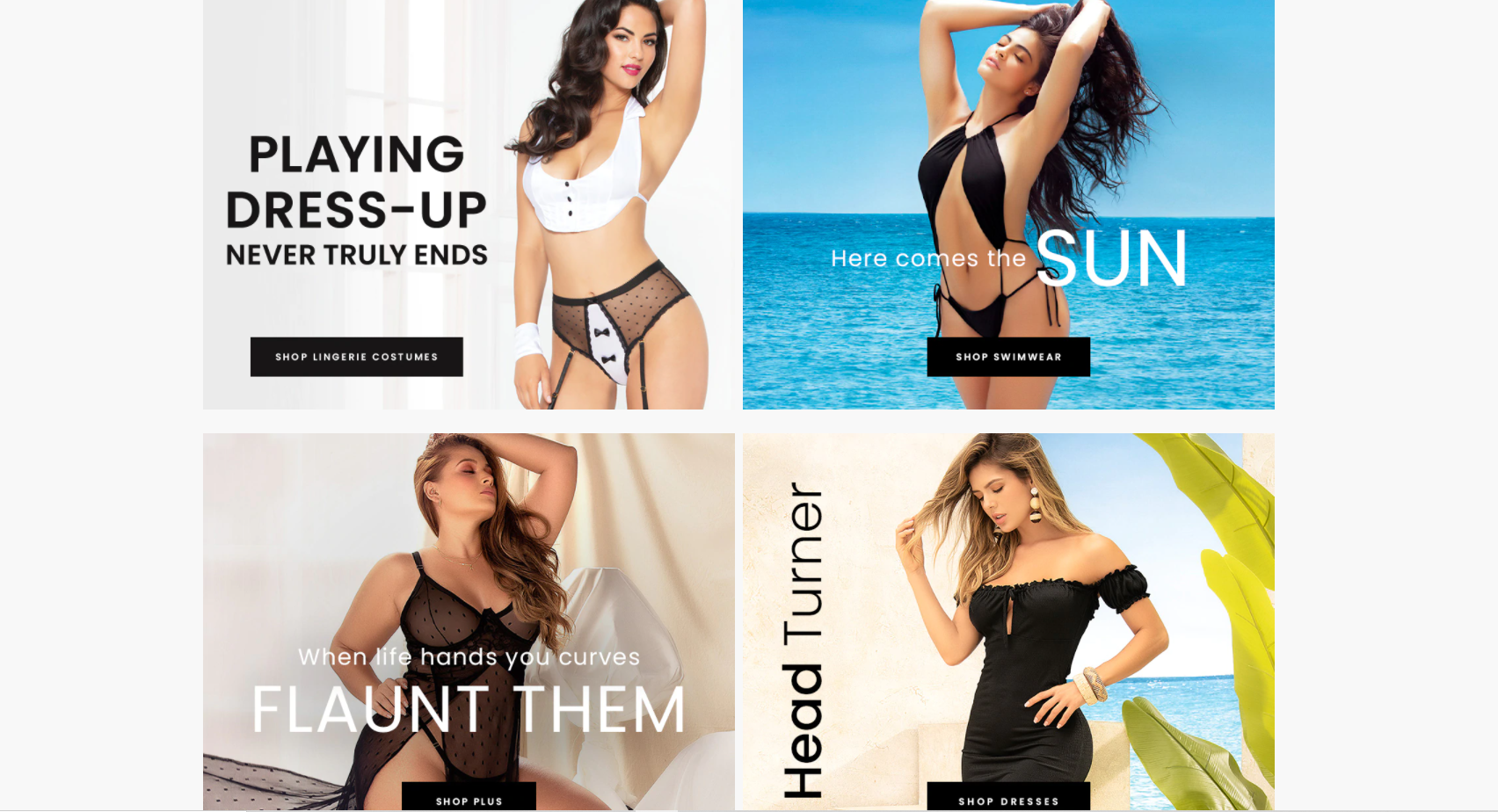
This popular lingerie store has an amazing landing page that makes visitors stop in their tracks and pay attention
It uses bold images and well-crafted copy to make its products as alluring as possible to new visitors.
On the landing page, you also get notifications for trending products, as well as pop-ups for discounts – both of which further help to encourage visitors to make a purchase.
To use this strategy for your own eCommerce store, make sure you’re taking high-quality photos of your products so you can display them in the most flattering light.
A landing page like this wouldn’t be effective if you were using low-quality images.
If the page is a particularly long one, you might also include bold calls to action throughout so customers can click through and buy regardless of where they are on the page.
This works very well as long as you know exactly to whom you’re marketing your product.
7. Asana
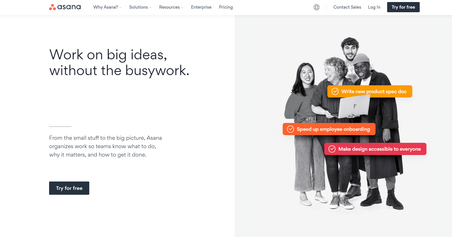
Since the advent of the global pandemic, we’ve experienced a massive rise in remote work and tools like Asana have been popping up all over the place.
But, Asana’s landing page is one thing that helps the platform stand apart from tons of other task management tools.
It’s simple, yet extremely effective.
It contains lots of white space and some pops of color in the form of animated text.
The page gets straight to the point and lets the visitor know at a glance exactly what the platform is about.
You, too, can use this strategy for creating your own landing pages. To make it even more unique, you can replace elements such as the animated text with videos, GIFs, or infographics.
Basically, you can use anything that will help you to provide as much relevant information to your audience in the shortest time possible.
8. Sleep Junkie
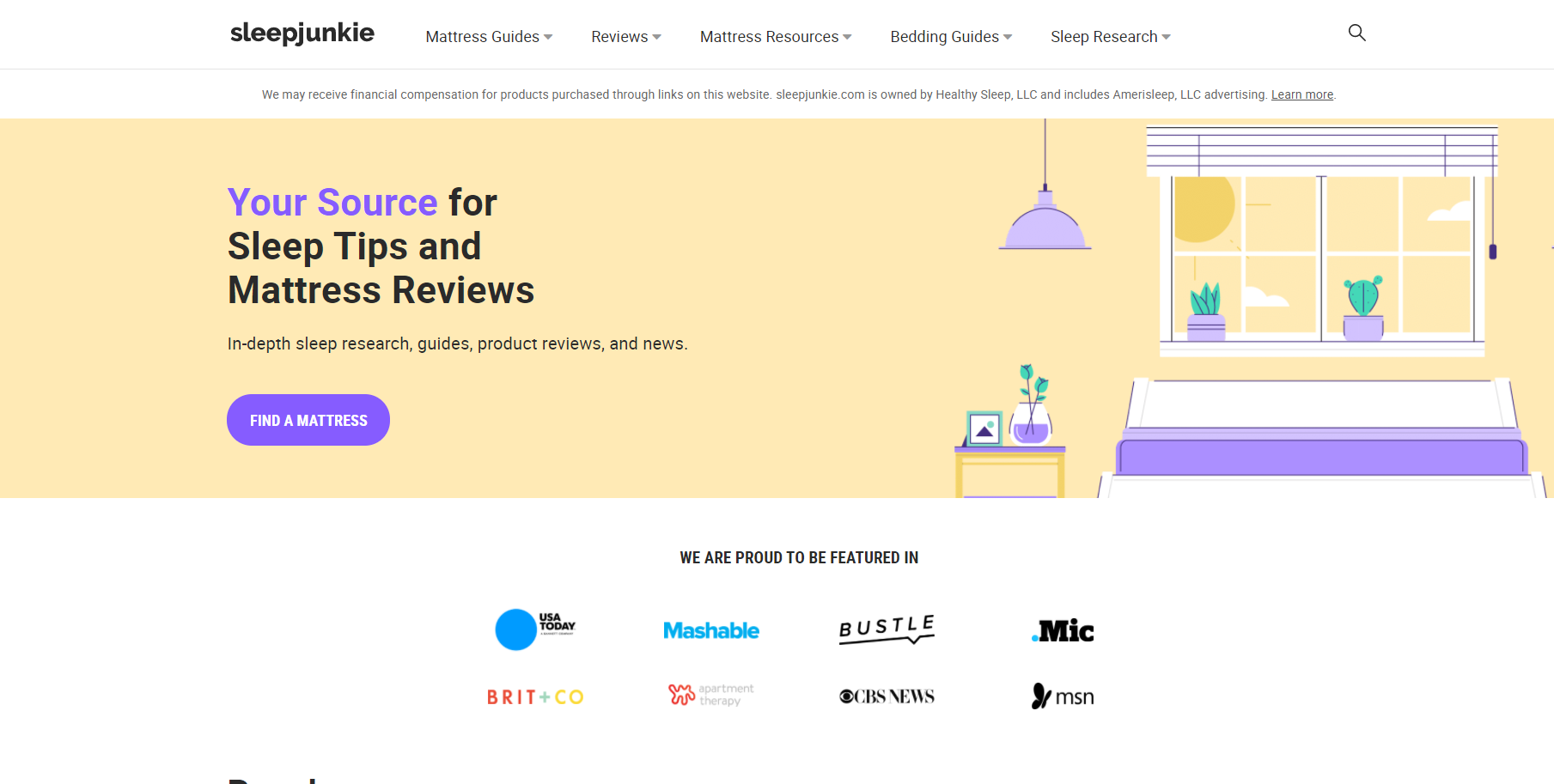
This site, which focuses on sleep tips and mattress reviews, creates a fun and welcoming environment with its landing page.
In contrast to some of the other examples above, the social proof on this landing page is placed front and center so that visitors coming to the page know right away that this is a credible and trustworthy website.
On the landing page, you’ll also find a list of product inventory that makes it easy for shoppers to find what they’re looking for, see whether it’s in stock, and so on.
They also have badges for best-selling products that offer guidance to shoppers.
Furthermore, there are links to mattress guides, mattress reviews, accessories, and various other resources, such as the latest sleep research and case studies.
In short, this landing page provides ALL the information shoppers need to make well-informed decisions as to the best mattress for them to purchase.
This is a great landing page to emulate whether you sell products on your own website or on a site like Shopify.
9. Preply
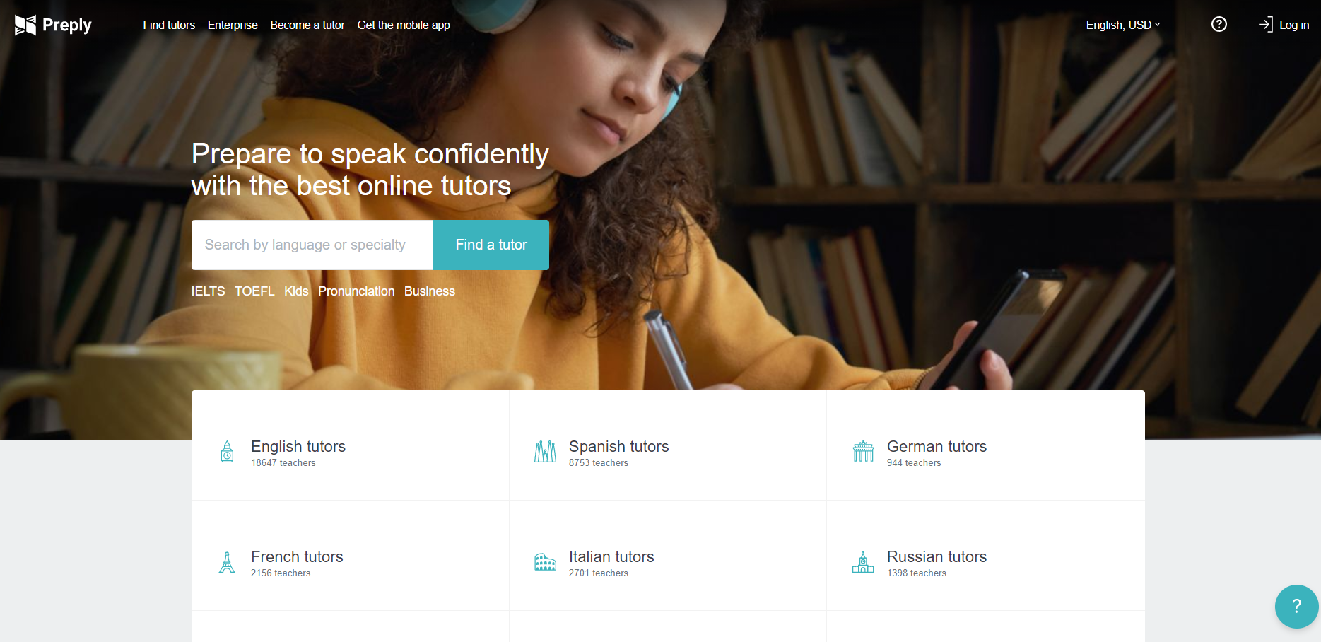
This website offers language tutors to students from around the world.
As soon as you land on the page, you can see that they offer a wide range of languages, from English and Spanish to German, French, Russian, and Chinese.
In the next fold, the benefits of each program are outlined, which helps to convince visitors that this is, indeed, the right program for them.
There is also a prominent call to action button to “search by language or specialty” so visitors can quickly find a tutor.
This is yet another example of how simple landing pages can be extremely effective – just as long as they are aligned with the visitor’s place in the sales journey.
One way this page could be improved is by including video.
With more and more people watching videos online, this is one element that is fast becoming a landing page must-have.
Luckily, there are tons of tools and video editing apps you can use to create stunning and engaging videos for your page.
10. Inflow
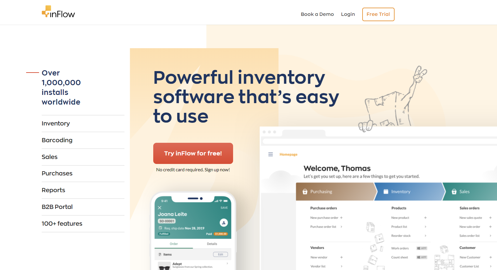
Inflow is a purchase order management software for eCommerce.
The site’s landing page uses elements such as social proof, concise copy, and fun animation to bring a spark to an otherwise tepid topic like “inventory software”.
This type of strategy is great for use in industries that are not otherwise considered “interesting”, or “fun”.
For instance, a landing page for a predictive dialer could use a template such as this one as a way to create more buzz for the product.
11. VPN Overview
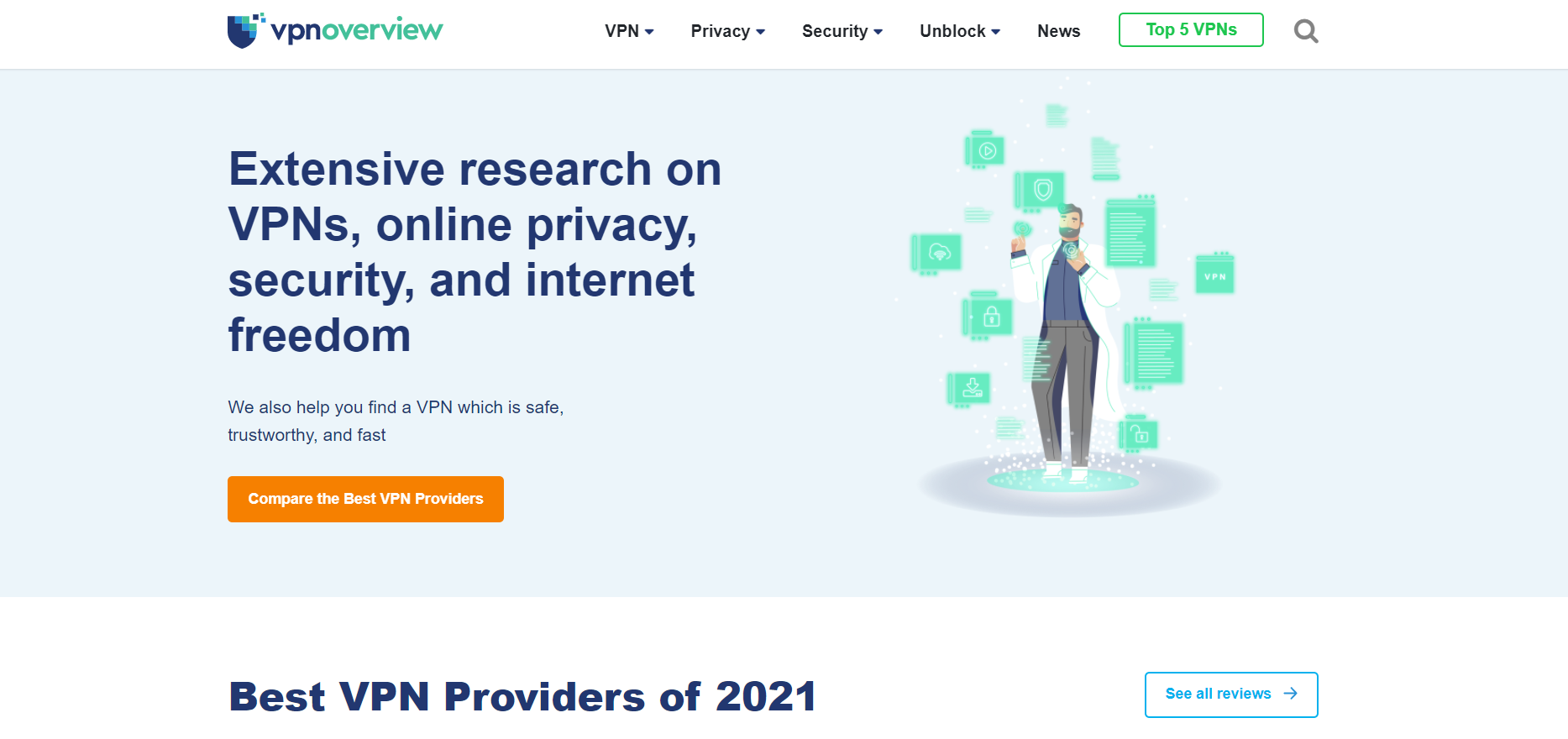
This website landing page is focused on how to stay safe while browsing online.
In addition to a clear CTA to explore the best VPN providers, the page also includes links to different article reviews, all of which are rated according to factors such as ease-of-use, value for money, guarantee, servers, etc.
This makes it very easy for visitors to choose the right VPN to suit their needs.
The page also includes answers to questions such as “How to browse safely on the dark web”, and more – the answers to each question then position the VPN products as the ultimate solution for visitors.
Pro Tip: If you lack the technical skill required to create some of the elements that make up a successful landing page, such as high-quality images, videos, and writing copy that converts, you can simply hire qualified professionals on a freelancing platform like this one.
Conclusion
By now, you have an arsenal of responsive landing page examples that you can emulate for your own eCommerce business.
Remember to align your landing page to your visitor’s place in the customer journey so you can maximize the results from your marketing efforts.
Author’s Bio

Burkhard Berger is the founder of awesomex™. You can follow him on his journey from 0 to 100,000 monthly visitors on www.awesomex.com. His articles include some of the best growth hacking strategies and digital scaling tactics that he has learned from his own successes and failures.


