
We live in a digital age where everyone walks around with a computer in their pocket. Around the globe, there are over 2.5 billion smartphone users. And when you think about it, your email campaigns are most likely opened on these small devices.
In fact, desktop only accounts for 15% of email opens and mobile makes up 61%. About 3 in 5 consumers like checking their email on the go and another 75% use their smartphones to check emails.
If there’s anything you learn in marketing, it’s that you need to meet the demands of your target audience. And as you’d imagine, consumers are using their smartphones for just about everything.
So it makes sense to create email campaigns that are responsive to mobile devices. It can help your email click-through rates and conversions.
In this article, we’ll discuss some of the ways you can improve your email designs to engage and convert mobile consumers.
Let’s dive in.
1. Short Paragraphs, No Blocky Texts
Desktop users rarely stick around on a site that has large blocks of text. So why would they on a smaller screen? That’s what makes this tip a must – it works for engaging both desktop and mobile device users.
Breaking up your text so it’s easily digestible. Here’s a great example from Caterpillar:
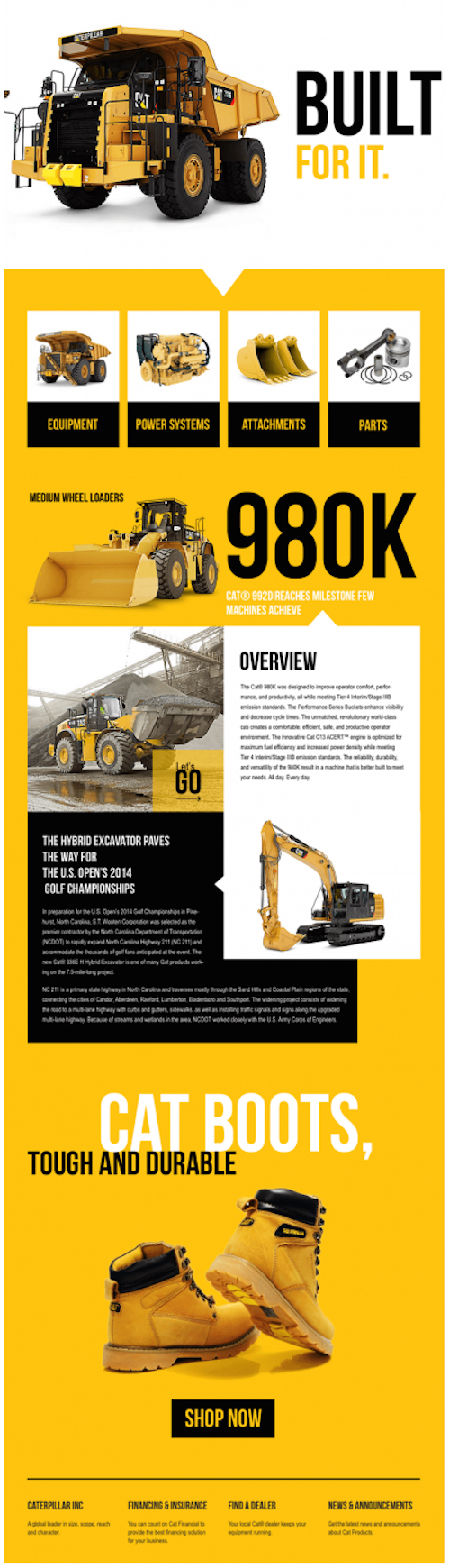
They do a great job of making the email attractive and easy to scan by mobile users. The colors and text boxes make it easier to consume. Plus, they include a CTA at the bottom mobile users can tap to search for Cat boots.
2. Strong & Bold Colors and Imagery
You want your emails to stand out in a good way. That’s why your color schemes and images are so important. Your contrasts should be eye-catching and the photos intriguing enough to make the user want to stop and look.
Here’s a great example from easyJet:

Adding color to your email newsletters isn’t just about preference. It’s actually scientifically proven that color can increase brand recognition by 80%. This is why you’ll find leading brands like Starbucks (green), Target (red), Dell (blue), and other notables with consistent and memorable color schemes.
Just make sure the colors you choose are attractive.
And as for images, you want them to be relevant and expressive of the message you’re trying to convey. For example, if you’re a travel company, you should use images of destinations, fun spots, or quality lodging.
Studies show that people retain 65% in the images they see. Make sure the images you show are high-quality.
3. Typography that’s Interesting, But Not Over the Top
Besides your color palette and text layout, it’s all about your typography. Obviously, you don’t want to choose anything that’s difficult to read. However, the fonts you choose can help to attract attention and add personality to your emails.
That’s exactly what Jack Daniels did in this email:

What’s clever about the way they used typography is how they mixed the various fonts. As you see in the heading, the first word has a unique cursive typography followed by a “Tennessee” script.
Then they play around with capitalization and font size in the heading to add a bit of spice. Serif text is used for the body of the email, matching the title and the CTA button (which links to their Facebook page).
Try out different fonts and sizes in various split tests to see what works best for your campaigns.
4. A Mouth Full of Content to Engage
Just because your email subscribers are on small devices doesn’t mean you have to reduce the amount of content you send. There’s a clever way you can give them a screen full of content to allow them access to what they desire.
And if you’re paying attention to your analytics and segmenting your campaigns, it should be a lot easier to come up with email “content clusters.”
Here’s a look at how Starbucks does it:

They offer:
- recipes for homemade ice coffee
- a freebie offer for purchasing their Iced Coffee Brewer
- a quick recipe with a Pinterest link to more ideas
- a promotion for one of their flavor blends
- a product promotion and recipe
- a product promotion for their coffee on the go product and a shop now link
Then to top it off, they include a way for their subscribers to get discounts on their products sold in grocery stores (packages with stars on it). Of course, they finish it up with CTAs for their forum and social media pages.
5. Animations to Captivate Your Readers
Images are great, but moving images are even better. These GIFs not only capture attention, but they can also get your subscribers to take the time to read your email.
Here’s an example of a banner animation you can include in an email.

It’s an animated phone that symbolizes the reader’s being called. And then the caption plays on this saying they wouldn’t want to allow the message to go to voicemail (creating a sense of urgency).
6. Add Video to the Subject & Email Body
If you look at the various case studies out there, you’ll find that adding the word “video” to your subject line can increase your open rates and click-through rates. And in some instances, it can minimize your unsubscribes.
In a report from HighQ, it shows a 19% increase in open rates, 65% increase in CTR, and 26% reduced unsubscribes just by adding “video” to email subject lines.
You can then either embed the video into your email or link that takes them to a landing page or YouTube video.
Here’s an example from Patagonia (they decided to link):

They made the video the center of their email to ensure the reader sees it and nothing else. Yet, they still include links at the top that readers can use to shop. It also includes a quick summary of its contents (and a warning).
Creating Emails that Engage & Convert
Now, it’s time to put these elements to use in your upcoming email campaigns. With these simple tips, you can potentially boost your open rates and CTR.
Then if you’re in need of a boost to your email subscriber list, then Poptin can help. This is a simple platform you can use to quickly design exit-intent popups that capture your audience before they leave.
You can design popups for your email subscription form to capture as many leads as possible. You can also make your popups show up after a certain amount of time spent on a page or after scrolling to the end of a blog post.
If you’d like to learn more about this tool, then sign up for free and give it a test run!


