
The ecommerce world is dominated by marketplaces such as Amazon, AliExpress or eBay that achieved and maintain huge success through bringing countless third-party sellers into their ecosystems. When it comes to shipping at volume, they’re the top dogs, and they’re excellent sources of inspiration for ecommerce design.
In this piece, we’re going to pick out some product pages from these three retail juggernauts and compare them to see how they compare. How do their approaches differ, how are they similar, and what can smaller business learn from their methods?
To make the comparison as clear as possible, I’ve gone for the same product (Logitech’s G102 mouse), but keep in mind that Amazon’s listing is from an official Logitech storefront, so the quality is rather higher there. With that said, let’s get started.
Introduction
Because we’re dealing with long pages, let’s cover a few comparable chunks. Here’s the first part of the page dealing with the main product image and basic description, starting with Amazon’s effort:
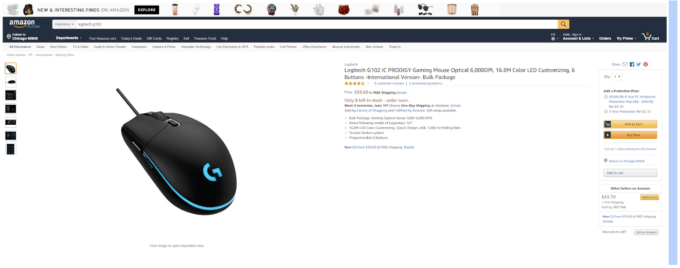
I didn’t need to crop this image horizontally because the page expands to use the full width of the browser window. What we can see here is great use of negative space, but very small text. I viewed it on a fairly high-resolution screen, so presumably Amazon ensures responsiveness by keeping elements very compact. Note the classic motivational features of inducing FOMO through mentioning limited stock and then promising the option of next-day delivery.
Now here’s AliExpress:
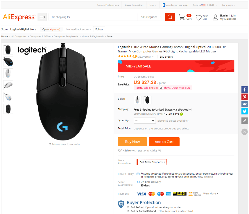
I did need to crop this, so it’s clearly fixed to a set width beyond basic desktop resolutions. What we see here is a much busier layout. The highlights are essentially the same (plus the mid-year sale banner), but there’s nowhere near as much negative space. There’s more FOMO on display with a temporary discount including a crossed-out price, and the primary shipping factor is cost here because AliExpress near-exclusively ships products overseas.
Now let’s see eBay:
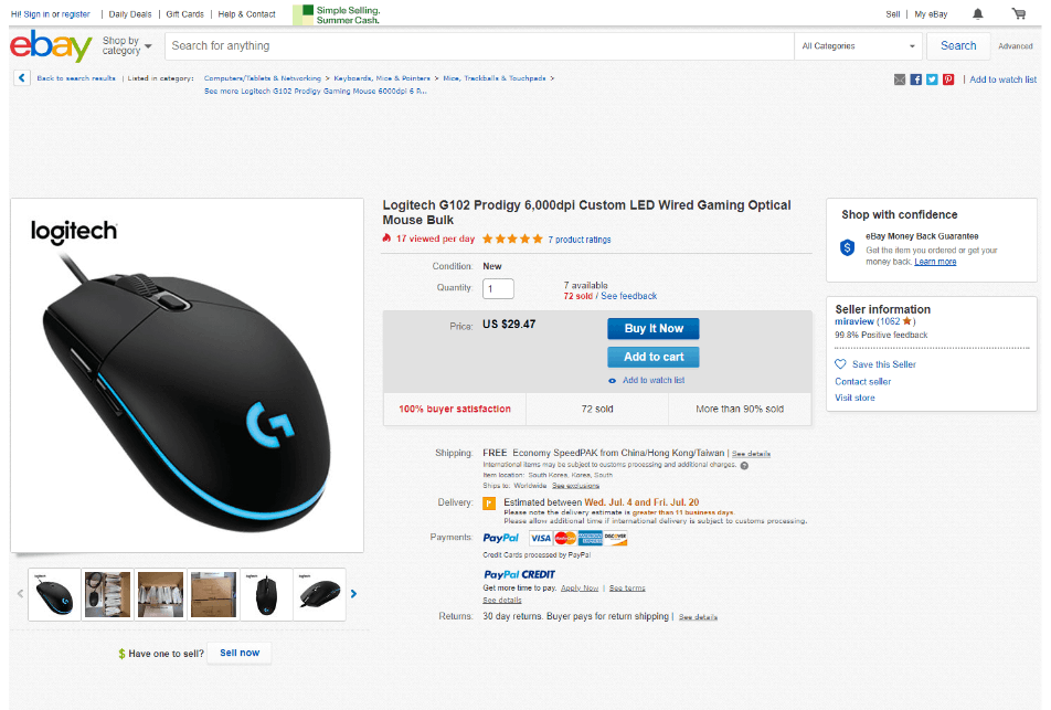
We see something of a middle ground here, with more negative space than the AliExpress page but nowhere near as much as Amazon provided. As with Amazon, there’s an option for adding it to a list to revisit later, but I like the added clarity of ‘watch list’ with the eye icon. The FOMO features here are a little more subtle but also more detailed, with the number of daily viewings and the stock percentage sold listed (the latter is quite clever, because it gives the impression of scarcity when the 10% of remaining stock could be in the thousands).
It’s very difficult to rate this because Amazon seems easy to me, but that might just be because I’m so familiar with it. I do get the sense that Amazon skates by despite its awkwardness because everyone is so used to it. I’m actually going to say that eBay’s layout is my favorite here.
Associations
Immediately following the introduction, Amazon goes into associated recommendations:
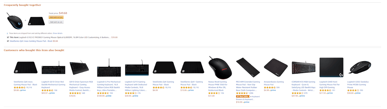
What I like about Amazon’s approach is that it’s clearly been carefully cultivated to deliver what gets people to buy. You have a bundle option that will appeal to someone likely to want accessories but not too eager to hunt them down manually, and a range of other items purchased alongside the product to see if anything captures the user’s attention.
Now here’s AliExpress’s effort from much farther down the page:
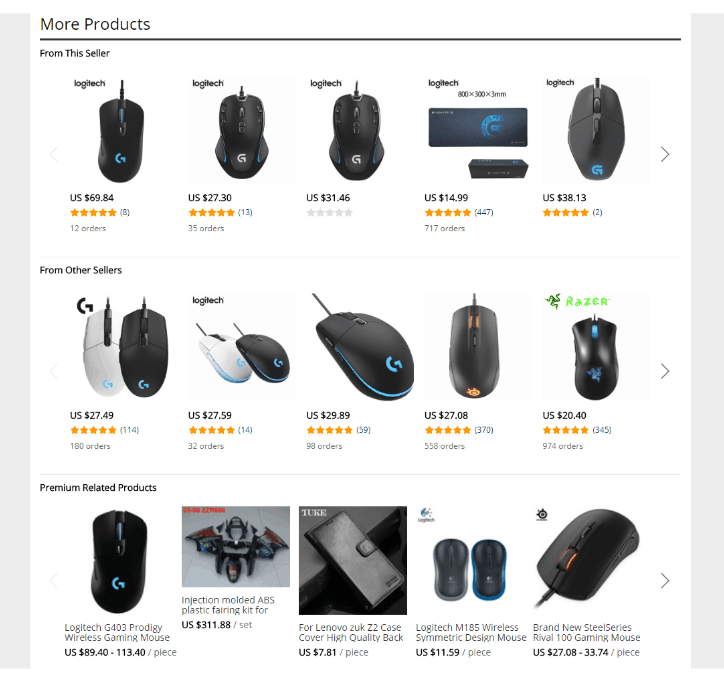
This is somewhat useful, but not nearly as interesting or relevant to the user. There’s some value in simply seeing other products from the seller that concern roughly the same topic, but that’s really all you’re getting. Amazon’s approach is far superior here.
Here’s eBay:
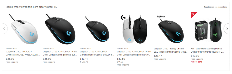
This is in-between the other two. It’s less decisive than Amazon’s data because we’re looking at views and not buys, but then it may be more useful to those who are on the fence about buying that particular item and might not benefit much from learning about the purchasing habits of those who ended up choosing it.
I’m giving this category to Amazon by some margin.
Description
Every product page needs a more detailed description, and every site differs in the structure it uses. Here’s Amazon’s layout:
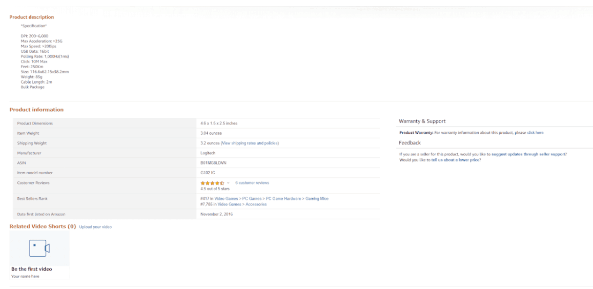
Extremely sparse stuff once again, and it doesn’t look great. The essential information is there, but the formatting is very clunky, with the primary description merely thrown in as a basic list.
Let’s see if AliExpress can do any better:
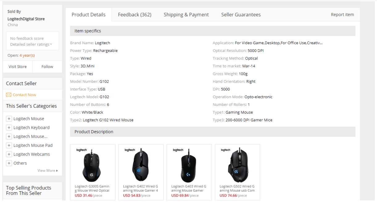
As it turns out, it can. This layout is vastly nicer, with space used sensibly, tabs provided to cover the important sections without overextending the page, and data presented in a much more digestible fashion. It’s unfortunate that a wired mouse is inaccurately listed as ‘Rechargeable’, but that’s not an issue with the page itself. (Additionally, the ‘Product Description’ section is very weak and hugely overlong, but I attribute that to the seller misusing the category).
And what of eBay?
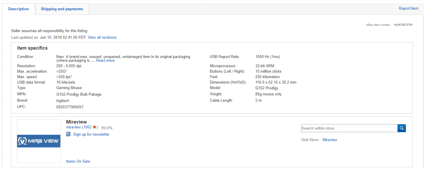
Certainly the middle option here once again. The date of the last update is very handy; Amazon tells you when it was first listed there, but not how recently it was changed. You even have the option of viewing all revisions to see every version that has been uploaded.
This goes to AliExpress in a big way. It’s clear and bold and I greatly appreciate the tabulation. Even if used optimally, the Amazon and eBay layouts just aren’t as good.
What we can learn
I didn’t expect to end up giving each website the nod in one of the three sections I looked at, in truth. Amazon is such a fixture in customer service and convenience that it’s easy to forget how weak its page design is in so many areas— it just doesn’t need to do any better because everyone’s used to it and there’s no major threat looming on the horizon.
AliExpress is the most colorful and bold, and the most brazenly promotional of the three. I imagine that it’s more indicative of what Amazon will look like if it ever opts for a redesign. That said, I was not best pleased with the ‘Product Description’ being infuriatingly long, as the page ran to several times longer than each of the other two entirely because of an enormous image stuffed into the section.
Ebay’s design reflects its focus on bidding, with a lot more data relevant to bidders and a much more relaxed approach to salesmanship; the FOMO comes across as more informative and less sales-oriented. Though it’s not as consistent as Amazon (being entirely third-party like AliExpress), eBay’s design is probably my favorite of the three. It’s clean and clear at all times.
Remember to seek inspiration
Whether you have a great site in place and you’re just looking for optimization tips, or you’re in the process of creating a site for your small business and you’re trying to soak up as much information as possible about how to master online presentation, always look to the biggest businesses out there to see not only what they’re getting right (so you can copy it) but also what they’re getting wrong (so you can beat it).


