
Email marketing is one of the most common marketing methods. 87% of businesses use it.
Why?
Well, there are a few reasons:
- Personalization: It allows you to create a personalized content marketing plan, which studies show that consumers value.
- Build relationships: It helps you build relationships with your customers, keeping them engaged with your brand.
- Increase traffic: It generates more traffic to your website.
These are just a few of the benefits of email marketing.
But in truth, the only way email marketing can be successful is if you have a solid list of email subscribers. Without subscribers, it’s pretty much a waste of time.
Fortunately, we’re going to outline five ways you can get more email opt-ins from your blog. So keep reading to find out how you can grow your mailing list and improve your business.
1. Incentivize sign-ups
Incentives are a great way to encourage users to sign-up for your emails. In fact, 85% of consumers say that receiving discounts is the most important reason for signing up for an email list.
Put yourself in the shoes of your consumer. If you were given an incentive to provide your email address, would you?
Chances are you’d be more likely to sign up to an email list that offered you a discount than an email list without any incentive at all.
So think about this when you’re trying to get more email opt-ins from your blog. Offering something of value can sway the consumer to provide their contact information and join your email list.
Here are a couple of examples.
eBooks
When users provide their contact information, they get access to valuable information.
Take a look at Nlyte, for example.
The company helps businesses optimize their digital infrastructure. In return for contact information, it offers consumers a free ebook on data center infrastructure.
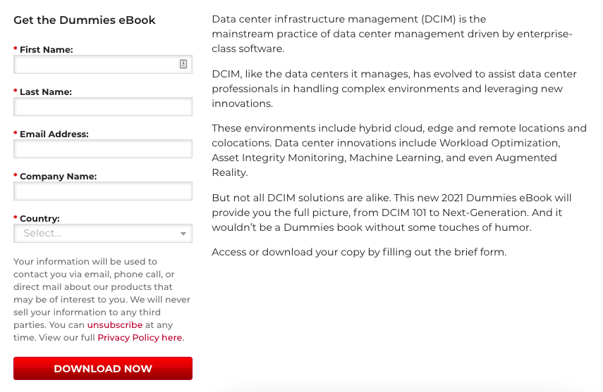
Consumers must enter their contact details, agree to receive promotional content, and voila. They’ve got access to useful information and you’ve got them signed up to your mailing list.
Discount code
Offering a discount or promo code for your product or service is another way to incentivize email opt-ins.
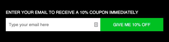
FutureKind’s vegan blog is a great example.
When they sign-up for its vegan blog, users receive a 10% discount on their next order.
These are just a few examples of how to incentivize your email opt-ins. To figure out what works best for your business, think about what your consumers would value.
2. Make the process as simple as possible
If your sign up form is too complicated, users won’t submit their information.
Put yourself in the shoes of a consumer for a second. If you saw a 5-step newsletter opt-in form that was asking for your name, email address, home address, occupation, and your reason for signing up, would you sign up?
Probably not. And why? Because that’s a long process just to opt-in for emails. Not to mention, you’d be providing a lot of unnecessary personal information.
So let’s take a look at some of the ways you can simplify the opt-in process:
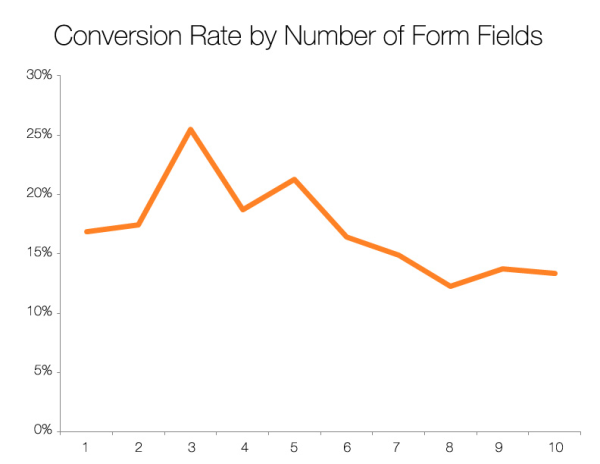
- Limit the information you ask for: Realistically, you don’t need to ask for a lot of information to get email sign ups. Sure, there are times when additional information (such as age or location) can be helpful for email segmentation, but it’s not vital. You need to weigh up what information you want to ask for and what’s an added bonus. To give you an idea of how many fields are optimal, take a look at this graph from HubSpot. It outlines how the number of fields in a sign-upf orm can influence conversions:
- Use a simple design: If your sign-up form is too busy or overcrowded, it can put people off. Instead, make it clean and simple so users can easily see what you’re asking for and how to sign up.
3. Be clear about what subscribers can expect
When a visitor sees your sign-up form, you need to be clear about what they’re signing up for. Failing to make it clear could mean that they won’t bother signing up at all.
Take a look at Massimo Chieruzzi’s site as an example.
In his blog post about book summary apps, Chieruzzi tells visitors what they’re signing up for if they subscribe to his emails. He provides subscribers with a ‘Weekly BrainDump, which he describes as follows:
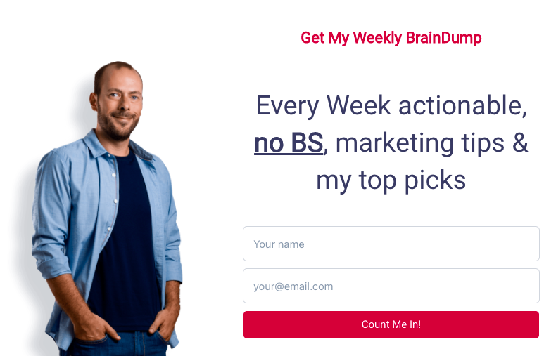
For visitors that want weekly marketing tips and advice, this is great. They know what these emails will provide when they sign up.
Simply put, visitors get a clear idea of what to expect and this can encourage them to sign up.
It also helps you avoid sign-ups from users who you aren’t trying to target. You can be clear about the information you provide and the visitor can decide for themselves if it’s what they want. Hopefully, that will help you engage your target audience and avoid unqualified leads.
When you have inactive or disengaged users on your email list, your analytics and data will be skewed. So make sure you’re clear about what your emails entail. If you don’t, visitors might not think it’s worthwhile to share their contact information with you.
4. Get creative with your call to action (CTA)
Your CTA is one of the most important elements of your sign-up form. If you don’t get it right, you risk losing out on potential subscribers.
So what can you do to your CTA to encourage visitors to subscribe?
Here are a few suggestions.
Ask a rhetorical question
Most CTAs command the user to take action. Sure, this works. But you might want to think about changing things up.
For example, asking rhetorical questions is a great way to pique their interest and stay clear of the typical CTA format.
Check out this travel nursing career guide. To get more email opt-ins, it asks a simple question: Are you ready to start your journey?
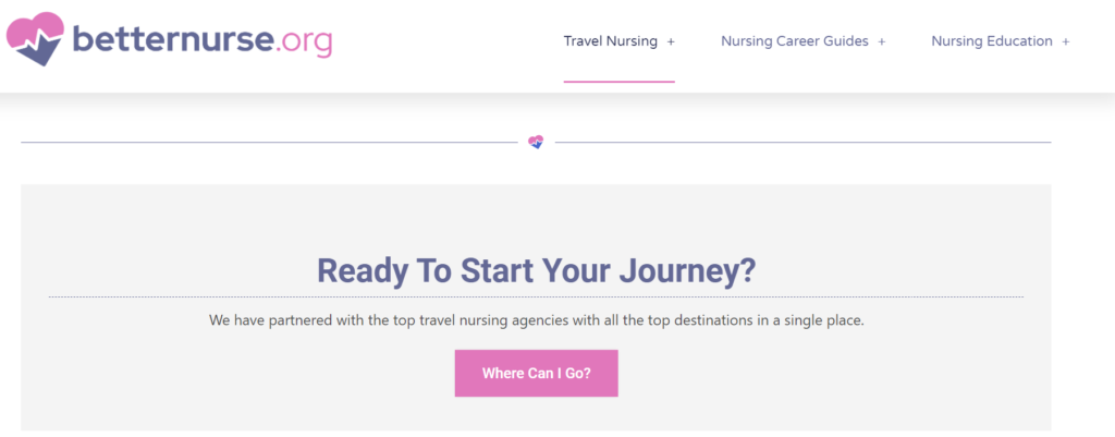
With a simple question, they’ve hooked visitors instantly (motivating them to take the first step on their journey to a new career).
So think about whether this is something you could incorporate into the email opt-in on your site. It’ll encourage users to sign up.
Use imperative language
Now back to the classic CTA: using imperative language.
This isn’t exactly a new technique, but it works. Why? Because it encourages an immediate response.
Take a look at the CTA here on the SendX website, for example:
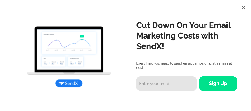
We’ve got a few imperatives in our email sign-up pop-up, including “cut,” “enter,” and “sign up.” This encourages users to take action and sign up as quickly as possible.
5. Create a community
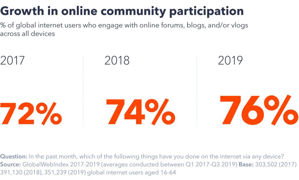
Even before the pandemic hit, internet users were interested in online communities. Take a look at these figures from the Global Web Index.
Now, in a world where digital connections are thriving, you might want to think about how your emails can create a sense of community.
This provides added value for visitors who sign up for your mailing list. They’re not just signing up for emails, they’re signing up for an experience.
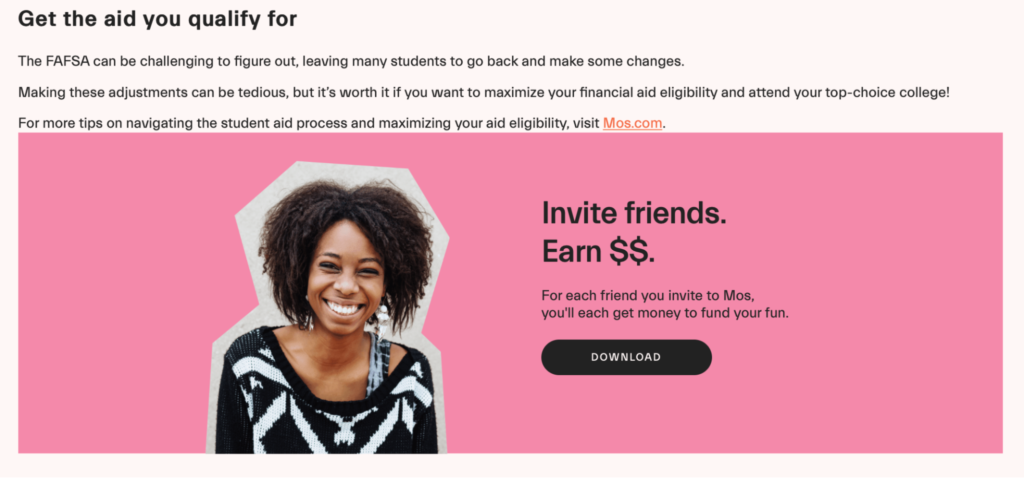
Let’s use MOS, a bank for college students, as an example.
After reading this blog post about FAFSA corrections, consumers can sign up for its bank services.
By inviting their friends, subscribers are also joining and building a community of peers who are working toward the same goal: saving money and optimize their financial aid eligibility.
So how can you create an online community for your subscribers?
In all honesty, it doesn’t take much. It could be as simple as setting up a social media group for subscribers to join or having a password-protected area on your website where they can connect.
Whatever you choose, make sure to think about how you can create a community for longevity. The last thing you want is to set up an online community that falters away because it’s not being utilized.
6. Make your sign-up form mobile-friendly
Mobile accounts for around 50% of all web traffic, and there are 5.27 billion mobile users globally.
What do these figures tell us?
More people are using mobile devices than ever before. That’s why you need to make sure your blog and email sign-up forms are mobile-friendly.
If your website isn’t mobile-friendly, you could be alienating a lot of visitors. And with fewer people visiting your website, you’ll have fewer people signing up for your emails.
So how can you make your sign-up form mobile-friendly?
Let’s take a look:
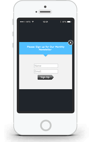
- Keep it simple: If your sign-up form is overly crowded, a mobile user won’t be happy. On a small screen, they need something efficient and easy to fill out. Keep it simple when it comes to the number of fields to make it as easy as possible to complete. Here’s an example:
- Have a clear “submit” button: On the subject of keeping things simple, your “submit” button needs to be easily visible. Think about the colors you use, the design, and where it’ll sit on the screen to make submission a simple matter.
- Think about display size: We probably don’t have to tell you that mobile screens are smaller than desktops. But how can you create a form that works on both desktop and mobile? Use a responsive website design. This will automatically resize your form based on the device being used to look at it.
7. Use a pop-up form
We’ve all seen a pop-up form on a website. You’ll land on a website and straightaway a message appears on the screen asking you to sign up for a newsletter or discount code.
Here’s an example from Canopy’s site:
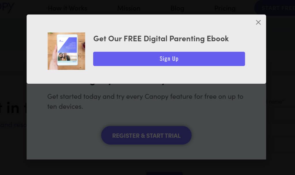
In an article about internet safety for kids, this pop-up appears offering a digital parenting ebook. Ensuring that your pop-up is relevant to the page site visitors are on is improtant for pop-ups to be effective.
They can be a really useful tool for getting email opt-ins, but you have to tread carefully.
If not used correctly, pop-ups can have the opposite effect. People can get frustrated and leave your site altogether.
So what’s the best way to utilize pop-ups without pushing people away?
Here’s what we’d suggest:
- Time your pop-ups: Instead of bombarding visitors the second they arrive on your blog, consider timing your pop-ups to appear after a certain amount of time. This gives the visitor a chance to browse your content before being asked to submit their contact information.
- Personalize the content: Consumers want personalized content. In fact, 52% of consumers say that a personalized digital experience improves their overall satisfaction. So to increase your chances of getting people to sign up to your email list, consider personalizing your pop-up.
- Allow people to close them down: Some pop-ups hide website content until users submit their information. It forces them to either sign up to your newsletter or leave your site altogether, which is a risky game to play. You can use this option if you want, but if you don’t give them access to the website information, you could lose them altogether. It’s sometimes a better option to give visitors the choice to close the pop-up and carry on with their browsing. And who knows, they might even sign up later down the line even if they close it down.
Create the perfect email opt-in form for your blog
By now, you’ve got a solid understanding of how to create the perfect email opt-in form on your blog.
So what next?
It’s time to put your newfound knowledge into action. Follow the five simple steps in this article and you’ll be increasing email opt-ins and growing your subscriber list before you know it.
Don’t know how to start with you email opt-ins? Start creating now with Poptin’s popup builder. It has a collection of customizable templates, targeting, triggers, and many other powerful features to boost conversions. Sign up to Poptin for free!
About The Author
Vikas Kalwani manages partnerships at uSERP and actively mentors portfolio companies of 500 Global. He is a product-led growth marketer and B2B marketing specialist skilled in SEO, content marketing, and social media marketing.


