
Popups? Whenever you hear this word, you’re probably asking yourself: “Are they helpful?” or, “Are they annoying? Should I use them for my marketing and sales or not?”
Well, I used to ask the same questions until I started to get the nice looking and creative popups with a compelling offer and amazing copy at the right time when I needed them.
For me, behavior-triggered popups that are shown at the right time are excellent. If the popup’s offer is creative, it can be a nice cherry on top for your website visitors.
So, the answer to your question is: “Yes, they are helpful and they can surely convert more people, but only if you’re using them right.”
In this article, we’re going to see::
- Things you should consider before creating an email pop up
- A bad example of email popup that can do everything except convert more people
- Six creative offers & examples to help you grow your email list
Things you should consider before creating a popup:
Before creating an email popup, you should always consider the following:
- Why are you showing a popup and what’s your goal related to it?
- Who is your ideal buyer persona?
- Where should you trigger your popup? Is it only on blogs, homepages or any other pages?
- Understanding visitor’s intent – For example, blog readers might not be ready to buy. So don’t offer them a 15% discount if they sign up. However, on your “high intent” pages such as book a demo, features, use cases, product/service pages, or any other “high intent” pages, you could offer a killer offer.,
- Understanding visitor’s behavior – Make sure that you don’t immediately show a popup as soon as the visitor lands on your website. Use different kinds of intent-related triggers such as timing, scroll, exit intent, and others.
- Your copy and offer – It makes a massive difference if your request is excellent based on the user context. Also, pay attention to how you are writing your copy. Is it compelling and intriguing to your visitors enough? Understand your visitor’s context. Is it on the top, middle, or bottom of your funnel? If it’s on the bottom, it isn’t ready to sign up for your product. Creating different popups for different visitor segments will help you to provide the proper assistance to the exemplary visitors at the right time.
What are the terrible examples of popups?
There’s nothing better than learning from others’ mistakes. So I want to share with you some of the bad popup examples I found out, as well as the reasons why they are bad. In this way, you will be able to understand what not to do.
To make it more understandable, our criteria for bad examples will be based on the following:
1 – Offer
2 – Copywriting
3 – Graphics
4 – Context & timing
5 – Intent & visitor-behavior
We’ll be giving points based on that so that it gets clearer. Each has 5 points and in total 25.
Popup # 1 – Growth Hacks
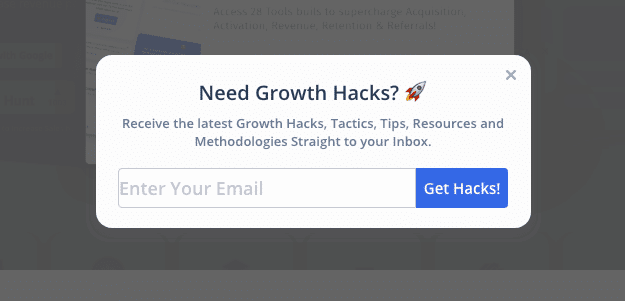
The above popup was popping up in a growth-related SaaS company’s blog.
It still does right that they’re at least targeting growth people. And this popup appeared in the exit intent.
What’s not good about it?
- Copy is weak and does not offer differentiation to give my email address.
- Offer is also weak; I could just look at their blogs and check them out. Why should I give my email address? There’s nothing unique about this website’s offer.
- The graphics are weak because the marketer used just an existing software popup and changed the copy. There was not a lot of effort behind it.
- Context and timing: It was purely based on exit intent. I would have loved it if the exit intent had waited for me for 15-30 seconds and then showed me the popup. Current exit intent directly shows you the popup, which does not take “time” into. I would not want to give my email anyway.
- Intent & visitor behavior: The popup at least offered the content instead of asking for signup. So, good job on that.
Here are my points:
Copy: 2
Offer: 2
Graphics: 0
Context: 2
Intent: 4
Total points: 10
Now that we talked about lousy popup. Let’s jump into creative popups.
6 Creative Offers & Examples to Help You Grow Your Email List
1 – Popup with honesty, creativity, and the human element
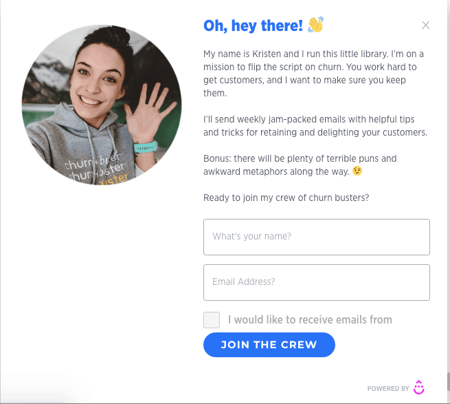
This is by far one of my favorite popups. It has everything that you need to subscribe to it immediately. I love this popup because it has a human element behind it. Here’s a marketing manager, Kristen LeFrance, sharing that she runs this blog and wants to flip the idea of churn and has excellent content. She’s also making me look forward to “puns and metaphors,” so it has “motivation built in it.”
Also, I love the picture with a friendly smile and great CTA. She’s not asking to “subscribe.” She is asking to join her crew on her journey.
The context was terrific because this only pops up when I scroll 90%, and it’s only shown on the blog page.
Since it’s only on the blog page and asked to improve your churn rate, I would consider subscribing to her newsletter. I love the intent there.
The CTA is enticing to join.
Here are my points:
Copy: 5
Offer: 5
Graphics: 5
Context: 5
Intent: 5
Total points: 25
Protip. Add a little human element to get noticed and sound authentic.
2 – The Pricing Page Popup
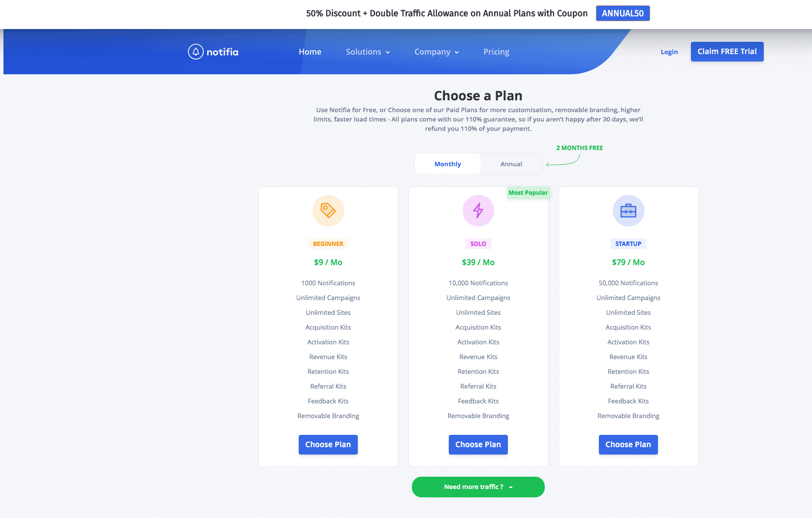
This popup is shown by the team Notifia on its pricing page. The pricing page is highly intent and needs to be handled with care. This page allows you to choose a plan and get a discount if you buy an “annual contract,” which is a fantastic hook.
When creating popups on the pricing page, you should entirely focus on the visitor’s needs. Don’t pay too much attention to the graphics – they can only mess up your great offer.
The copy & offer are reasonable; they show the benefit while still asking for an upgrade.
Since I am on the pricing page, it is at the right time and attached. It gets more points for context and intent.
Here are my points:
Copy: 3
Offer: 4
Graphics: 3
Context: 4
Intent: 4
Total points: 18
3 – The Instant Offer Popup
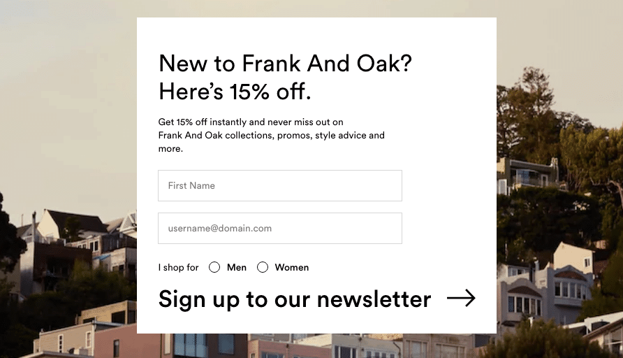
I was browsing through Frank + Oak e-commerce website and found this popup. Usually, e-commerce wants to drive more sales, and this was great for driving traffic.
It’s attached to the page for every new user. They give you 15% off just signup for their newsletter.
Although The pop-up graphics are pretty weak, the image behind them is fantastic.
The context is terrific since I am the new user, so they just want my email to send me new product collections.
Here are my points:
Copy: 3
Offer: 4
Graphics: 2
Context: 4
Intent: 4
Total points: 17
4 – The Exit Intent Free Course Popup
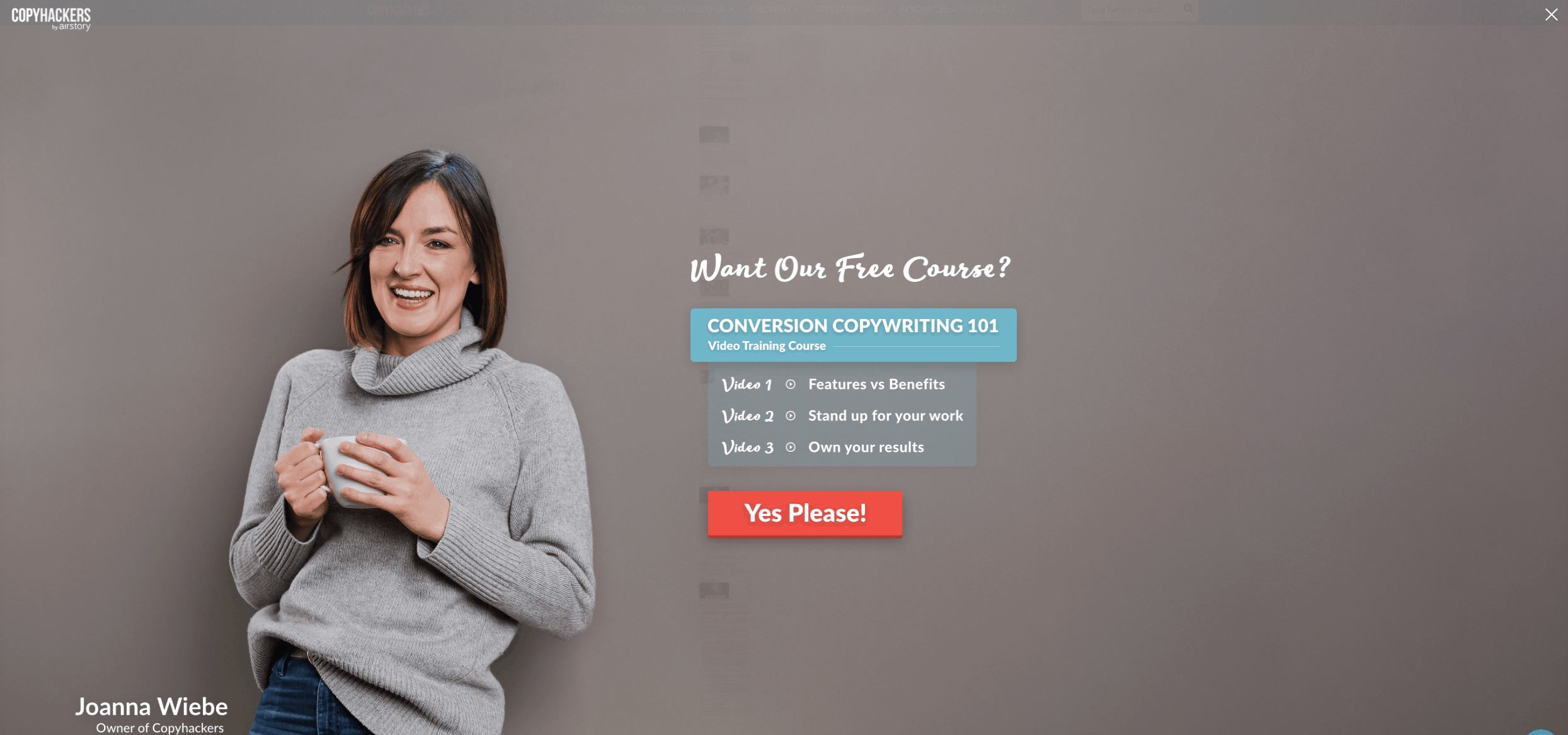
I’d be honest; I love copy hackers’ blogs. It offers free resources to take your copywriting skills to the next level.
Why do I love this popup? It’s based on exit intent. Although it didn’t wait for me, the copy is fantastic.
The offer is stunning. Free course with a clear outcome that I’m going to learn. What could I want more?
Graphics are breathtaking – as I said, human images always work. It shows authenticity and genuineness.
The CTA is speaking my language. Again, an excellent copy.
Here are my points:
Copy: 5
Offer: 5
Graphics: 4.5
Context: 3
Intent: 4
Total points: 21.5
What could get better? If the exit intent could wait for the first 10-15 seconds. If the user bounces after 2 seconds, you probably won’t save them anyway.
5 – The Interactive Gamified Popups
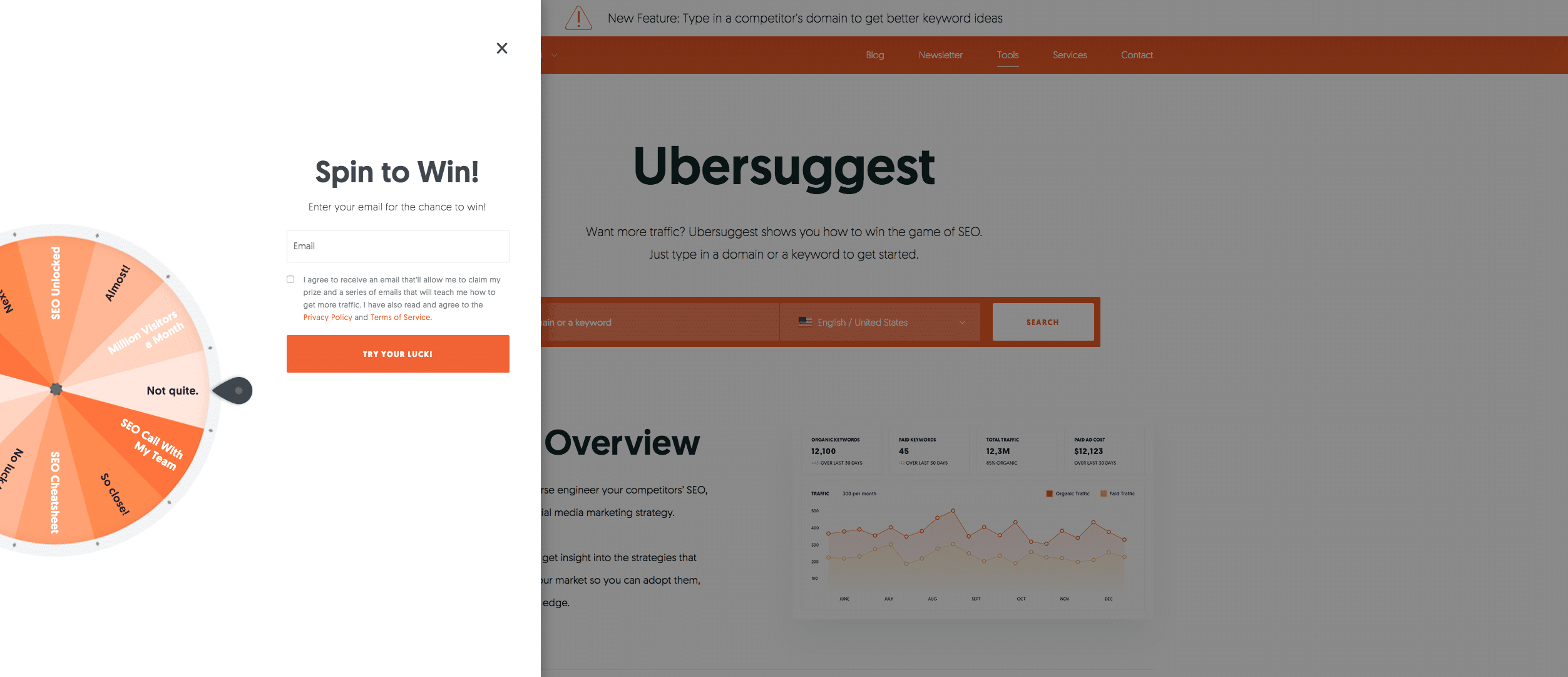
The digital marketing guru Neil Patel uses this popup on his website. It’s breathtaking. Interactive and playful for the visitors at the same time. (although the popup is annoying if I keep visiting from different IPs – don’t copy his all strategies as a marketer).
If they win, then perhaps even better.
Other than the interactive part, I think the copy could get better.
It does work. I also gave my email address at the end.
The graphics are astonishing as well.
The offers are amazing. If someone wins, he might get his full SEO audit or team call for free.
What I didn’t love was that it immediately popups, and I think you should not immediately show the popups, rather wait for the user to experience the site first. In short, it disrupts a user’s experience and gets low points in context & intent.
Here are my points:
Copy: 3
Offer: 5
Graphics: 4.5
Context:2
Intent: 1
Total points: 15.5
6 – The Interactive Quiz Popup
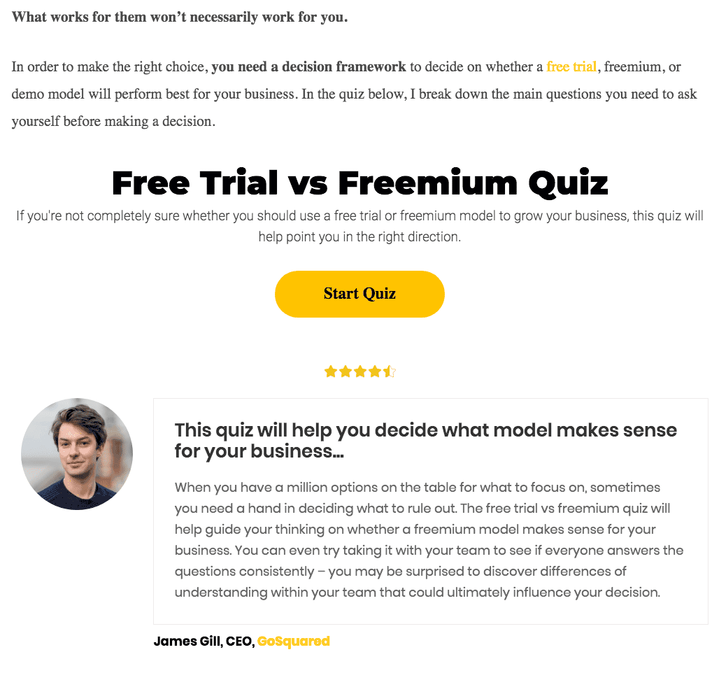
The interactive quiz popups usually give you some helpful content and add value; in return, you collect the emails.
I love this quiz popup because it’s integrated inside the blog about the free trial vs. freemium pricing model. So, the context is rightly set.
It’s not graphically pleasing, but the copy forces you to find out what’s a good solution for you.
The graphics are enhanced due to the testimonial and which again increases the trust.
Here are my points:
Copy: 4
Offer: 5
Graphics: 4
Context: 4
Intent: 5
Total points: 22
Protip: Use this on your website’s homepage to the footer to increase engagement.
I hope the above creative popups help you to grow your email list.
Key takeaways
Here are the key takeaways from this article. They are your go-to’s if you want to grow your email list and convert more people.
- Popups should be behavior and context-triggered and shown at the right time.
- Use human images to enhance trust.
- Use interactive content to increase website visitor engagement.
- Focus on the copywriting and offer. Make your offer truly valuable so that visitors can get the value in exchange for his/her email address.
- Try to make popups visually pleasing.
So, which one will you implement to grow your email list?
Want to create your email popup? Sign up to Poptin for free and create fantastic email pop ups in seconds!


