
Your homepage has a key role in converting your visitors. Even when people visit your landing pages, they tend to have a sneak peek at your homepage (and probably your about page) to get to know you better and make sure you’re trustworthy.
Homepage optimization is one of the first steps for conversion rate optimization. In this article, I’ll analyze some of the standard homepage elements and show how to optimize them.
1. Prototypical design
People’s idea of a professional website is largely defined by how well it conforms to the standard norms and best practices. A study shows that the high prototypicality of a website (including many prototypical design elements) makes it more aesthetically appealing to visitors.
You need to make sure your website looks like a prototypical professionally designed website. Some of the professional website design elements are:
Site speed:
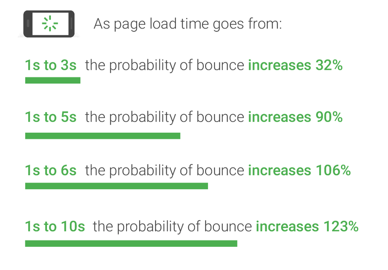
Your website’s performance comes before any design elements. People lose interest in your website if it takes a few seconds to load or is slow to perform actions. 1 in 4 people says they would abandon a website if it takes more than 4 seconds to load. Google advises webmasters to keep their loading time below 3 seconds on mobile devices.
As page load time goes from one second to 10 seconds, the probability of a mobile site visitor bouncing increases by 123%.
Navigation:
Make sure you have a simple and intuitive navigation menu. People should not be confused when trying to find out what they’re looking for on your website.
What should you include in your homepage navigation menu?
Your homepage’s navigation menu is a good place to make your most important pages visible. Your product pages could be a good example. You need to insert your most important products in your navigation.
But instead of using a generic keyword “products” or “services”, it’s a good idea to use a keyword you want to rank for to make it easier for search engines to crawl your pages.
If you’re offering “home page optimization” and “copywriting” services, you need to use these two keywords in your navigation menu (rather than a generic “services” keyword). If you need to use a dropdown layout for your menu, make sure you use mega menus rather than typical dropdowns.
Aside from your products, you want to make sure people can get to know you — you need an “about” page that describes who you are and what you offer. Your “About” page has a crucial role in convincing people that you’re credible and trustworthy. So instead of considering it as an afterthought, make it your best page.
Content:
The content on your homepage does the most important job of all: it conveys your message to your visitors.
It does so by taking advantage of texts and visuals. Even though people tend to consider visuals more important than text when it comes to homepage content, text plays an exceptionally important role in conveying your message. While images might be prone to misinterpretations, your website’s copy is abrupt and straightforward.
Visuals, on the other hand, are ideal for setting the theme and increasing the impact of your copy. Videos can increase the conversion rates of a landing page by 80%. A good combination of these content elements is the perfect recipe for a top-performing homepage.
Maybe the most important copy of a homepage is a headline and a subheading. This is where you could propose a unique value proposition to your visitors. It’s true that headline copy is considered a creative work that should not be bound by rules, but in order to be successful, it needs to offer a clear and sought-after benefit. As Ogilvy explains in “Ogilvy on Advertising”:
“The headlines which work best are those which promise the reader a benefit — like a whiter wash, more miles per gallon, freedom from pimples, fewer cavities. Riffle through a magazine and count the number of ads whose headlines promise a benefit of any kind.”
Here’s how Poptin presents its products’ benefits in a headline optimized for UX.
The content on your homepage has a direct impact on your homepage bounce rate, which shows how many people view your homepage and exit without looking at other pages.
A good bounce rate is said to be between 10% and 30%. Anything above 50% should be concerning. Here are some questions you need to ask in order to optimize your homepage content to decrease bounce rate:
- Is it clear what we offer at first glance?
- Are users clicking where they should be?
- Is the page tuned to the #1 thing customers come to the site for?
- Is the page simple and straightforward?
- Am I giving the user what they are looking for?
2. Social Proof
If design prototypicality gives an implication of credibility, social proof provides your visitors with hard facts for your claims and promises. The claims you make on your website will have no effect if they’re not accompanied with valid social proof.
As Vicky Jain, the performance marketing lead for Airmeet, explains placing a customer case study on their homepage could increase their demo requests by 300%:
“Social proof is like solutions for any prospective customer, helping them make a better decision, feel confident, and compare claims. If you are able to place the right one on the right page/section you will not have to depend on other elements much, plus it makes a page less salesy.”
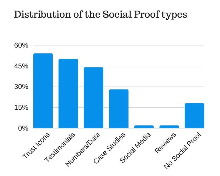
Social proof in any form (testimonial, numbers, case studies, ratings, peer review site badges) if placed carefully can improve your metrics by 400%. In one of my experiments, we placed a powerful case study of a customer and had a CTA “Become the next successful case study” and it drove 3x more product demo requests.
Some of these social proof types you can use in your landing pages are:
Case studies:
When it comes to providing hard facts for your claims and promises, nothing can beat real-life examples of your past success. As your most powerful social proof element, case studies could be a great addition to your homepage design. There are some points you need to consider.
- Keep your social proof succinct and to the point. Describe the results of your work for the client but keep the full account of your case study on a separate page. Link to the full case study from your homepage.
- Use quotes and images from your clients.
- Describe the before and after states and compare them using numbers. Take advantage of the quotes from your customers to see the most results.
Testimonials:
Testimonials are quotes from your customers endorsing you and your products. These quotes could have the most effect on your visitors if they’re coming from high-ticket people from top companies in your niche.
You need to be proactive in this area and reach out to people for testimonials. Providing rewards (for example discounts) in exchange for real testimonials could go a long way here.
It’s a good idea to ask your customers to mention the results they got from working from you and describe why everybody else should be your customer. Their arguments could be more convincing if they cite real data.
Trust Icons:
Trust icons are the logos of the companies you’ve worked with or the publications you’ve been featured on.
They’re the most popular form of social proof according to a study I did a while ago. They’re easy to obtain and because of their visual nature have a striking effect on your visitors. Like testimonials, they could have the highest effect if logos of high-profile customers are featured there.
Data/Numbers:
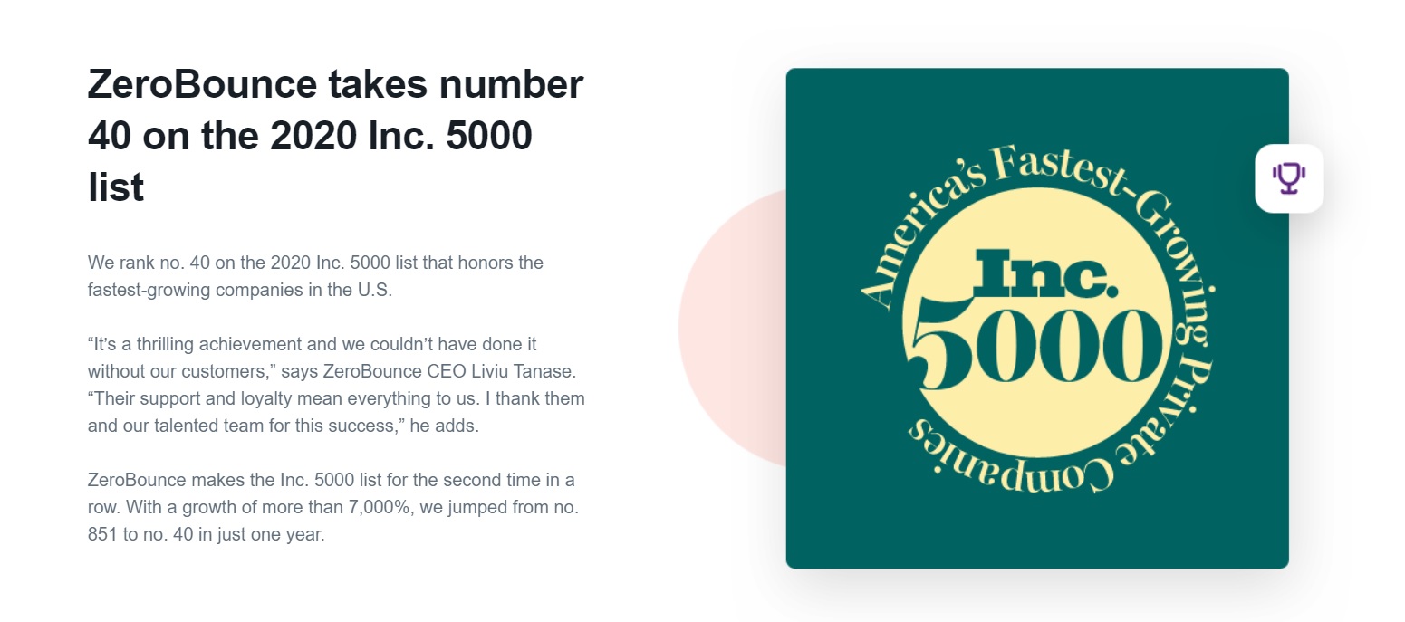
If you have worked with an impressive number of people or have achieved impressive results with them, you can show the data/numbers on your homepage. These numbers could simply be anything related to your business as long as they sound impressive.
ZeroBounce mentions the fact that they’re number 40 on the Inc. 5000 list, which makes them quite credible.
Social Media:
Taking advantage of social media as a form of social proof goes beyond just showcasing the number of your followers. The true merit of social media for you is the repository of positive customer sentiment it provides.
As Ben Aston explains “the sentiment is the emotional message within an expression—the emotions, opinions, and attitudes embedded in a person’s actions, writing, or speech.”
This emotional message has a stronger force on social media (compared to typical testimonials) because they’re posted on a third-party platform and seem more genuine. After all, user-generated content is 2.4 times more likely to be viewed authentic by consumers.
Mention these positive sentiments on your homepage. A screenshot from the original post would be ideal for this.
Reviews:
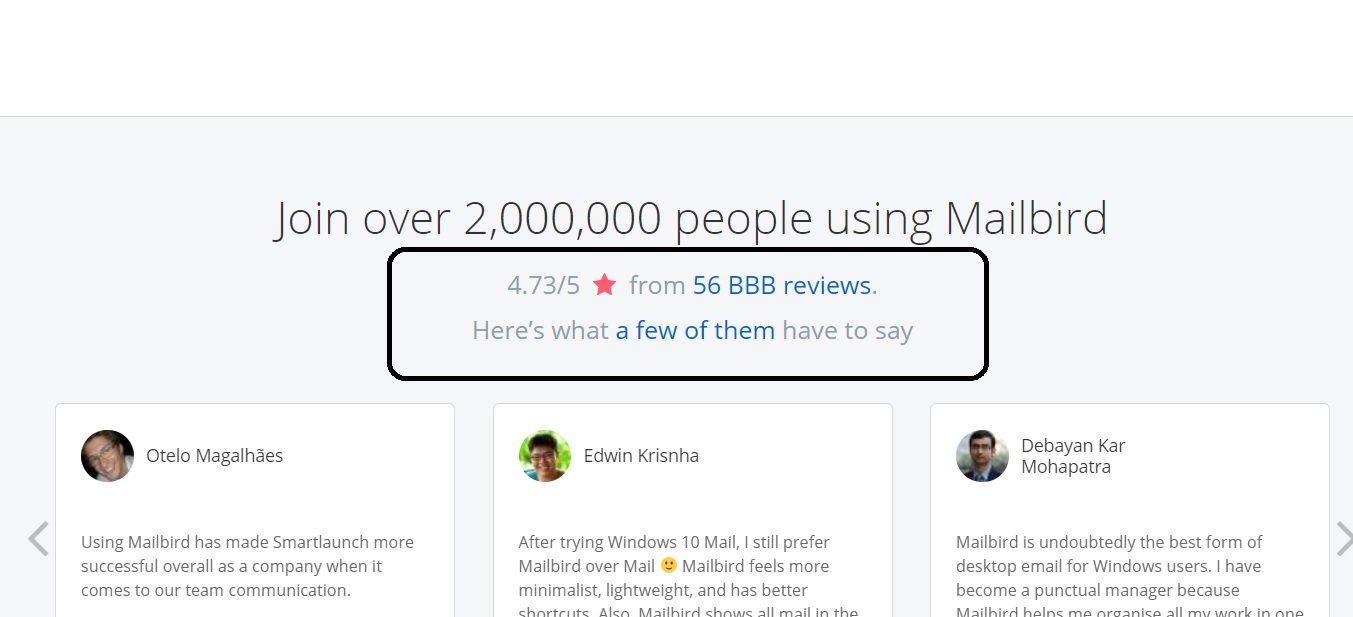
You could feature real reviews of your products or services by trusted sources. These reviews are featured on trusted review sites such as Amazon Customer Reviews or Trustpilot, so like social media, they could be a good example of user-generated content. A simple way to use reviews on your homepage is by linking to the third-party review site. Here’s how MailBird does this.
3. Mobile-friendly design:
People are using mobile devices not only have access to the internet but make purchases online more than ever before. 41.32% of online retail conversions took place on mobile devices in 2019.
In 2015 Google rolled out its mobile-friendly update boosting “the ranking of mobile-friendly pages on mobile search results”. The aftermath was clear: website pages that were optimized for readability and usability were given priority in Google searches performed on mobile (which is more than half of the total searches).
A mobile-friendly design has these features according to research done by Google and AnswerLab:
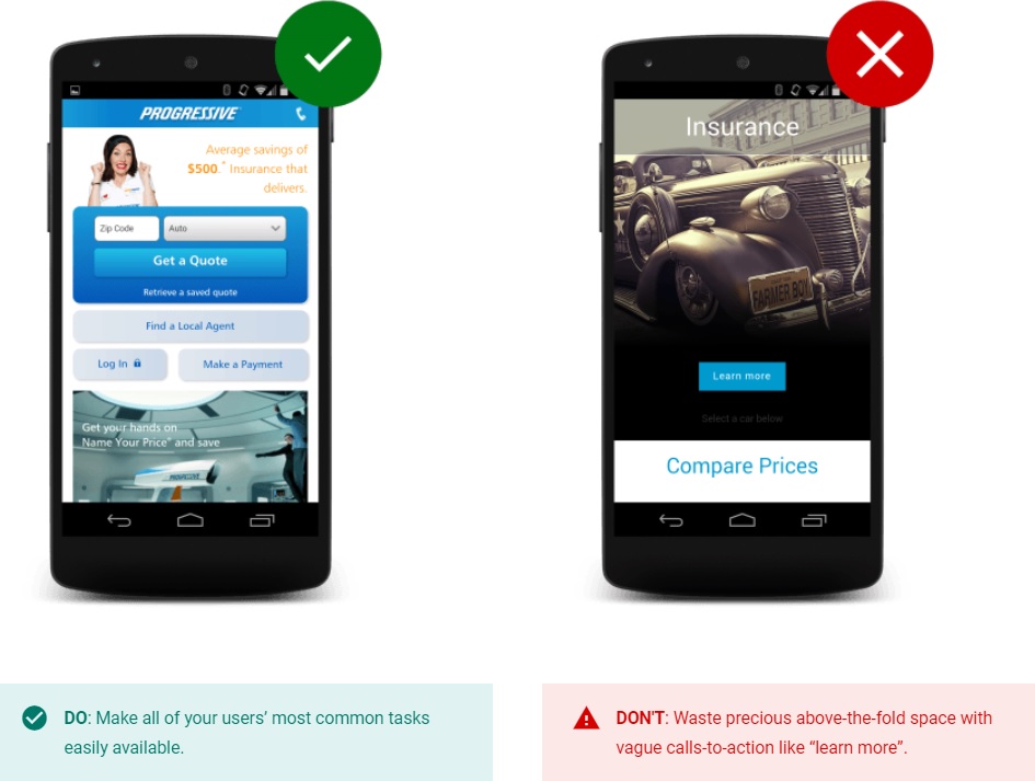
Call-to-actions are above the fold and at the center
Make sure people have access to top-priority information and elements above the fold and quite easily.
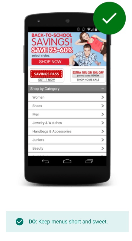
Menus are short, simple, and easy to navigate
Long and complicated menus are difficult to manage on mobile devices. Make sure you use short, simple, and easy-to-navigate menus.
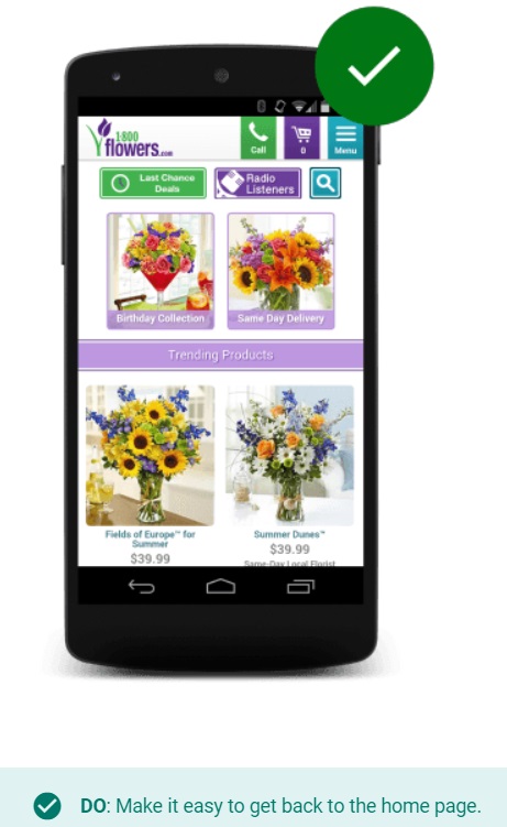
Going back to the homepage is easy
It’s industry-standard that you can create a logo for your website that should lead back to your homepage.
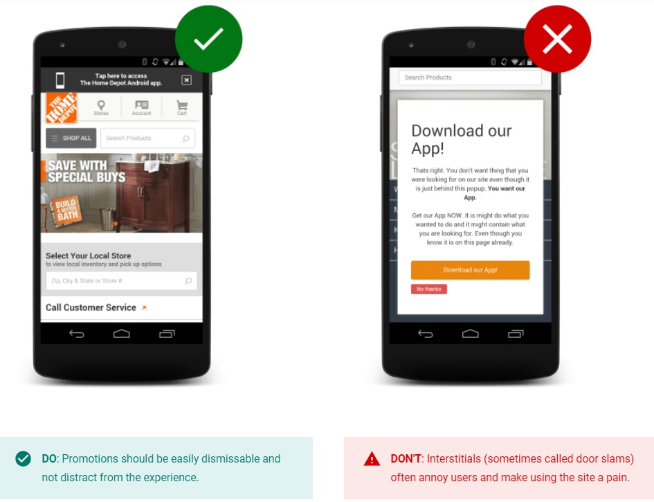
Avoid distractions
Your website should not use interstitials (e.g. full-page promotions that hide content and prompt users to install an app) and the website’s content should be easy to view.
Performing on-site searches is simple and effective
Provide a visible search bar with advanced search filters and make your search results relevant.
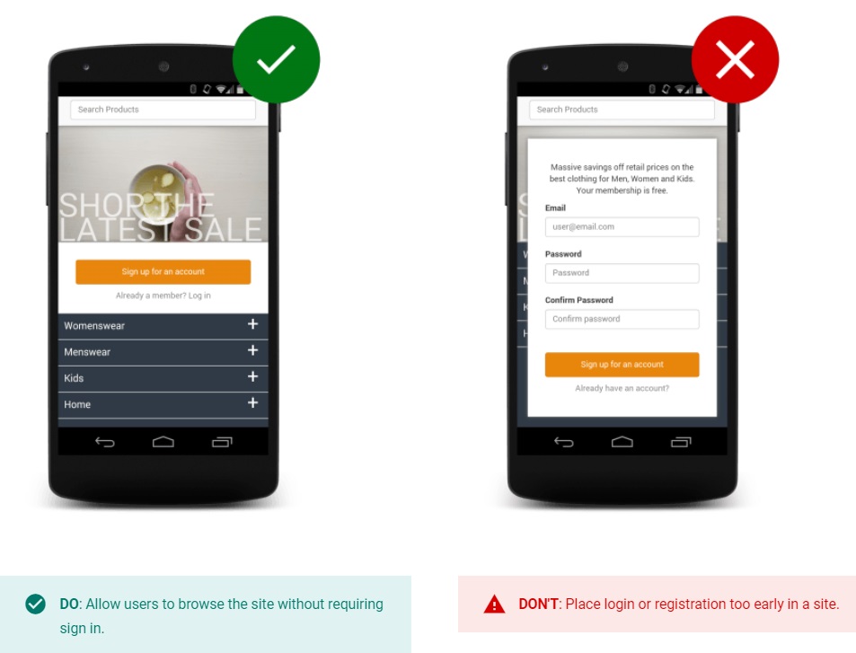
Visitors can explore the website without any barriers
People should be able to explore your website and make purchases without having to sign in.
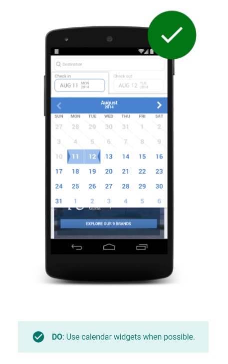
Filling in forms is made simple
Make sure filling your forms is not a hassle. Use efficient forms and provide options such as streamlined information entry, calendars for date selection, etc.
The whole website is optimized for mobile
Make sure all your website’s elements (including images, texts, menus, etc.) are optimized using an efficient responsive design. Test your website using cross-browser testing tools. This could help a lot in identifying and fixing errors on different devices and operating systems.
4. CTA above the fold:
The idea of above the fold is not invented to describe internet pages. It’s been used in print for newspapers for centuries (thus the use of the word “fold”). In newspapers, the most important headlines and images were always used on the top half of the paper sheet to be easily recognizable.
Today the same idea is used to describe what’s visible of a page immediately without any need for scrolling.
Some experts argue that adding a CTA below the fold might get the visitors to scroll down and see more of your page’s content. There might be some benefit to adding the CTA below the fold, but nothing beats visibility and straightforwardness.
More and more people are getting interested in adding the main CTA above the fold where it’s the most visible and conveys the message quickly.
According to a study by Nielsen Norman Group, people view the 100 pixels above the fold 102% more than the 100 pixels below the fold. This is the heatmap that the study presents to back its claim:

Red dots are the places people look at the most. Yellow dots are the places people looked less, and white dots are the places people paid almost no attention to. So obviously marketers defending the above-the-fold notion have something to say when it comes to data-driven research.
If you want the most important elements on your page to be seen and clicked more often, you need to place them above the fold where people pay the most attention.
What to include above the fold:
By now you should be convinced that content above the fold gets the most views, but then there is the question of what to include above the fold? Should you include a “Buy now” button and expect to increase your sales?
The answer might not be that straightforward. Popular websites with famous products might see an increase in sales if they encourage purchases right above the fold.
For instance, Mailchimp (probably the most known email marketing platform) encourages “picking a plan” above the fold on its homepage.
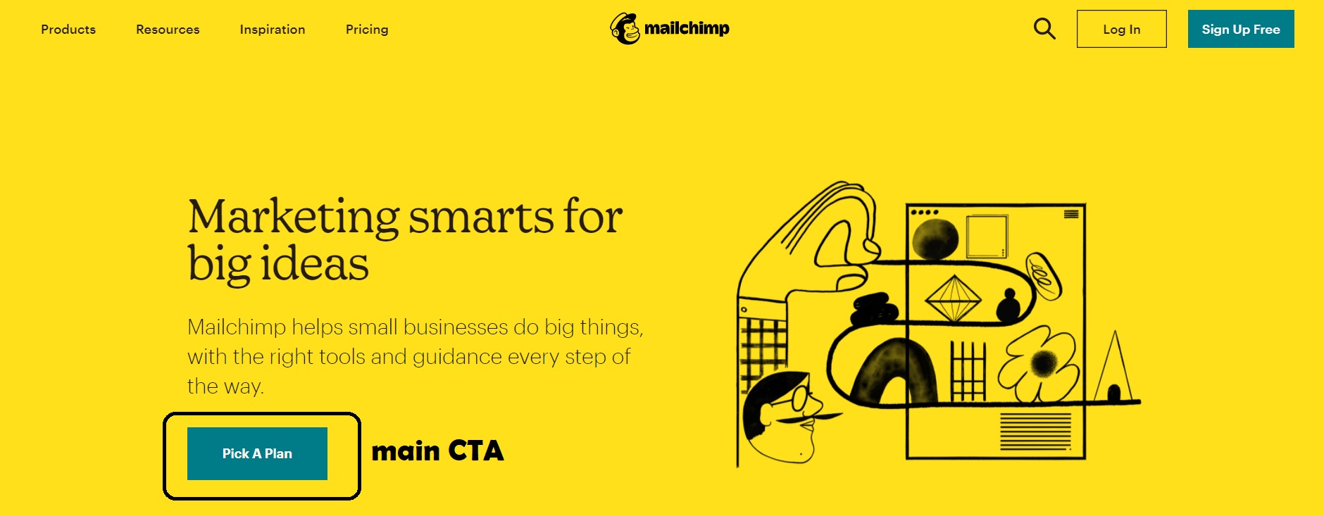
This is while most of their email marketing platforms encourage registering for a free trial or offer more information about their features. Most business websites see it more reasonable to include CTA’s that encourage visitors to enter their funnel as leads or get more educated about their products.
In a study I did on homepage elements of top business’s homepages, I found that the most used CTA types used by these websites were the “More info” type (including learning more, watch now, find out more, read more) and “sample” type (sign up for free, download, start a free trial, etc.).
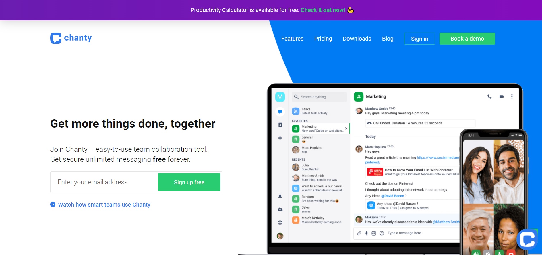
Chanty takes good advantage of the above-the-fold space on its homepage. I contacted Anastasia Matveyeva, the marketing manager at Chanty, and asked her to explain the dynamics of their above-the-fold space:
“On our homepage at Chanty.com, we use several design elements to increase website conversions. First of all, on top of the homepage, there’s a hello bar leading to an employee productivity calculator developed by our team. This calculator enables users to measure productivity per hour and per employee and it attracts great traffic to our website, allowing us to rank on Google’s first page.”
Next is the heading “Get more things done, together” with the email input right under it suggesting to sign up and try our tool for free. The third main homepage element is a video guide on how to use Chanty. It is a 3-minute video tutorial showing Chanty functionalities such as creating conversations, assigning tasks, making calls, recording audio messages.”
5. Hands-on customer support
Visitors have a lot of questions about your products in various stages. Homepage visitors have more questions, especially because most of them are first-time visitors.
Good homepage design and quality content could help them find answers to their questions, but it’s always necessary to provide means of hands-on communication in case any of their questions are left unanswered.
Answering your customers’ questions will increase revenue by up to 15% while also boosting customer satisfaction by around 20%.
There are some ways to provide customer support on your homepage:
1. Design a contact page
Just like an “about” page, a “contact” page gives your website credibility. Make it bold and visible and give your visitors a reason to contact you.
Provide different means of communication on your contact page. Insert a simple form they can use directly from your website and an email address they can use from their email client.
2. Use a live chat
Slow response time to your visitors’ (or leads’) queries has a huge impact on your ability to preserve them. Faster responses to contact form query increase the odds of your success while a prolonged response time could mean missing the leads. A study found that there’s a “10X decrease in the odds of making contact with a lead after just five minutes without a response”.
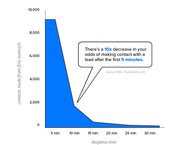
The study also found that only 7% of the companies surveyed responded within five minutes of a lead’s query. These companies all used live chat for support. Live chat is the fastest and easiest way to respond to queries and provide a great customer experience.
Here’s how a typical live chat software functions in real life:
Source: LiveAgent
3. Chatbots
If people respond to queries in live chat support, robots are in charge of the queries submitted through chatbots. And they’re doing a pretty good job of it. Chatbots are equipped with natural language processing technology to analyze the queries and come up with the best response.
These tools can pretty much answer simple and repetitive queries such as the queries about specific features, pricing, integrations, etc. In cases which queries get complicated, they can connect customers to human support agents.
Here’s a list of top chatbot tools you can use on your homepage.
Finally:
Your homepage functions as the storefront of your business. A good homepage can lure people in and present you as trustworthy and credible, while a bad homepage can drive people away. A good homepage has 5 elements:
- It has a prototypical design to fulfill visitor’s expectations.
- It uses social proof to show credibility.
- It’s mobile-friendly because the use of mobile phones is exceeding desktop.
- They take advantage of the space above the fold to show their most important CTA’s.
- They have hands-on support to answer visitors’ queries
Author’s Bio:
Mostafa Dastras is a writer at The Digital Project Manager, a leading digital project management resource hub and community run by the indie digital publishing team at Black & White Zebra. His work has appeared on some top publications such as HubSpot, WordStream, SmartInsights, LeadPages, Sendinblue, and MarketingProfs.


