Establishing a special connection with visitors is always a good way to attract new customers to your brand.
They need to feel good about making a purchase, and your goal as an entrepreneur is to provide prospects with as much assurance as possible.
Increasing conversions is not an easy task, but with the right approach, you can leave an amazing impression on your customers.
At different stages of the customer journey, they all have certain experiences with your brand, and “touchpoint” moments are those key moments that decide whether it was a good experience or not.
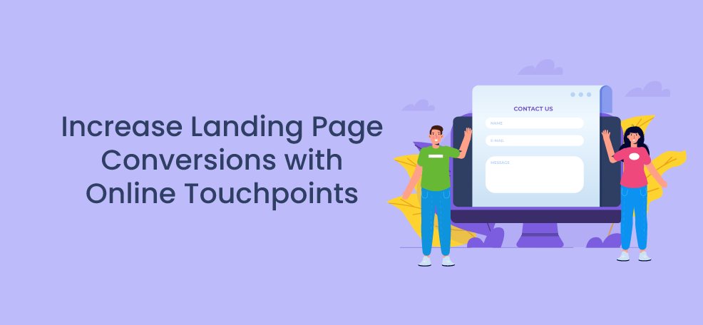
Through several examples, we will explain how you can increase landing page conversions using these so-called touchpoints, so don’t waste any more time.
Start improving your business right away!
Use pop-ups to grab people’s attention
Pop-ups can be a touchpoint for your visitors as these windows have a huge effect on your conversion rates.
Although some would say that pop-ups are annoying and can turn visitors away from your website, many more would disagree and say that they can actually help.
If used in the right place and at the right time, pop-ups can be highly converting.
Also, they are pretty successful in conveying a message, which is important to present your brand properly.
You want your visitors to be intrigued by your offer, but you don’t want to interrupt their user experience, so set the right trigger and there won’t be any problems.
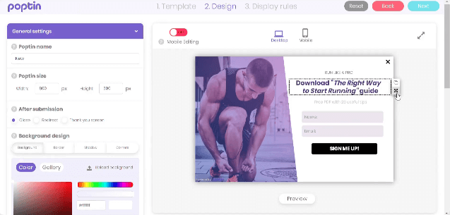
There are certain tools that can help you create engaging pop-ups but also customize them fully to match your website design, and one of these is Poptin.
In addition to pop-ups, with this amazing tool you can also:
- Build embedded forms
- Send automatic emails to your subscribers
With its drag and drop editor, you can easily customize your pop-ups by changing colors, fonts, size, but also by adding or removing fields, images, videos, and more:
We have already mentioned triggers and how important they are.
If you want to surprise visitors with the right offer at the right moment, use some of the many pop-up triggers.
The Poptin tool also offers several different pop-up triggers that you can choose from:
- Exit-intent trigger
- Time-delay trigger
- On-click trigger
- Scroll trigger
The trigger that helps with cart abandonment rates and reduces them effectively is the exit-intent trigger.
Reducing cart abandonment is very important for conversions, so stop your visitors from leaving your website with a pop-up and offer something valuable to attract their attention.
Your visitor didn’t make a purchase?
That could be easily changed.
Just offer him a discount, a coupon code, or something of a similar value, and there is a big chance of converting him into a customer.
Whenever a pop-up appears, the visitor has to decide what his next step will be.
Will he actually take action?
You can only try to encourage him to do so.
Offer him something valuable, make the checkout process easier for him, or simply be original and unique in some way and you will surely get another customer.
Include clear and simple CTAs to clarify the next steps
Complications and confusion can be strong reasons why your visitor decided not to take action on your website.
Use simple and clear CTAs to clarify the next steps to your visitors, and include them in your blog posts for maximum effect.
Blog posts are another important touchpoint that you need to pay attention to, so make sure to include CTAs in your content to increase conversions.
People like to know exactly what they should do next in order to, for example, get a special offer or a discount, so make it easy for them.
Strong CTAs can only improve your content and help your visitors navigate your website.
Create engaging content, and place your CTAs properly.
Be sure to put them in these places on your blog:
- At the bottom of the page
- Above the fold
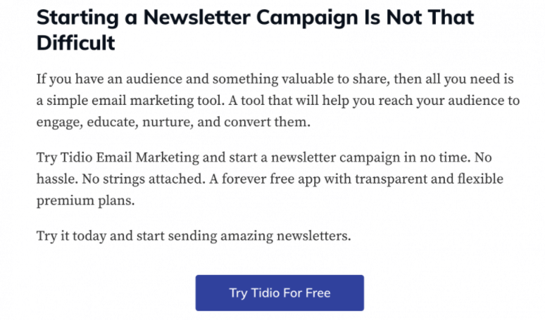
You can also put it somewhere in the middle and nurture your leads that way as Tidio does it on their blogs:
Source: Tidio
This is a clear CTA that asks potential customers to try this tool for free and check it out first.
It is short, action-driven, and the button is in a contrasting color.
Engage your visitors with the reasons why they should use your product/service, and then offer them some incentive to get one step closer to conversion.
This simple CTA button can solve all your problems, so don’t complicate things.
Help your potential customers make a decision.
Add a user-friendly search bar to improve their experience
When there are a lot of different products/services available, it is best to add a user-friendly search bar to allow visitors to easily find exactly what they are looking for on your website.
It will improve their user experience and help them quickly find what they need without wasting time and energy.
To keep them from being frustrated by having to spend hours looking for some specific product information or an article on your website, implement a simple search bar and stop them from exiting and going somewhere else.
Navigation is important for the conversion rates, so make your website as user-friendly as you can, and it will pay off.
There are two different ways how search bars can be presented:
- A text field and a search button
- A magnifying glass icon
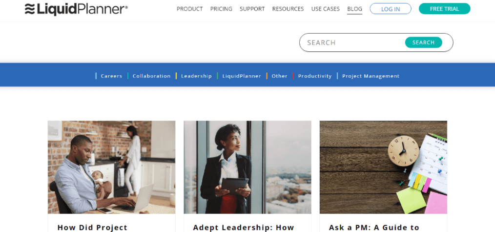
The first one can have a number of variations, but the basic search bar has a search box where the visitors can type in whatever they are searching for, and a search button to click on.
It is very easy to use, and extremely intuitive:
Source: LiquidPlanner
This is the most basic example of a search bar we have seen a million times so far.
On the other hand, when you add a magnifying glass icon and mix these two types, you get something more creative and better designed as the example below:

Source: Worldwildlife
A single click on a magnifying glass icon and a full search bar with a button appears.
The whole point of it is to simplify and facilitate the search process as much as possible for your prospects because you need to keep their interest, and this is the easiest way to do it.
Depending on the search plugin that you use, you can observe and track what your visitors are looking for the most and use these insights to review your keywords or similar.
Display product reviews to inspire trust
People will always look for other people’s experiences with certain products and rely heavily on these opinions.
The moment they see some kind of social proof on your website can be one of the touchpoints as it can decide how they feel about your brand.
Product reviews can bring you more conversions than ever which is why you need to include them to build trust and motivate visitors to make a purchase.
Potential customers need a little push from time to time, so use some of the following types of social proof on your landing page:
- Testimonials
- Case studies
- Product reviews
Product reviews are highly effective and pretty successful in convincing potential customers that your product/service is the right one for them.
These could be reviews from industry experts, affiliate reviews, customer reviews, and similar.
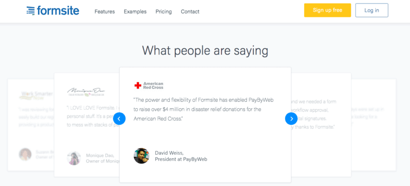
You can present your customers’ testimonials in a visually appealing kind of way as we can see from this example:
Source: Formsite
These shared experiences of your previous customers can boost trust and even help you build a loyal customer base.
Many would say that they are a key factor when deciding on a purchase because many visitors would simply leave a website if there aren’t any reviews included.
They give visitors a sense of security, which is necessary when it comes to online shopping.
Be sure to include some not-so-great reviews too, in order not to lose credibility.
It is important that you show that you genuinely value your customers’ opinions and that you are also able to handle some constructive criticism.
These reviews have to seem honest and reliable, so if you’re able, include full names and faces of your customers.
Use clear and specific reviews to make your website more professional and elevate your brand image.
To Sum up
As an online business owner and a brand representative, you need to define each of these touchpoints and give your visitors a fantastic experience.
Use these opportunities to keep the attention of visitors and connect with them as a brand.
Some of the best tactics to increase landing page conversions with touchpoints are the following:
- Using pop-ups to grab people’s attention
- Including clear and simple CTAs to lead them
- Adding a user-friendly search bar to improve their experience
- Displaying product reviews to inspire trust
When it comes to pop-ups, use tools such as the Poptin tool to create and customize engaging pop-ups for your e-commerce website.
Encourage your potential customers to buy, and witness the incredible success of your brand!
