
Human psychology plays a powerful role in marketing. According to Harvard professor Gerald Zaltman, an overwhelming “95% of our purchase decision-making takes place in the subconscious mind.” And at the center of all that decision-making lies emotions and uncontrolled urges that truly shape buyer behavior.
In fact, even on the marketing side, you’ll find that most seasoned marketers and brand consultants are often also interested in understanding how the human mind works and, of course, what makes their customers tick.
In this blog, we will deep-dive to understand some of the most tried-and-tested psychology hacks and triggers you can use to drive customer decision-making in your brand’s favor and boost your website’s conversions rates. We will also look at some interesting real-life examples to help you get inspired and create your own psychology-driven website conversion strategy. Without wasting much time, let’s jump right in.
Top-6 Proven Hacks that can Supercharge Your Website Conversions
1. Demonstrate ‘social proof’ and build curiosity
Humans see–humans like–humans buy. This is the underlying principle behind demonstrating ‘social proof’ on your website.
Instead of telling you how this works, let us show you an example of a website that demonstrates social proof perfectly:
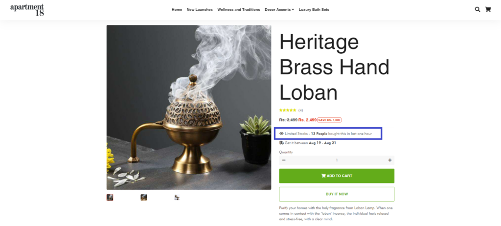
Apartment18 makes it a point to highlight how many users have bought the product in the last one hour. This simple yet super powerful strategy can influence–and motivate–other buyers to buy the product:
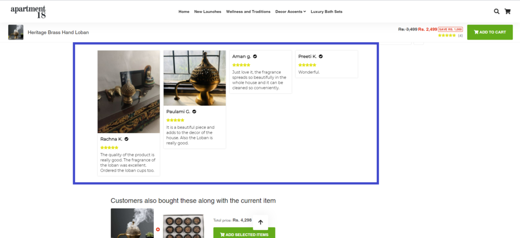
As you scroll down, you’ll see real customers posting very real testimonials and reviews of their purchase along with images of the product–a masterstroke as according to research, around 56% of users suffer from FOMO or “fear of missing out”. Additionally, 91% of millennials trust reviews as much as recommendations from friends and family. Finally, 91% of users read online reviews before buying anything.
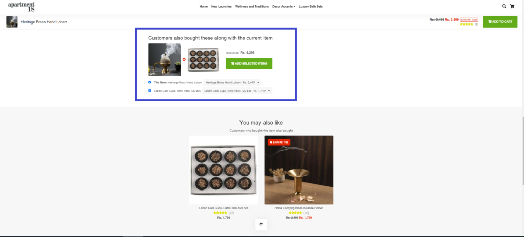
As you scroll down even further, the brand engages in cross-selling/up-selling by showing what other users bought. In addition, it shows personalized recommendations that are tailor-made as per the onlookers taste to ensure that the experience is relevant, engaging, and customized through and through:
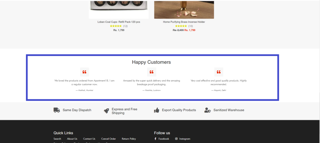
Finally, the page ends with quotes from recent customers to reinforce social proof once again:
As you can imagine, considering that humans are socially guided, all these social proof psychological hacks can ultimately help to motivate the users and encourage them to make the purchase–without any doubt/regret later on. While these examples are eCommerce-driven, you can integrate them into your SaaS website to drive conversions. It will work swimmingly well in the SaaS domain as well.
2. Make your website UI easy to navigate and use the right design principles:
By now, users have come to understand what certain features on the website mean. For instance, a “Free Trial” button means that if the user clicks on it, they will get access to a free trial period. This ‘action-reaction philosophy can be used to enhance your website’s UI navigation and make it more user-friendly.
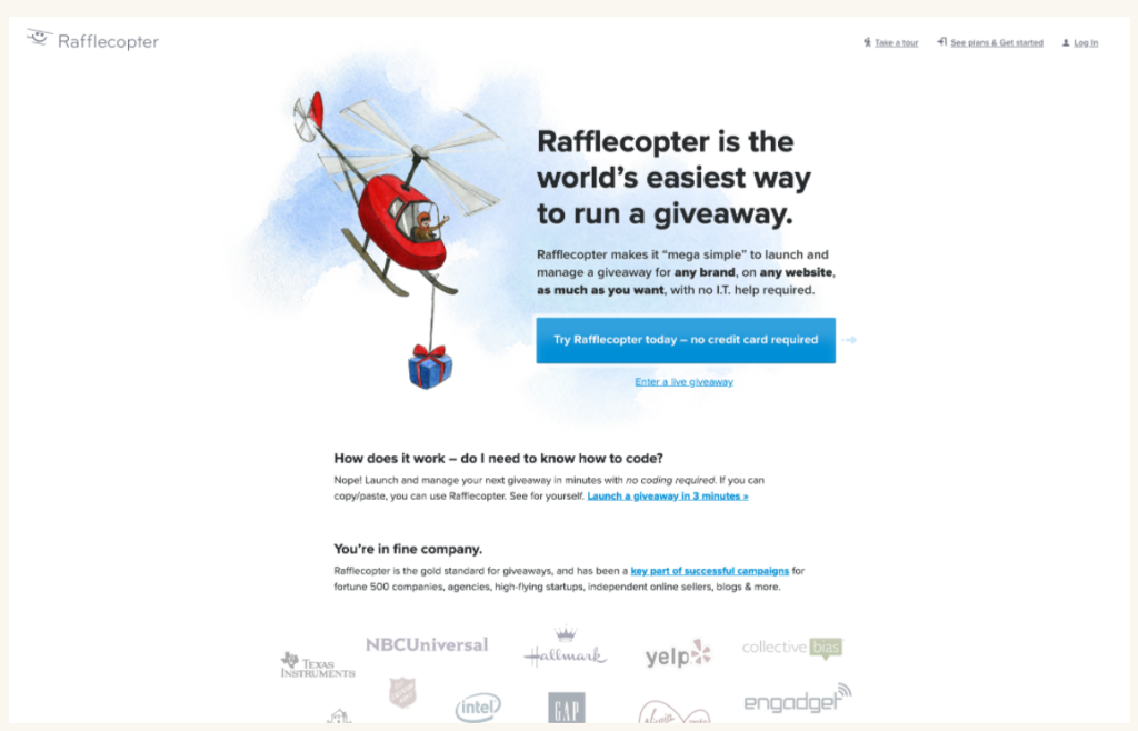
Let’s take a look at an example of a CTA button to understand this better. Rafflecopter makes use of a blue-colored CTA button as blue is proven to have a calming, positive effect on the brain:
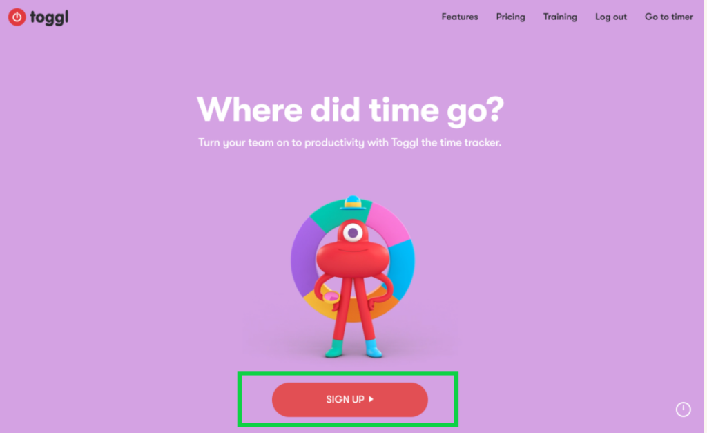
On the other hand, the color red is found to increase performance on a detail-oriented task, according to a study by the University of British Columbia.
The website, Toggl makes effective use of a red-colored CTA button to drive the user to action, minus the distractions:
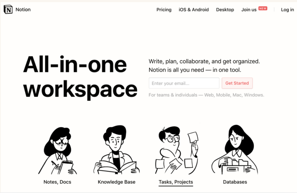
Another obvious design suggestion that most SaaS websites should embrace to increase their conversion rates is focusing on a simple, minimal, and intuitive design (as opposed to a chaotic and complex one), as Notion demonstrates below:
Other useful design tips to keep in mind include:
- Keep the website free of distracting elements.
- Make sure that the content is organized into neat buckets and is value-oriented.
- Ensure that the navigation feels intuitive and is simple.
At the end of the day, you don’t want your website visitors to be overwhelmed by a chaotic navigation menu or due to too many distracting elements on the webpage. So when designing, go for the mantra, “Less is more”–and you’re golden.
3. Drive real-time support via live chat
Personalization boosts website conversions. You can use the live chat support software to drive a greater sense of hyper-personalization and boost the chances of conversion. How does this work?
Look at the following example below. Say you have a customer who visited your website yesterday and checked out a few pricing plans. If said customer revisits your website again the next day, you can personalize the experience by customizing the message for the return visitor (as shown below):
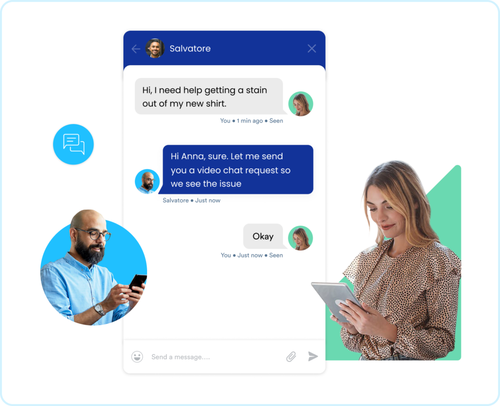
Moreover, you can proactively reach out to them and enquire if they have any questions. For example, if you notice that the person is stuck on the Pricing page for too long, you can integrate live chat services and proactively ask the user if they need any help.
Thanks to giants like Amazon, Netflix, etc., customers want personalized service–irrespective of the industry/domain. So SaaS brands in particular need to up their personalization game and drive a customized service that offers relevant suggestions, instant query resolution, and speedy assistance–the specialties of live chat software.
4. Pay attention to ‘Hick’s Law’ and restrict the number of choices
Ever heard of decision paralysis? This occurs when customers are faced with way too many choices and options. In psychological terms, we call it Hick’s Law which states that “The more stimuli (or choices) users face, the longer it will take them to make a decision.”
The solution is deceivingly simple.
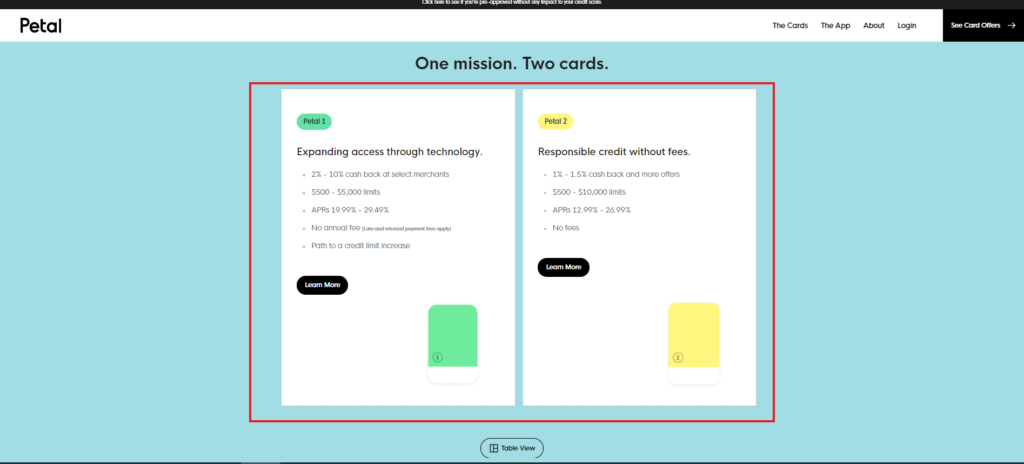
Restrict the number of choices you present to the customer on your website–be it on the Pricing page, the Sign Up page, etc. if you want users to convert faster. PetalCard’s website demonstrates this best practice as efficiently as possible:
The design is simple and clean, and only two options are presented to the user:
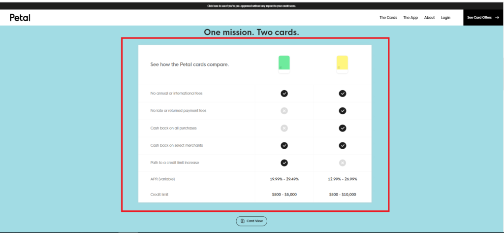
Plus, the options are presented in two formats–the “Table View” and the “Card View,” allowing users to visualize and retain the information based on the format of their liking:
The straightforward user flow and clean, seamless design work in the website’s favor, making the decision-making simple and effective.
5. Showcase scarcity and provide value-driven assets for free:
Another time-tested tactic that always works without fail is showcasing scarcity, offering a valuable resource/asset to the user, and creating a sense of urgency in the user.
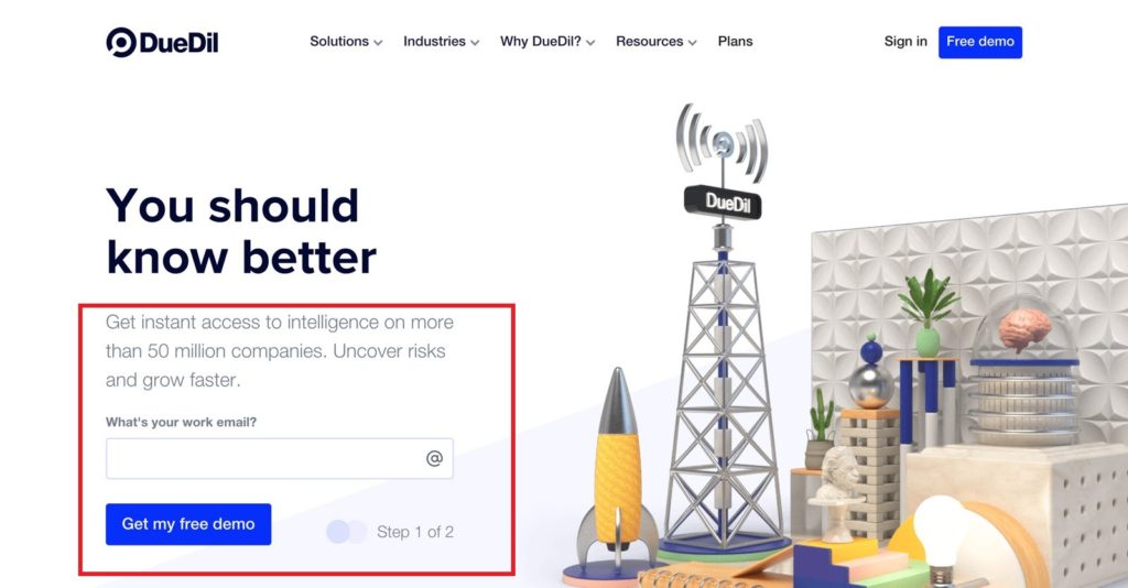
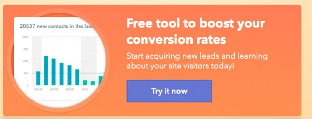
DueDill provides instant access to free-market intelligence to users in exchange for their email address:
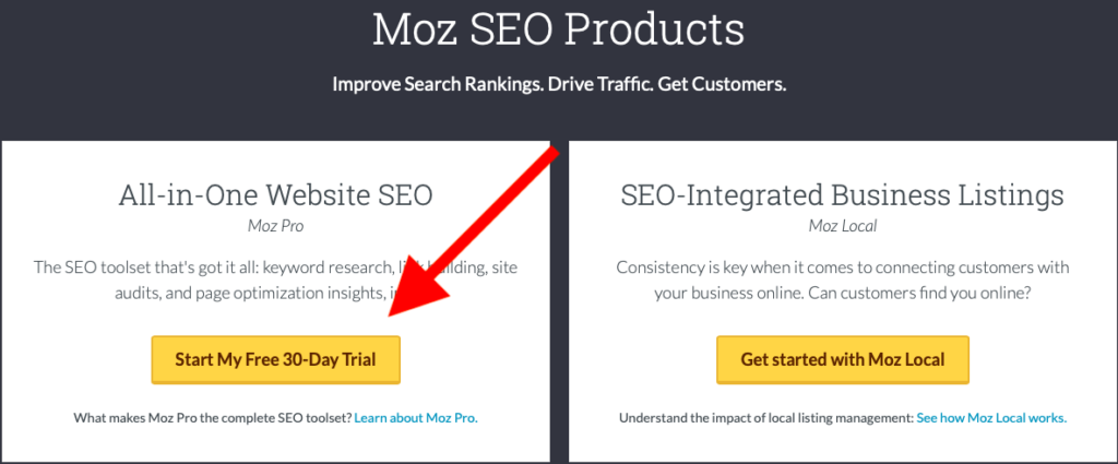
In terms of creating urgency, Moz does this brilliantly by adding a ‘time period’ to the CTA button, compelling users to act now and get in on the added advantages:
You can also use words such as ‘Now’ to nudge the users in the right direction and take the final step:
The end goal is to offer users valuable content–from blog posts and webinars to ebooks and guides–free of cost so that they cannot refuse the offer, and will be compelled enough to engage with the website. You can take this tactic one step further by creating a sense of urgency and adding terms like sign up now, start your free trial, activate today, etc.
6. Aim for a familiar browsing experience
Whether you call it the path of least resistance or the law of past experience, the philosophy is this: Our past experiences influence our interpretation of the current experience. In other words, any detraction from the familiar experience can negatively affect the user’s focus.
For instance, people generally perceive information from the top to the bottom, universally. So it makes it logical and aesthetic to design your website accordingly. Moreover, people also generally perceive information from the left to right. So brands should take cues from these well-established design principles and create a well-organized and well-mapped-out website.
Additionally, you can employ the Serial Position effect when thinking about how to place important pieces of information on the website homepage. According to this theory, “The tendency of a person to recall the first and last items in a series is best, and the middle items is the worst.”
In simpler, prioritize the information you deem is important in the beginning and end sections of the homepage to ensure better data comprehension and retention.
In the end, as long as you’re offering users a guided, familiar browsing experience, your conversion rates will not get affected.
The Takeaway
There are literally thousands and thousands of psychology tips that brands can embrace to nudge users in the right direction and provide them with a guided experience from start to finish. Plus, what’s important to remember is that there is no ‘one-size-fits-all approach that you can embrace.
Every brand is different and so should their website narrative be. Take a cue from the psychology-powered useful hacks outlined above, and give your website a fighting chance in an intensely competitive landscape.


