
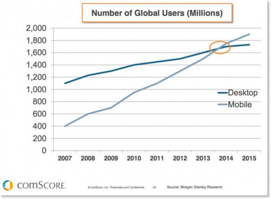
With the number of users browsing websites on their mobile devices surpassing the number of desktop web-surfers, it is no wonder that business owners are looking (as they should be) to adapt their own sites to cellular browsing. Present day website developers are building responsive sites from the outset.
What Exactly is a “Responsive Site”?
A responsive website is a site that responds and dynamically adjusts itself to different computer monitor and mobile device screen resolutions. If you reduce the size of your web browser window you will see our blog change shape along with the reduction or expansion in the dimensions of the browser. These automatic adjustments are made possible using CSS3 technology that allows web browsers to identify which device a user is browsing from and to automatically alter the currently viewed website to the device’s proportions and resolution.
What about Mobile Ready Sites or Apps?
Let’s start from the end – An application is not a viable alternative for a responsive site, while a mobile ready site might be a fitting replacement for a responsive site in cases of technical complexity or an intricate user experience.
Building a mobile application is typically an expensive endeavor that not every business can afford. The application will not appear in Google or other search engines’ search results, and chances are usually pretty slim that a visitor to your website will download the application (and return to use it later on).
Mobile ready websites are relevant to complicated sites whose desktop navigation and usage differ greatly from the way the site is used on cellular devices. For example, price comparison sites with many categories and filters will usually offer mobile device users different, leaner and simpler versions of their sites.
Let’s Talk Pixels
When building a landing page or website, we need to consider these dimensions in our code, but design should be done based on viewports:
Mobile: 320px to 480px
Tablets: 481px to 980px
Desktop: 801px to 1200px
Full Screen Desktop: 1201px to 1920px
Additionally, we also need to remember that on mobile devices, certain sections of the screen are often hidden behind the browser’s toolbar or buttons on the bottom of the browser.
Click here to learn more about correctly constructing responsive pages using viewports.
Credit: developers.google.com
6 Best Practices for Making a Winning and User Friendly Responsive Site
Considering the user’s perspective
To start, we would do well to keep at the forefront of our minds the fact that mobile users are in a different “mode” then people surfing the web on a computer. In addition to our attention that, for all of us, deteriorates over time, people usually engage in cellular browsing under fairly stressful conditions: while at work / while walking / while having a telephone conversation / while riding the bus, etc. The time available to such users is limited and they will, therefore, seek to obtain answers quickly. Today, when a large number of Internet users begin their searches for products or services that they need on mobile devices, it is vitally important to customize your website to their needs and behaviors by making the information they are looking for speedily and readily available. Below you will find an infographic that summarizes the latest trends in mcommerce (mobile commerce) and also provides predictions for the future.
Infographic by- Invesp
Images
Not every picture that looks good on your desktop will also look good on mobile. Make sure images are scalable and don’t get cut off on mobile devices. If you want to maintain a distinct design between desktop and mobile, but your image is overly detailed, consider swapping the picture.
Text
Mobile visitors to your website do not have the same patience or the time to read large blocks of text, as you might expect from them when viewing your site on a desktop browser. Texts for mobile need to be concise and messages must be abbreviated. If your standard homepage contains a three sentence description of your company or products, try to cut it down to one and a half sentences for mobile. Moreover, beyond striving to make sure users’ attention does not wander, causing them to close your site, it is important that your webpage looks good. Seeing as a mobile screen is substantially smaller, don’t overload your site visitors with unnecessary texts.
Navigation
Create a clear and simple navigation bar. If your desktop site has many pages on it menu, it is very likely that you will not want to display all of these pages on your mobile navigation menu. In the case of a large site with tens or hundreds of pages and products, we recommend adding an easy to use search option.
Is your site excessively long? You can shorten it and part with a number of sections on your mobile site, plus you can make your nav. bar “sticky” such that it moves up and down with the page (always visible).
Call to Action
In mobile environments you should try and stick with a single call to action that you want “your user” to execute. Avoid trying to get a user to sign up for a newsletter, buy a product, leave feedback and share your product on Facebook, all at once. Figure out what is the principal action you wish your users to carry out, and focus on that action alone. For example, on MailChimp’s mobile site, that action is registering to their service for free. This is the only button presented to users, together with short and succinct texts.

Mobile Site Additions
One of the advantages of cellular is that it allows you to add features that will help your website visitors contact you or easily make their way to your store or offices.
By adding the ”tel:” tag to any phone number on your site, users will be able to dial up your business with a simple click of a button. In addition, you can add a floating telephone icon that will also serve as a speed dial option.
Another example is getting phone based directions to your place of business. Adding a Waze icon to your site, will, once clicked, open the Waze application with your business slotted as the destination.
A third example, is to add a share icon (including sharing on Whatsapp) to the end of each article or post on your website.
In Summary, every website development project needs to account for responsiveness and to how the site will look on computers (with different sized computer monitors), mobile phones (Iphones and Android devices with a variety of mobile browsers) and various (desktop) web browsers. In addition to responsive website design, you need to plan ahead as to what will appear on the mobile version of your site, text optimizations, images and calls to action.


