
팝 업? 이 단어를 들을 때마다 아마도 “도움이 되는가?”라고 자문하게 될 것입니다. 또는 “그거 짜증나나요? 마케팅과 영업에 사용해야 할까요, 말까요?”
글쎄요, 저는 필요할 때 적절한 시기에 설득력 있는 제안과 놀라운 카피가 포함된 멋지고 창의적인 팝업을 받기 시작할 때까지 동일한 질문을 하곤 했습니다.
나를 위해, 행동으로 인한 팝업 에 표시되는 것 적절한 시간 우수합니다. 팝업의 제안이 창의적이라면 웹 사이트 방문자에게 멋진 체리가 될 수 있습니다.
따라서 귀하의 질문에 대한 대답은 다음과 같습니다. "그렇습니다. 도움이 되고 더 많은 사람을 전환시킬 수 있습니다. 단, 올바르게 사용하는 경우에만 가능합니다."
이 기사에서 우리는 다음을 볼 것입니다::
- 이메일 팝업을 만들기 전에 고려해야 할 사항
- 더 많은 사람들을 전환시키는 것 외에는 모든 것을 할 수 있는 이메일 팝업의 나쁜 예
- 이메일 목록을 늘리는 데 도움이 되는 XNUMX가지 창의적인 제안 및 예
팝업을 만들기 전에 고려해야 할 사항:
이메일 팝업을 만들기 전에 항상 다음 사항을 고려해야 합니다.
- 팝업을 표시하는 이유는 무엇이며 이와 관련된 목표는 무엇입니까?
- 당신의 이상적인 구매자 페르소나는 누구입니까?
- 팝업을 어디에서 실행해야 합니까? 블로그나 홈페이지, 다른 페이지에서만 되나요?
- 방문자의 의도 이해 – 예를 들어 블로그 독자는 구매할 준비가 되지 않았을 수 있습니다. 따라서 가입하는 경우 15% 할인을 제공하지 마십시오. 그러나 데모 예약, 기능, 사용 사례, 제품/서비스 페이지 또는 기타 "고의도" 페이지와 같은 "고의도" 페이지에서는 킬러 제안을 제공할 수 있습니다.
- 방문자의 행동 이해 – 방문자가 웹사이트에 방문하자마자 즉시 팝업을 표시하지 않도록 하세요. 타이밍, 스크롤 등 다양한 종류의 인텐트 관련 트리거를 사용하세요. 출구 의도그리고 다른 사람.
- 귀하의 사본 및 제안 - 귀하의 요청이 사용자 상황에 따라 우수하다면 큰 차이를 만듭니다. 또한, 당신이 어떤지주의를 기울이십시오 당신의 사본을 작성. 방문자에게 충분히 매력적이고 흥미로운 내용인가요? 방문자의 상황을 이해하세요. 퍼널의 상단, 중간, 하단에 있습니까? 하단에 있으면 제품에 가입할 준비가 되지 않은 것입니다. 다양한 방문자 세그먼트에 대해 다양한 팝업을 생성하면 예시적인 방문자 세그먼트에 적절한 지원을 제공하는 데 도움이 됩니다. 적절한 시간에 방문자.
팝업의 끔찍한 예는 무엇입니까?
다른 사람에게서 배우는 것보다 더 좋은 것은 없다 실수. 그래서 저는 제가 발견한 몇 가지 나쁜 팝업 예와 그것이 왜 나쁜지에 대한 이유를 여러분과 공유하고 싶습니다. ~ 안에 이렇게 하면 하지 말아야 할 것이 무엇인지 이해할 수 있을 것입니다.
더 쉽게 이해할 수 있도록 나쁜 예에 대한 기준은 다음을 기반으로 합니다.
1 – 제안
2 – 카피라이팅
3 – 그래픽
4 – 상황 및 타이밍
5 – 의도 및 방문자 행동
이를 바탕으로 더 명확하게 포인트를 부여하겠습니다. 각각 5점씩 총 25점입니다.
팝업 # 1 – 성장 해킹
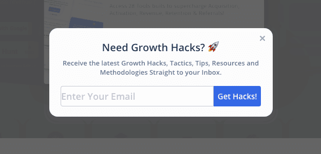
위 팝업은 성장 관련 SaaS 업체의 블로그에서 떴던 것이었습니다.
적어도 그들이 타겟팅하고 있다는 것은 여전히 옳습니다. 성장하는 사람들. 그리고 이 팝업은 종료 의도에 나타났습니다.
무엇이 좋지 않은가요?
- 카피가 약하고 내 이메일 주소를 알려주기 위한 차별성을 제공하지 않습니다.
- 제안도 약하다. 나는 그들의 블로그를보고 확인할 수있었습니다. 내 이메일 주소를 왜 제공해야 하나요? 이 웹사이트의 제안에는 특별한 것이 없습니다.
- 마케팅 담당자가 기존 소프트웨어 팝업만 사용하고 카피를 변경했기 때문에 그래픽이 약합니다. 그 뒤에는 많은 노력이 없었습니다.
- 상황 및 시기: 순전히 이탈 의도에 기반한 것입니다. 종료 의도가 15~30초 동안 나를 기다렸다가 팝업을 표시했다면 좋았을 것입니다. 현재 종료 의도는 "시간"을 들이지 않는 팝업을 직접 표시합니다. 어쨌든 내 이메일을 알려주고 싶지 않습니다.
- 의도 및 방문자 행동: 팝업은 최소한 가입을 요청하는 대신 콘텐츠를 제공했습니다. 잘했어요.
내 요점은 다음과 같습니다.
복사: 2
제안: 2
그래픽 : 0
컨텍스트: 2
의도: 4
총점: 10
이제 우리는 형편없는 팝업에 대해 이야기했습니다. 창의적인 팝업 속으로 뛰어들어 봅시다.
이메일 목록을 늘리는 데 도움이 되는 6가지 창의적인 제안 및 예
1 – 팝업 정직, 창의성, 그리고 인간적인 요소
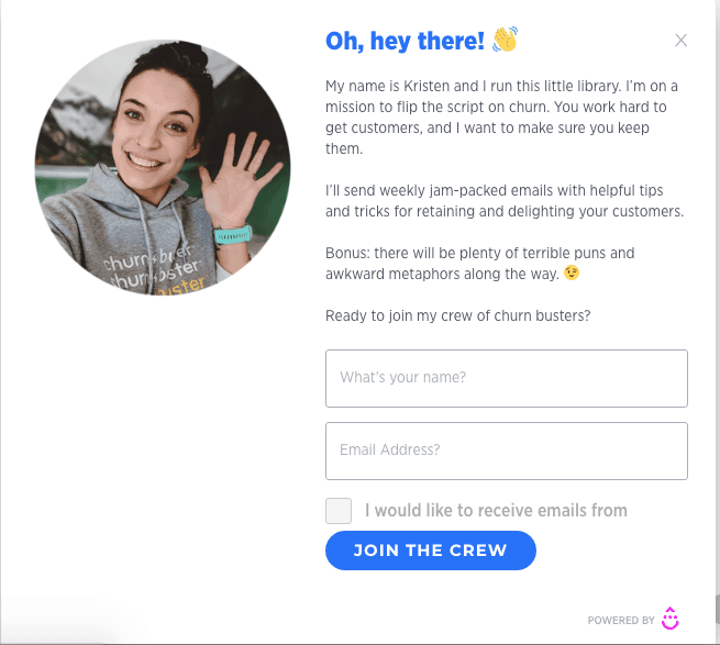
이것은 제가 가장 좋아하는 팝업 중 하나입니다. 즉시 구독하는 데 필요한 모든 기능이 포함되어 있습니다. 저는 이 팝업을 좋아합니다. 왜냐하면 그 뒤에 인간적인 요소가 있기 때문입니다. 마케팅 관리자인 Kristen LeFrance는 자신이 이 블로그를 운영하고 있으며 이탈에 대한 아이디어를 뒤집고 싶어하며 우수한 콘텐츠를 가지고 있다고 공유합니다.. 그녀는 또한 나에게 "말장난과 은유"를 기대하게 만들고 있기 때문에 "동기 부여"가 포함되어 있습니다.
그리고 친절한 미소와 멋진 CTA가 담긴 사진도 마음에 듭니다. 그녀는 "구독"을 요청하는 것이 아닙니다. 그녀는 여행에 동료들과 합류할 것을 요청하고 있습니다.
이 내용은 90% 스크롤할 때만 팝업되고 블로그 페이지에만 표시되기 때문에 컨텍스트가 훌륭했습니다.
블로그 페이지에만 있고 이탈률을 개선해 달라는 요청이 있으므로 그녀의 뉴스레터 구독을 고려해 보겠습니다. 나는 거기의 의도를 좋아합니다.
CTA에 가입하고 싶은 마음이 듭니다.
내 요점은 다음과 같습니다.
복사: 5
제안: 5
그래픽 : 5
컨텍스트: 5
의도: 5
총점: 25
유용한 팁. 주목을 받고 실제처럼 들리도록 약간의 인간적 요소를 추가하세요.
2 – 가격 페이지 팝업
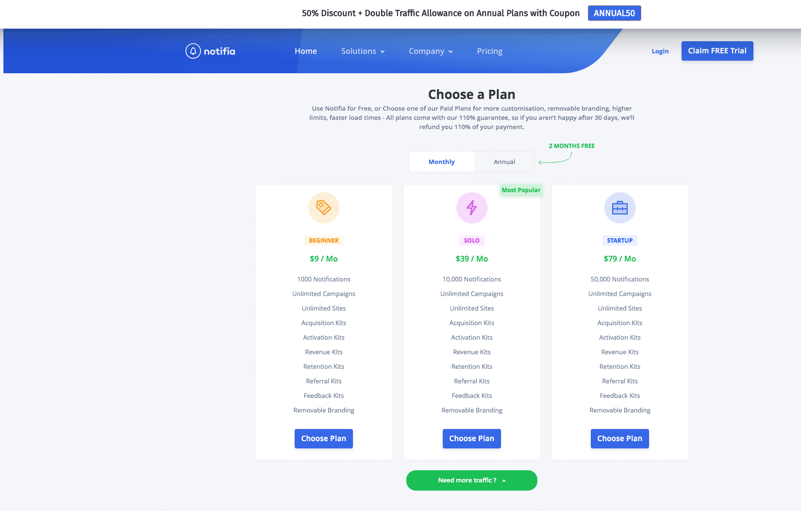
이 팝업은 Notifia 팀의 가격 페이지에 표시됩니다. 가격 페이지는 매우 의도가 있으므로 주의해서 처리해야 합니다. 이 페이지에서는 "연간 계약"을 구매하면 플랜을 선택하고 할인을 받을 수 있습니다. 훅.
가격 페이지에 팝업을 생성할 때 방문자의 요구 사항에 전적으로 초점을 맞춰야 합니다. 너무 지불하지 마십시오 많은 관심 그래픽 – 그들은 당신의 훌륭한 제안을 망칠 뿐입니다.
복사 및 제안이 합리적입니다. 여전히 업그레이드를 요청하면서 이점을 보여줍니다.
가격 페이지에 있으니 적절한 시기에 첨부되어 있습니다. 맥락과 의도에 대해 더 많은 점수를 얻습니다.
내 요점은 다음과 같습니다.
복사: 3
제안: 4
그래픽 : 3
컨텍스트: 4
의도: 4
총점: 18
3 – 즉시 제안 팝업
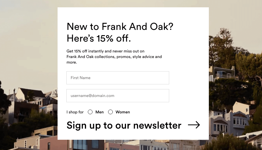
Frank + Oak 전자상거래 웹사이트를 탐색하던 중 이 팝업을 발견했습니다. 일반적으로 전자상거래는 더 많은 판매를 유도하기를 원하며 이는 트래픽을 유도하는 데 매우 좋습니다.
모든 신규 사용자를 위한 페이지에 첨부됩니다. 뉴스레터에 가입하면 15% 할인을 받을 수 있습니다.
이기는하지만 팝업 그래픽이 너무 이쁘네요 약한, 뒤에 있는 이미지가 환상적이야.
제가 새로운 사용자이기 때문에 맥락이 훌륭하기 때문에 그들은 제 이메일로 새로운 제품 컬렉션을 보내주기를 원합니다.
내 요점은 다음과 같습니다.
복사: 3
제안: 4
그래픽 : 2
컨텍스트: 4
의도: 4
총점: 17
4 – 종료 의도 무료 코스 팝업
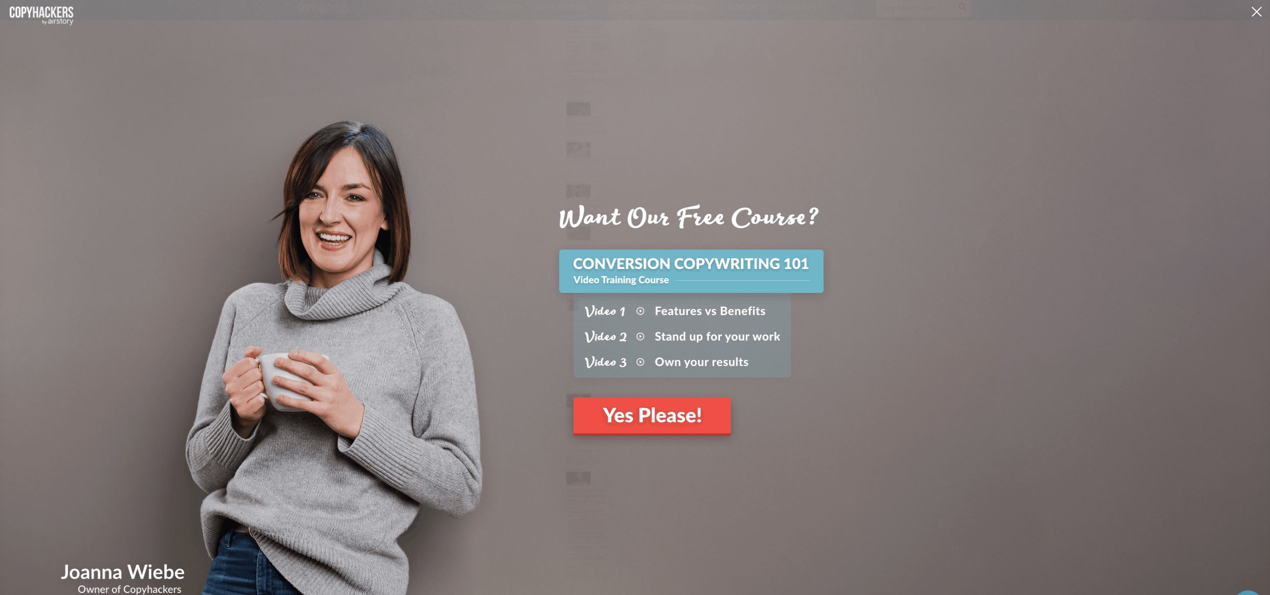
솔직히 말해서요. 나 카피 해커를 사랑해요' 블로그. 무료 리소스를 제공합니다 당신의 카피라이팅 기술을 한 단계 더 발전시키세요.
내가 이 팝업을 좋아하는 이유는 무엇입니까? 이는 종료 의도를 기반으로 합니다. 하지만 날 기다리지 않았어, 카피가 환상적이야.
제안은 놀랍습니다. 내가 배우려는 명확한 결과가 있는 무료 강좌입니다. 내가 무엇을 더 원할 수 있겠는가?
그래픽은 숨이 막힐 정도로 아름답습니다. 제가 말했듯이 인간의 이미지는 항상 작동합니다. 진정성과 진정성을 보여줍니다.
CTA가 내 언어로 말하고 있습니다. 다시 말하지만 훌륭한 사본입니다.
내 요점은 다음과 같습니다.
복사: 5
제안: 5
그래픽 : 4.5
컨텍스트: 3
의도: 4
총점: 21.5
무엇이 더 좋아질 수 있을까요? 이탈 인텐트가 처음 10~15초 동안 기다릴 수 있는 경우. 사용자가 2초 후에 이탈하면 어쨌든 저장되지 않을 것입니다.
5 – 대화형 게임화된 팝업
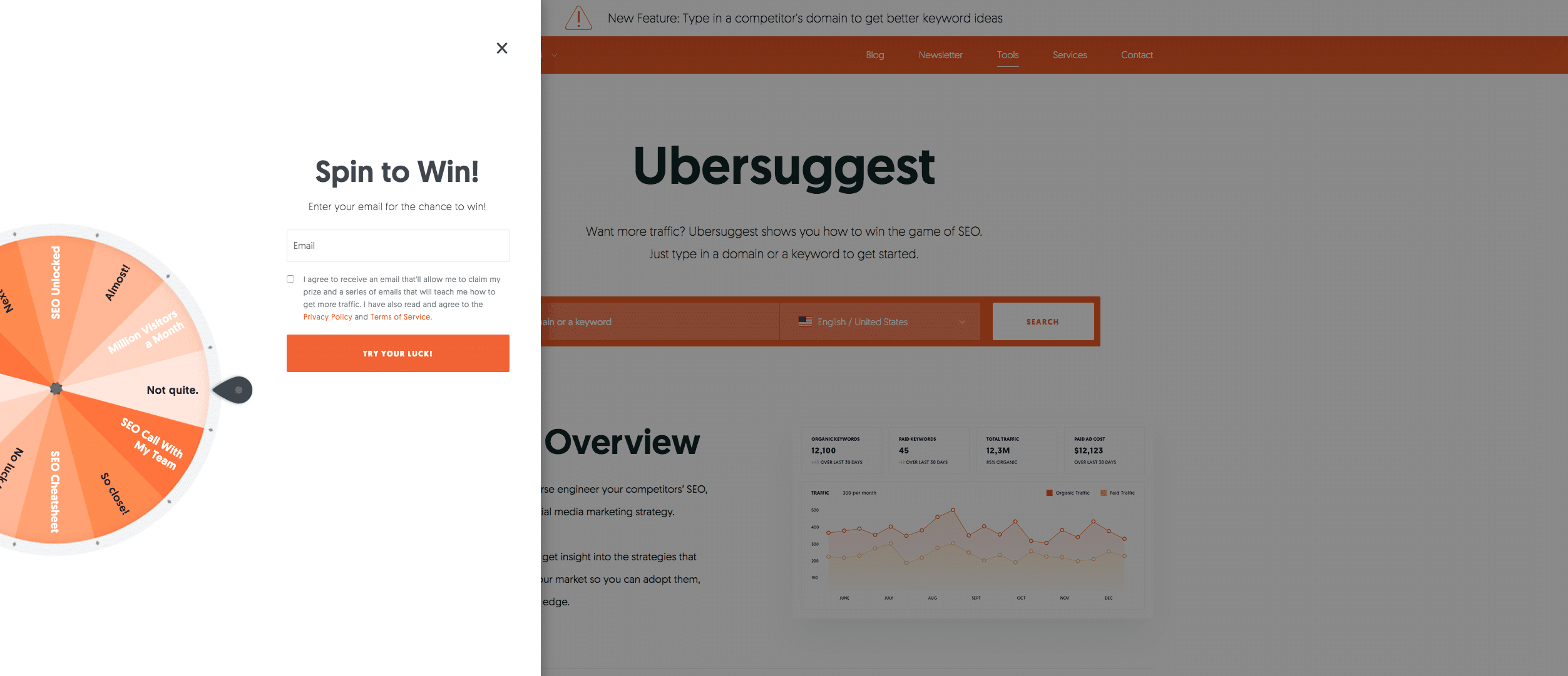
디지털 마케팅 전문가인 Neil Patel은 자신의 웹사이트에서 이 팝업을 사용합니다. 숨이 막힐 지경이다. 방문객들에게 동시에 상호 작용적이고 재미있습니다. (다른 IP에서 계속 방문하면 팝업이 짜증나지만 마케팅 담당자로서 그의 모든 전략을 복사하지 마십시오).
그들이 이기면 아마도 더 좋을 것입니다.
인터랙티브한 부분 외에는 카피가 더 좋아질 수 있을 것 같아요.
작동합니다. 마지막에 이메일 주소도 알려줬어요.
그래픽도 놀랍습니다.
제안은 놀랍습니다. 누군가가 이기면, 그 사람은 자신의 모든 것을 얻을 수도 있습니다 SEO 감사 또는 무료로 팀 통화를 할 수 있습니다.
마음에 들지 않는 점은 바로 팝업이 나타난다는 것입니다. 그리고 팝업을 즉시 표시하는 것이 아니라 사용자가 사이트를 먼저 경험할 때까지 기다려야 한다고 생각합니다. 간단히 말해서, 이는 사용자의 경험을 방해하고 다음과 같은 이점을 얻습니다. 맥락과 의도가 낮은 점수입니다.
내 요점은 다음과 같습니다.
복사: 3
제안: 5
그래픽 : 4.5
컨텍스트:2
의도: 1
총점: 15.5
6 – 대화형 퀴즈 팝업
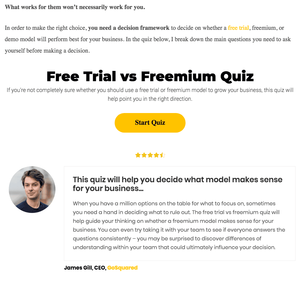
대화형 퀴즈 팝업은 일반적으로 유용한 콘텐츠를 제공합니다. 그리고 가치를 추가하십시오; ~에 돌아와서 이메일을 수집합니다.
저는 이 퀴즈 팝업이 무료 평가판과 부분 유료화 가격 모델에 대한 블로그 내부에 통합되어 있기 때문에 좋아합니다. 그래서, 컨텍스트가 올바르게 설정되었습니다..
그래픽적으로 만족스럽지는 않지만 사본을 보면 자신에게 적합한 솔루션이 무엇인지 알 수 있습니다.
평가 덕분에 그래픽이 향상되었습니다. 그러면 다시 신뢰가 높아집니다.
내 요점은 다음과 같습니다.
복사: 4
제안: 5
그래픽 : 4
컨텍스트: 4
의도: 5
총점: 22
Protip: 웹사이트 홈페이지의 바닥글에 사용하여 참여도를 높이세요.
나는 희망한다. 위의 창의적인 팝업은 귀하의 성장에 도움이 됩니다. 이메일 목록.
주요 테이크 아웃
이 기사의 주요 내용은 다음과 같습니다. 이메일 목록을 늘리고 더 많은 사람을 전환시키고 싶다면 이 앱을 선택하세요.
- 팝업은 동작이어야 하며 상황에 따라 트리거되어야 하며 적절한 시간에 표시됩니다.
- 인간의 이미지를 활용하여 신뢰도를 높이세요.
- 대화형 콘텐츠를 사용하여 웹사이트 방문자 참여를 높입니다.
- 카피라이팅과 제안에 집중하세요. 방문자가 방문할 수 있도록 귀하의 제안을 진정으로 가치있게 만드십시오. 이메일 주소와 교환하여 가치를 얻을 수 있습니다.
- 팝업을 시각적으로 즐겁게 만드십시오.
그렇다면 이메일 목록을 늘리기 위해 어떤 것을 구현하시겠습니까?
이메일 팝업을 만들고 싶으신가요? Poptin에 무료로 가입하세요 몇 초 만에 환상적인 이메일 팝업을 만들어보세요!


