
You want more subscribers to your email list. So you develop a strategy to capture leads using popups. And while this is a great strategy for growing your list of subscribers, there are some things that may hinder your results.
The only thing between you and your prospects at this point is your web form. If this doesn’t make the job of the lead easier, then the chances of them converting is going to decrease greatly.
This is why it’s so important to pay close attention to how you design and implement your web forms. In this article, we’re going to look at 7 best practices for web form design that help boost conversion rates.
There’s no time to waste, so let’s get to it!
1. Design Forms that Are Short & Sweet
The last thing a web user wants to do is fill out a long form just to get discounts, updates, or news emailed to them. And this is especially true if the user is on a mobile device.

Photo credit: Wordstream
All you really need to know at the beginning is their email address, first name, and maybe an opt-in for two or three types of newsletters/emails you offer.
The key is to get the details needed to personalize your email interactions as best you can.
2. Use Visitor Behavior Metrics for the Design
Your popup forms should be strategically timed based on the user’s behavior and position in the buyer’s journey. And the same goes for the type of form you use.
For example, you don’t want to ask a user who’s never been to your site before to sign up for a free demo. They may not be ready at this point. Instead, it’d be best to offer a free resource to help them learn more about your services or product and how it can benefit them.
This is also a great opportunity to ask them to sign up for your email newsletter for insider tips, news, and deals. Or you can offer a free quote or consultation if that suits the users need based on their interactions with your brand and site.
3. Whatever You Do – Don’t Use Captcha!
If you want to start an email list, there’s nothing that’ll hinder your email list subscription rate more than throwing a roadblock in the signup process. One way to do this is to include a captcha. It’s understandable that you want to ensure your subscribers are real human beings, but you do this at the risk of turning off your human visitors.
There’s even evidence that shows captchas causing a 3.2% drop in conversions.

Photo credit: Wikipedia
However, to prevent robots from signing up to your email list, you can use smart scripts. These are able to determine whether or not your subscriber is a human.
Another option is to use what’s known as a honeypot. This is a hidden area that only bots fill out and once they do, it’ll prevent them from completing the form.
4. Always Be Testing
That’s the golden rule in all forms of marketing. You never know if what you’re doing is good or not if you’re not watching the metrics. And you definitely can’t tell if it’s yielding the best possible results if you have nothing to compare it to.
This is what makes A/B testing so important. Create two different versions of a web form and see which outperforms the other. Make sure to only have slight differences in the two so the reason behind the success is easy to identify.
Then if you feel you can further improve your web forms, you compare the winner to yet another web form with slight changes.
The testing never really ends, even after you find your form champ. Because over time, your results will die down and you may need to spice things up again.
5. Include a Confirmation Message After Form Completion
Things can get a little hazy on the web sometimes, especially when Wi-Fi or mobile device issues arise. So to help ensure your visitors know they successfully completed your form, you should include a confirmation message afterward.
This will also help prevent duplicate signups and user frustrations if it appears the form isn’t working.
6. Make Your Call to Action Elements Noticeable
Both the text and the button design you use for your web forms should be noticeable and easy to read. The purpose of your CTA is to attract the attention of the user. To do this, you can use bold colors like dark blue or red.
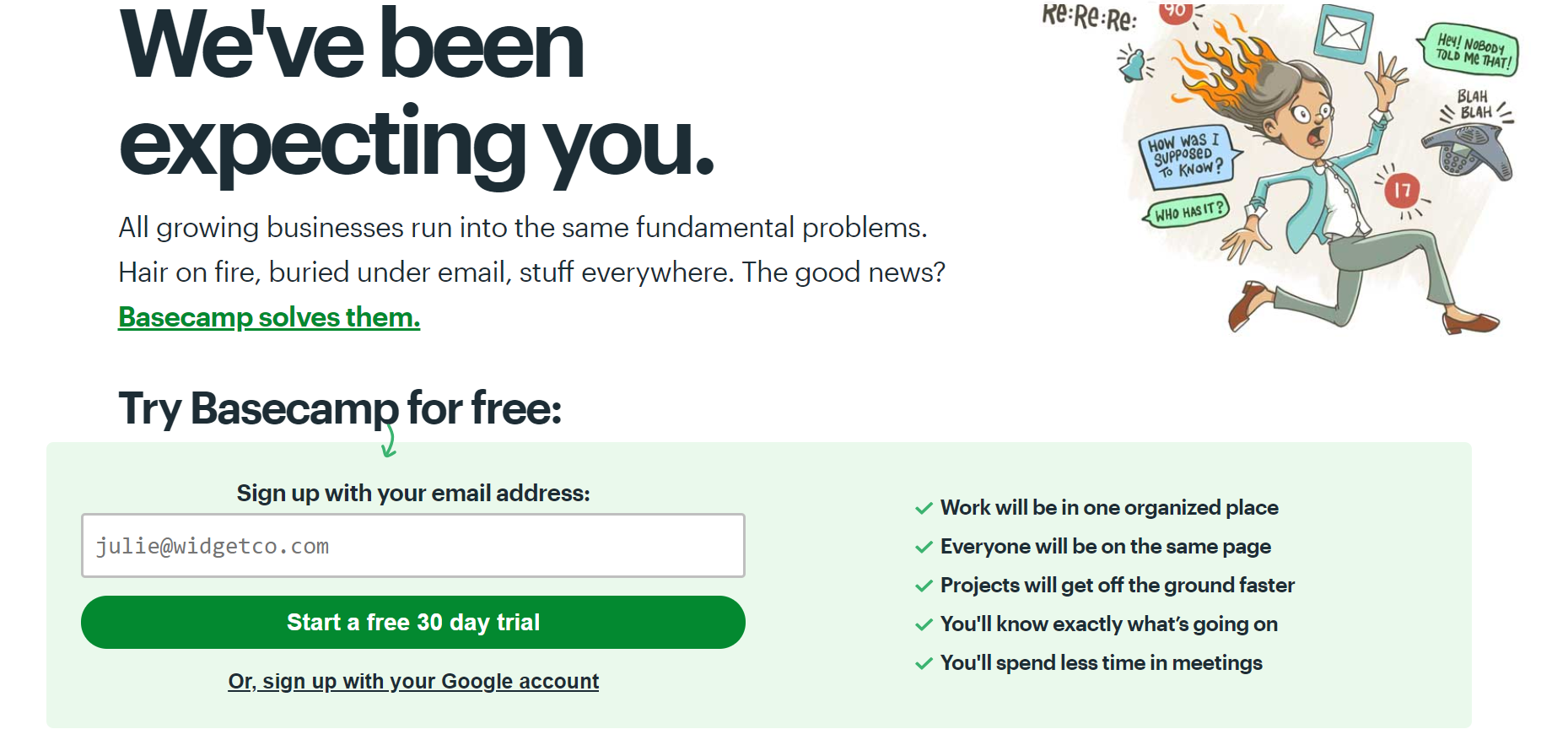
Photo credit: Basecamp
Some brands even go as far as to use arrows and boxes to ensure the user doesn’t miss the call to action. The goal is to motivate the user to take the next step without seeming pushy.
Ensure your text is clear and concise, like “Ready to sign up? Click here!” The size of the text and button should also be easy to read and click on a mobile device.
7. Use Proper Spacing and Layouts
The design of your web forms should be clean and to the point. Make sure that your design is just as visible and easy to use on a mobile device as it is on desktops. You’d be surprised to see how many brands ignore this.
The spacing of the text and fields should make it easy for the user to understand what’s required. Group similar fields together, such as name, number, and address. And it’s also recommended that you use two columns to make it easier to scroll through.
Start Using these Web Form Best Practices Today!
You’ll find that learning the best practices of marketing is never-ending. That’s because marketing is an ever-evolving terrain. Just when you think you’ve reached your hilltop, you plunge into a plateau.
If you’re not careful, you could find yourself stuck in a rut. With these web form design tips, you can ensure that you’re always generating the best results for your popups.
And speaking of popups, you can start designing your own today using tools like Poptin. Sign up for free now to begin creating popups that convert, using our easy drag and drop editor!


