
Over the past few years, SaaS has grown from a fashionable tech trend to a solution that many businesses and individuals rely on.
According to Yalantis.com, factors like cost efficiency, availability of timely updates, and easy maintenance have contributed to this growth. This dependence has increased the need for web design SaaS.This year, SaaS might reach $145 million.
If you want to offer a unique service or build a successful product that will meet your target audience’s needs, you should focus on the SaaS design patterns you use on your site. This is because visitors will look at these elements to determine whether your product or service is worth it.
For this reason, your SaaS website should be appealing and outstanding. It should also pass a clear message and help your target customers understand your service’s value.
SaaS Website Design Specifics
Before selecting the best SaaS website designs, it is crucial to understand the specifics of website design. Today, SaaS has become a popular public cloud service.
Statistics indicate that 89% of consumers choose a brand with excellent user experience over its competitor.
Additionally, 94% of a site’s first impression are design-related.
Therefore, you should look for ways to stand out, attract loyal customers, and earn a competitive advantage through various strategies, such as implementing memorable design elements.
However, having a unique SaaS website is one of the most effective techniques in this tight market. This is because it effectively introduces your product or service to your target customers and explains how it works. It also attracts more users with appealing web pages.
A SaaS website also enables the end-users to realize the benefits that your SaaS product offers.
SaaS Website Practices
To reap these benefits, you should adhere to several SaaS site design practices. These include:
Intuitive Interface
Your competitiveness in the SaaS industry depends on your ability to retain visitors to your website and ensure that their navigation journey is seamless. To achieve this, you should create an intuitive and easy-to-perceive interface that will allow the end-users to access vital information without straining.
According to statistics, it takes 2.6 seconds for users to identify the influential parts of a website and 0.05 seconds for users to create an opinion about a brand. Therefore, an interface that is difficult to understand will confuse your potential customers and push them away.
Clear Website Navigation
Another practice that you should observe when creating a SaaS website is clear navigation. A SaaS landing page usually contains little information.
For this reason, ensure that you include important information, such as links and CTAs, and place it where users can easily find it.
Instant Product or Service Introduction
It is crucial to give your SaaS website visitors a clear idea of what you are dealing with. You should also explain to them how your product works, its key features, and the benefits it offers.
Your target customers should realize this value immediately they open your page. You can introduce the product using a noticeable heading, an appealing photo, or a simple demo.
Noticeable CTAs
Having distinctive and appealing call-to-action buttons on your SaaS website is advisable.
Additionally, you should consider placing them at the top of the website where visitors can notice them and perform the required action.
For instance, you could request them to sign up or watch a demo.
Include Happy Clients’ Reviews
SaaS solution providers should also include customer feedback on their websites. This additional information will enable users to feel closer to the benefits described. It will also convince others to use your SaaS product or service.
Best SaaS website designs
After knowing the principles to follow when building a SaaS product, you should determine the best design to use on your website. Read on to learn some examples of the best SaaS website designs in 2022.
Dropbox
Dropbox’s web design is easy, clear, and minimal. The homepage has tagline statements and well-written text that conveys the services offered and its key features.
Additionally, it offers a simple sign-up form that users can fill out to start using the service.
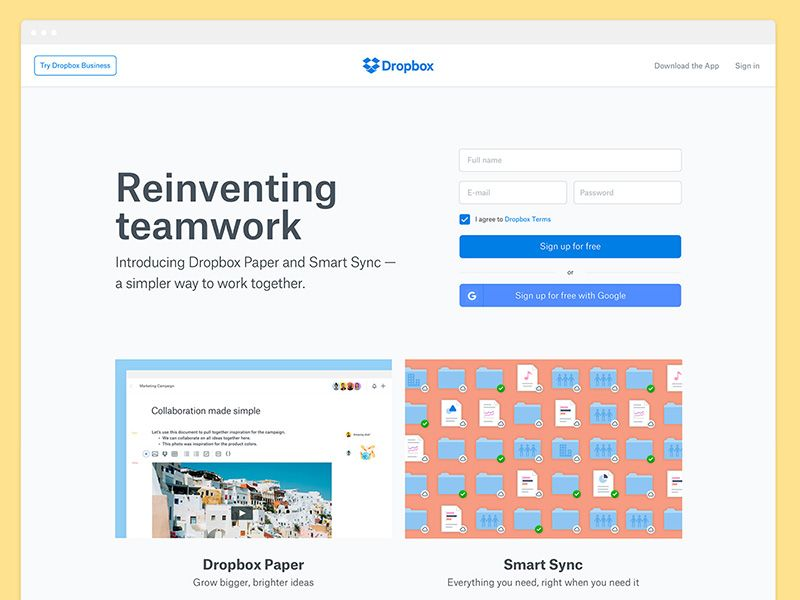
Dropbox is an excellent option for people looking for a login-centric SaaS design. However, this SaaS product design is unsuitable for those starting new SaaS businesses.
This is because placing a sign-up form at the center of your landing page may confuse the visitors who have no idea of your product.
Figma
This popular website design for SaaS offers multiple web design and graphic design features. It also supports the collaboration of different elements within the system.
Additionally, it engages the users with creative and appealing animations and pictures to help them understand the tool’s value.
Figma bases its website on a flexible and consistent design. This approach enables designers to update the website, change the fonts, or add new pages swiftly and effectively.
Kissmetrics
People running eCommerce businesses, should consider using this product and marketing analytics platform. It offers various features that you can use to track your revenue, sales, and conversion rate.
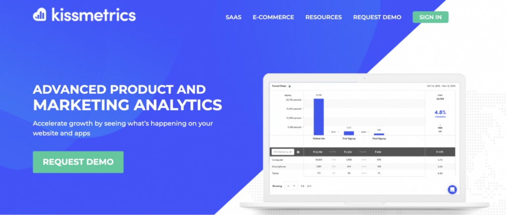
The Kissmetrics website has a simple and precise design that helps visitors to understand these functions quickly. It also uses gentle color contrast to highlight important messages. Moreover, the design allows users to ask questions through a chatbot.
Slack
Slack is an excellent SaaS program design for websites. You can use this communication tool to send messages regardless of the size of your organization. Approximately 600,000 organizations use this platform around the world.
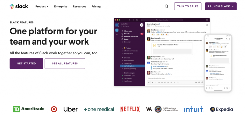
Slack has a simple, straightforward, and creative website design that features high-quality videos, classic fonts, and unique and vibrant colors. These features account for the 88% more time slack users spend on this platform.
It also has a convenient menu, an intuitive interface, and a clear CTA button. This type of design focuses on integrations that contribute significantly to the effectiveness of different communication platforms. These design features have enabled slack to attract about 10 million active users.
Grammarly
Grammarly is a platform that helps users to communicate clearly and effectively. It offers detailed suggestions that help writers correct their spelling and grammatical errors, make their sentences clearer, and refine their tone.
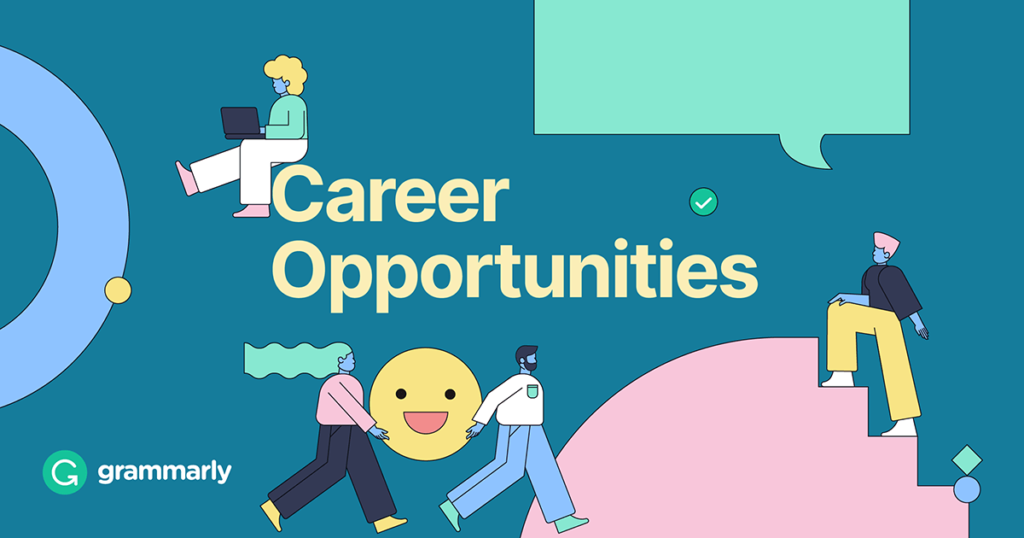
Today, grammarly has about 30 milion active users, thanks to its user-friendly design.
Grammarly’s website has a simple and intuitive design. It has various features, such as collaboration tools, plagiarism detection, text editing, thesaurus, punctuation check, project management, and grammar check.
It is also simple to use since you only need to paste your content, and then you can get a real-time report. Moreover, the centralized administrative dashboard enables users to manage their subscriptions and track their performance.
WooCommerce
WooCommerce is an eCommerce platform specially designed for people using WordPress. It enables users to build and customize their websites based on their business needs.
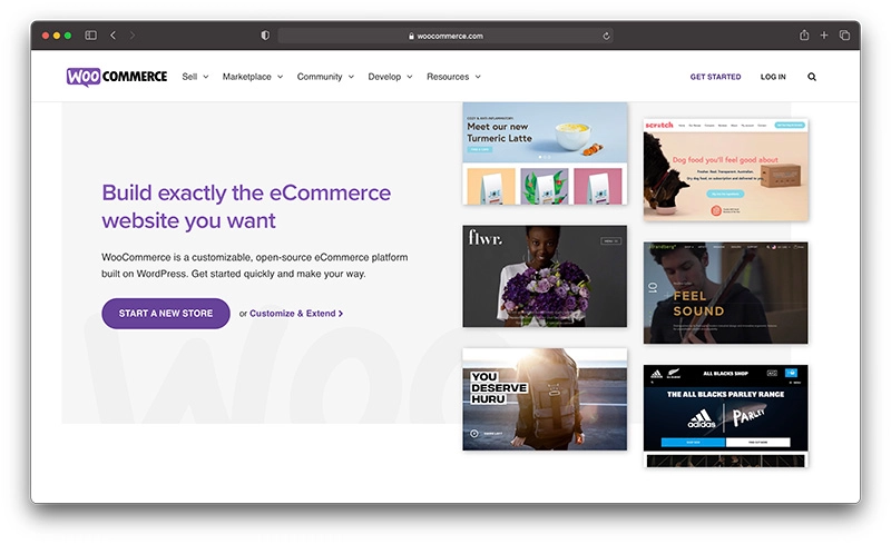
The website’s landing page gives users a clear idea of the product offered and how it works.
It also has a CTA button that requests potential customers to “start a new store.”
The main page also offers appealing examples to address potential concerns that first-time website builders may experience.
Incorporating such features in the website design proves that WooCommerce knows and cares about its customers.
Sketch
Sketch is a tool used to make beautiful designs for macOS systems. It has a modern, user-friendly, and beautifully-deigned website.
Various features, such as an intuitive interface, attractive visuals, and gradient background help users understand how this SaaS tool works.
The website also has a video that potential customers can watch to see how the platform works and understand its key features. Sketch’s main page also has an appealing and attention-grabbing CTA at the bottom.
Rakuten
Rakuten is a platform that enables users to get cash back for shopping from different member stores through the site. This offer might seem like it is too good to be true.
Consequently, Rakuten addresses such customer concerns by answering specific questions, explaining how the service works, and providing statistics and customer feedback on the homepage.
The website is simple and easy to navigate, hence making it easier for potential customers to see the member stores and the cashback percentage they will receive before signing up. Moreover, it is easy to identify CTA buttons like “shop now.”
Mailchimp
This is one of the best SaaS websites today. It is clean, balanced, and straightforward. Moreover, it successfully explains the email marketing service and its features and helps users understand its benefits.
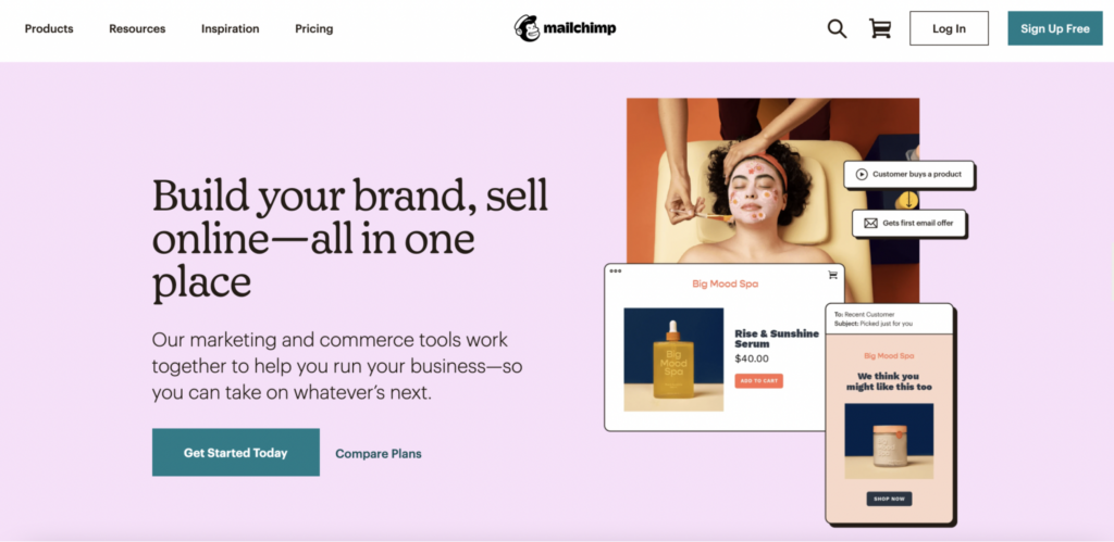
The engaging illustrations, classic fonts, stylish graphics, notable CTAs, and vibrant colors help visitors engage well with the site.
You can easily tell what this company is about simply by seeing the logo, photos, and animations on its main page.
Conclusion
In summary, a SaaS website should have a clean, attractive, and straightforward design to attract and engage visitors. It should also have a clear CTA to enable target customers to know more about the service and take the desired action.
The above SaaS company examples should give you an idea of the elements you should include to make your SaaS website balanced and appealing and match your brand.


