
Growth may take different shapes. Although everyone is obsessed with a rocket-jump, exponential kind of growth, for most startups it’s rather slow. According to a study by Eric Kutcher, the director at McKinsey’s office, startups that are growing at less than 60% annually are doomed to fail.
On the other hand, there is a whopping amount of businesses now following the ‘slow business’ concept. Just like fast-growing trees, fast-growing companies don’t have roots deep enough to last through storms and drought, they say.
Growing slow is OK
Being a bootstrapped startup, our team at Chanty believes slower pace will help our roots stretch deeper and wider. Rather than making a rocket jump with the help of venture capital, we’ve chosen to take advantage of every little opportunity we have, growing slowly but steadily, one step at a time.
We were lucky to build the marketing funnel for our business that actually works. Watching emails stacking up your MailChimp account is a great feeling. However, if you are a team at a growth-driven startup, you should never stop and relax. Instead of giving ourselves a well-deserved pat on the back, we’ve embraced the everlasting process of testing, experimenting and optimizing every step on our customer journey.
Conversion rate optimization
When you think in terms of growth, it’s hard to overestimate the power of conversion rate optimization (CRO) for your business website. It can be a real game changer boosting your business growth without additional traffic.
Ensuring high conversion rates starts with building a credible website. The rest is a matter of tests, experiments and optimization. We’ve tried animated buttons, simple signup forms, fixed header menus and played with various popup windows. Moreover, we’ve spent an enormous amount of time creating educating eBooks trying to use every opportunity to convert visitors into leads. Surprisingly, we’ve discovered that some of our CRO efforts worked way better than others. That’s exactly the reason why we’ve devoted this article to the value of the exit popup.
What is exit popup?
An exit popup appears whenever your visitors are about to navigate away from your website and close the tab in their browser. It is aimed at capturing email information from website visitors before they accidentally leave your site. It can display a special offer, promotion or explanation: why visitors shouldn’t leave.
You may think nothing will stop a person who’s already decided to leave. However, as our experience has proven, last-minute offer may change their mind sending you extra leads to ensure the growth you’ve been craving for.
The moment I brought up the topic of an exit popup, the idea was met with immediate portion of criticism:
“Everyone hates annoying popups”
“It’ll ruin our reputation”
“I always ignore this kind of stuff”
Nevertheless, I thought it never hurts to try. After all, you can’t find out whether something works until you actually try it.
The anatomy of an exit popup
We’ve been investigating the best practices of an exit popup implementation for a while. As a result, we came up with several design options:
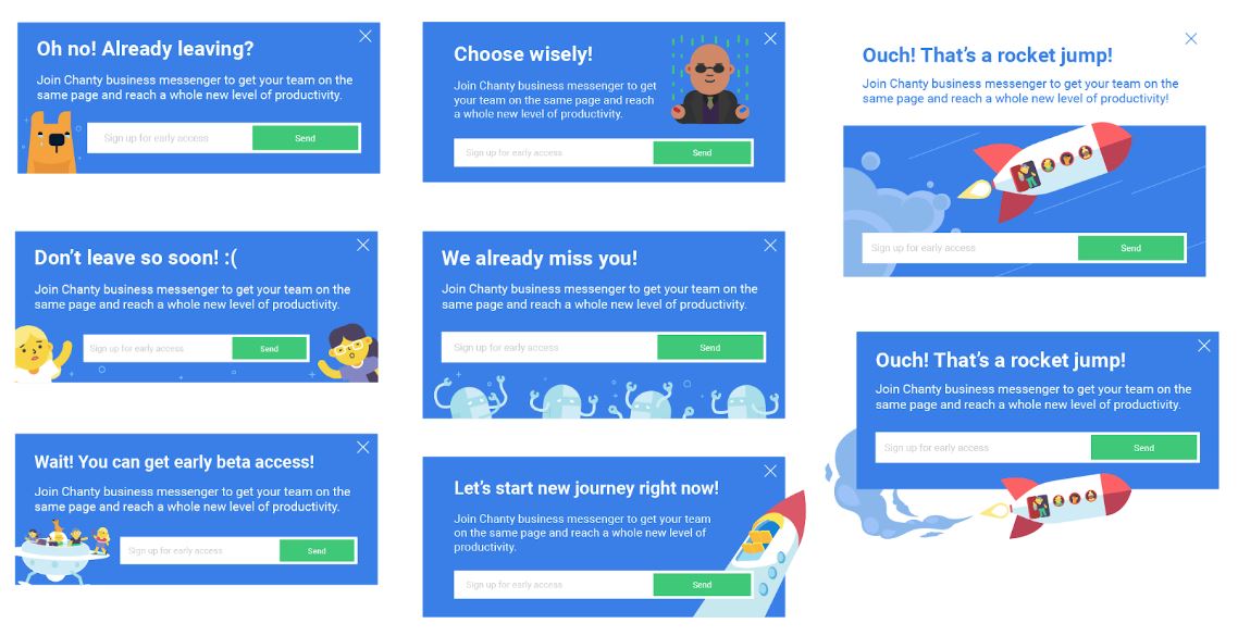
Moreover, we’ve conducted a number of tests and experiments to optimize our popup. Today we are happy to share our findings with you. Let’s take a look at the exit popup essentials.
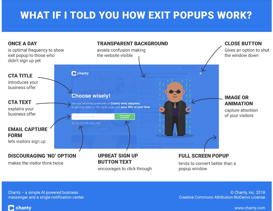
Close button
You don’t want to irritate your visitors, therefore they should be able to close the exit popup if they feel like it. Don’t hide the popup close button, don’t make it invisible for the few seconds like some websites do. Put it right in front of them. Trust me, nobody was ever delighted to discover the close button is absent and thought: “Oh, I’ll just go ahead and leave my email if I can’t close this thing.” If you’ve made a choice of implementing exit popup that obviously interrupts your visitors’ intention to exit, the least you can do is to treat people with respect.
Image or animation
The first thing you want to do with your popup is to draw visitor’s attention away from exiting. This means there should be something that attracts their attention. Having just some kind of lame graphics isn’t enough. Think images, or better, GIFs, that trigger emotions and resonate with the audience. These visuals can delight, shock, surprise, make people laugh, etc. What they shouldn’t do is to leave your audience indifferent. E.g. we’ve chosen to make an animated reference to a well-known movie while leaving some room for guessing. Since our product is an AI-driven business chat, this theme organically fits into our branding.
Full screen popup
The first version of our exit popup was a window that only covered a small part of the screen. However, it wasn’t too effective. I assume people tend to close everything they haven’t asked for that stands in their way. We’ve experimented with different sizes and it turned out the full screen popup works at least twice as better. The psychology behind it is in switching visitor’s complete focus at the popup. They don’t automatically close it like they do with window-type one.
Upbeat sign up button text
While simple conventional phrases like ‘Sign up’, ‘Submit’, ‘Learn more’ or ‘Join now’ are perfectly fine, why not come up with something more creative? Think of a call to action (CTA) that addresses the main issue of your customers your offer solves. E.g. our software is aimed at increasing productivity within a working team. That’s why we went with ‘Start boosting your productivity’ text for our button. It’s your turn now – use your creativity to come up with an encouraging sign up button text for your exit popup.
Discouraging ‘No’ option
This one is my favorite. Rather than saying ‘No, thank you’ or ‘Remind me later’ you have a unique opportunity to discourage your visitors from bouncing in a creative and, sometimes, funny way. I’ve researched different phrases website owners use as a ‘No’ option for their exit popups and picked out some examples for you:
No, I don’t want more clients
No, thanks, I have enough traffic
No, my business is already perfect
No, thanks, I’d rather learn the hard way
No, thanks, I’d like to pay a full price
Email capture form
There are no rules when it comes to exit popup. Best practices only. E.g. you can choose to offer a discount code on your popup screen and not ask for email. It all depends on the goals you are trying to achieve. One way or another, if I were you, I wouldn’t miss an opportunity to grab an email of your visitors. Therefore, I consider an email capture form a must-have. Let’s admit it, exit popup is basically your last attempt to get bouncing visitor’s email. My best advice would be to keep it simple – make sure you don’t include ten different fields as it’ll drive your audience away, leaving you empty-handed. Although this may seem obvious, but it wouldn’t hurt to hint it’s actually an email you are expecting people to put into the field. You can simply accomplish this by marking the field with ‘Email’ text. After all, not everyone reads your mind.
CTA title
The title of the call to action introduces your offer. It’s also the first thing your visitors will read when looking at the popup. In the title you can, once again, address the issue you are solving with your product/service or continue playing according to the overall exit-popup scenario like we’ve done (Choose wisely!). If you offer a discount, make sure to put the numbers in the title (e.g. ‘Get 20% Off Your Order’). Here’s a bunch of popular one-size-fits-all CTA titles I’ve discovered on the net:
Wait!
Leaving so soon?
Before you leave…
Don’t go! (Don’t go just yet)
Want a free %product%?
CTA text
This is where you provide details of your offer. Support the CTA title with more information, convincing your audience to sign up, subscribe for newsletter, use coupon code, etc.
Once a day
Exit popup frequency is tricky. How often do you reshow it to visitors who already closed it? What about those who clicked the ‘No’ option? Again, after a few experiments, we’ve adjusted it to stop from reappearing after:
1 day – for those who decided to close the window
1 month – for those who clicked the ‘No’ option
1 year – for those who signed up
This rule works well for us, however, you may come up with your own frequency, depending on multiple factors. E.g. if you tend to have same visitors coming to your website every day, they may find the everyday popup annoying. Therefore, make sure you know your buyer persona – who they are and how they behave at your website. Then customize the popup frequency according to your visitors’ expectations.
Transparent background
I believe a full screen popup coming from nowhere could be quite confusing. Your visitors may think they’ve clicked the wrong button or they’ve been redirected somewhere away from your website. Although transparent background of your popup is optional and completely up to you, it gives your audience a confident feeling they are still on your website. That’s why we’ve made sure our visitors still see Chanty website through the exit popup.
Bonus: the wow effect
Marketers all over the world do their best to communicate with the audience in a natural and non-intrusive manner. As you probably know, personalization is a big deal in marketing for the last several years at least. Just like any other aspect of marketing, exit pop up couldn’t be left unaffected by this trend.
Imagine your website was featured on Forbes and a fair share of traffic is flowing directly to your website. Wouldn’t it be great to craft an individual message and give special attention to those, coming from Forbes? We haven’t tried this technique yet, but we’ll definitely will.
Still not convinced?
Guess it’s right about time to share our results. Implementing a custom exit popup didn’t take us long, but brought us significant outcome. After a few optimization steps, the number of emails our website generates was increased by 20% thanks to exit popup.
When you think of it in terms of efforts vs results, exit popup appears as a highly effective CRO technique. FYI, the number of emails we receive thanks to ebook downloads, accounts for only 2%. I must say, creating an ebook was far more time consuming than putting up an exit popup.
One more fact to consider – when we’ve changed the window popup to a full screen, the number of conversions doubled.
Since exit popup works for us, I believe it’ll work for you as well. Follow the best practices we’ve shared in this post, but don’t forget to customize it for your audience. If you have any questions, feel free to ask me in the comments below. Good luck growing your next big thing!


