As the global market advances, businesses of all sizes need to use various tools and techniques to engage with their website visitors and convert them into customers.
Exit-intent technology is one such tool that has gained popularity in recent years. This technology offers a unique way to boost conversions on your website without necessarily breaking the bank.
There might be many ways to increase your website conversion rate and convert more visitors into customers but one of the most effective ways to get more leads is to use an exit intent pop up in your marketing and business growth efforts.
What is Exit-Intent technology?
Exit Intent technology tracks the mouse movements of website visitors and detects when a visitor is about to leave the site without leaving his/her information or buying anything.
Exit intent technology is used to capture more leads and reduce cart abandonment by showing a popup or a widget once the visitor’s cursor leaves the site’s frame.
Exit-Intent technology on mobile
What happens when there is no cursor, like on mobile devices and tablets?
Here at Poptin, we developed an exit intent solution for it:
When a visitor comes to your landing page and tries to click “back” to go to the previous page (let’s say Google SERP results), the exit intent popup will show up.
What is a Popup?
A popup is a small window that appears on your computer or mobile device screen when you visit a website or use a specific application. Pop ups are designed to grab your attention and display information such as advertisements, notifications, or requests for action.
Why do exit intent pop ups work?
There are a few reasons why exit intent overlays work so well:
- When a visitor decides to leave the website, his/her mind is clear for the next task. This is the perfect moment to catch their attention and show them an irresistible offer.
- When you show visitors a popup in the middle of the screen, they have to make a choice. They have no distractions – they can engage with the popup and leave their information or close the popup.
- Mostly you won’t offer the same thing on your landing page as in your exit popup. If the visitor didn’t convert to your page, you would probably suggest something with a different CTA (call to action) or higher value to catch him/her while hesitating.
When should you use exit popups?
If you target the right pages and the right audience, an exit intent overlay can be an excellent opportunity to show a special offer of your brand to your visitors.
Exit popup window works very well in landing pages, commercial websites, and online eCommerce stores.
Here is one scenario: A visitor came to your online store and added a few products to the cart in a few minutes. Then, he started the checkout process, and right before he inserts his credit card information, he decided to wait for a deal with a better price, or his daughter just called him about the email she sent and distracted him from completing the purchase.
With an exit intent popup example like this, you can save abandoned carts like this and increase your revenue by 20%-30%.

In the following paragraphs, we will show you a study case about exit popups on a landing page.
Exit intent popup examples and Case Study
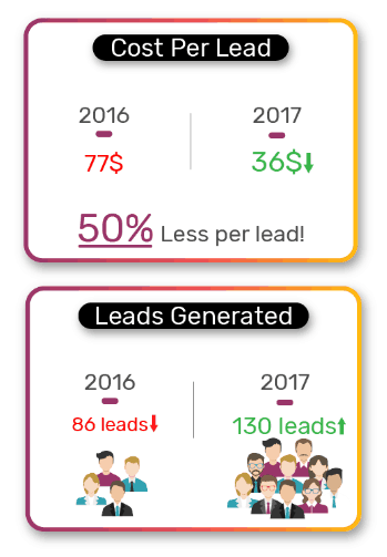
How Poptin’s exit popups helped to cut lead cost by more than 50%
Overview
The campaign discussed in this case study was for a local Israeli robot vacuum cleaner brand (hereafter referred to as “Robot Brand”). The experiment was conducted during the second quarter of 2017 (April-June), and the data was compared to the second quarter of 2016.
The goals of this experiment were crystal clear, and Poptin was used to increase the conversion rate substantially. Keep in mind that the robot brand was in a crowded market with fierce competitors such as IRobot. Therefore, advertising costs were not getting any cheaper from 2016 to 2017. The Robot Brand had to use all possible means to increase its conversion rate.
The Experiment
During the second quarter of 2016, the robot brand ran an Adwords campaign with a monthly average budget of 2,200 USD for a specific landing page. The landing page for this PPC campaign converted at an average cost of 77 USD per lead. For a total budget of 6,600 USD for the whole quarter, the landing page generated 86 leads.
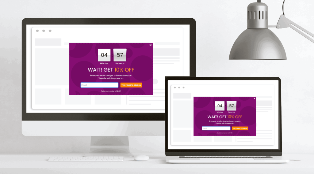
During the second quarter of 2017, the robot brand wanted to use the same landing page, only this time combined with Poptin. The robot brand created two popups and displayed them to visitors using Poptin’s A/B Test feature (the same templates were used only with different copies and design):
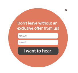
1. A round-shaped exit intent popup targeted to capture the visitors’ attention with its special shape.
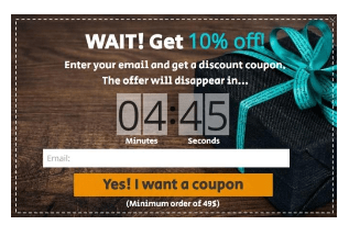
2. A timer popup designed to create urgency, the robot brand didn’t offer any discount in the poptin’s copy (this is important because giving a discount itself can increase conversion).
The Results? It’s amazing!
Now that you see exit intent popups work let’s look at how you can make them work for your brand.
First, let’s begin with the things you should avoid at all costs when using exit intent technology.
Exit Popup Mistakes to Avoid at all Costs
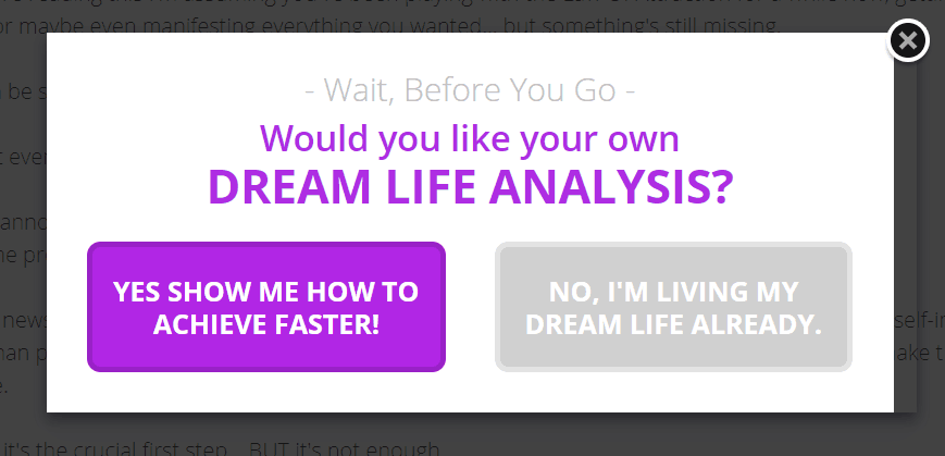
Asking for a Lot of Info
When a user comes to your website, clicks around, and is getting ready to leave – showing a pop up with a bunch of fields isn’t ideal. They’re already set to leave your site, which will likely push them out quicker.
In this example by Neil Patel, he only asks for the website URL, nothing else.
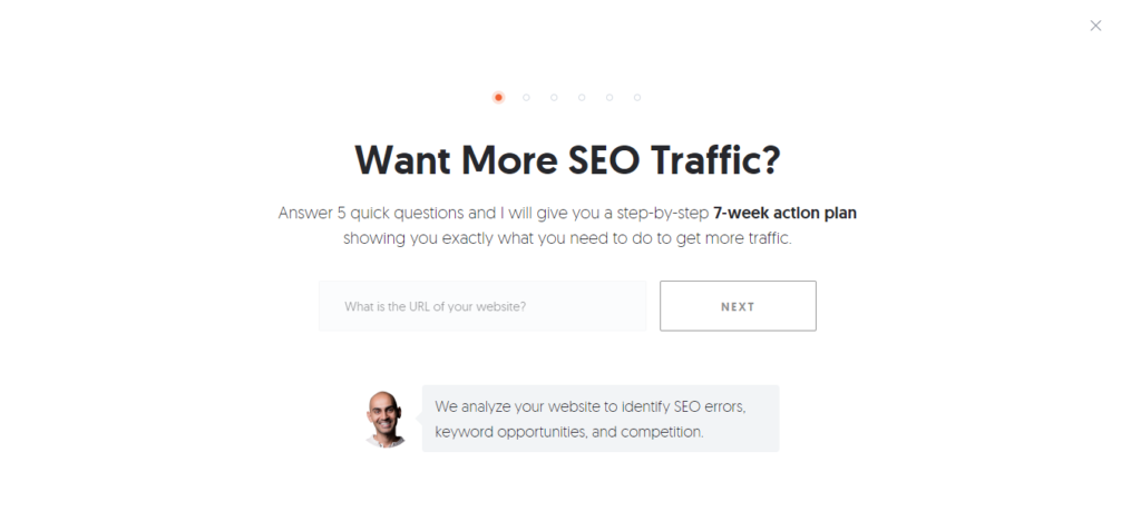
The purpose of an exit intent popup is to attract and convert. So the easier you can make the conversion process (signing up), the better. This is also a proven fact – studies show you can increase conversions by 120%+ by using fewer fields in your exit popups.
Being Sly with a Non-Existent “X”
We understand – brands want their exit popups to drive results. But this shouldn’t mean using shady methods to make it happen. You don’t want to create bad blood and burn bridges for the sake of your strategy.
That said, don’t make it hard for users to exit your exit popup. The “x” should be straightforward to see and click on. The user experience is significant to both Google and users. So don’t hurt your trust and ranking because you want to force visitors to convert.
It’s just not going to work. Studies show that just a moderate increase in customer experience increases your revenue.
Showing Irrelevant Offers
When visitors go to a specific page, blog post, or another form of content on your site, it’s key to display an offer relevant to their search and intentions. Well, that’s if you’re serious about converting your visitors into subscribers.
On that note, ensure you’re tracking user behavior to deliver the right message at the right time. In some cases, you can use a little common sense.
For example, The Idle Man is offering a free fitness e-book, and the popup for this page offers a chance to win a pair of Nike Air Jordan sneakers. It has all the other significant elements, including a simple sign-up process with just one field and a visible “x”.
This is a relevant popup because their target audience is those interested in fitness and gear used to work out or train.
If there’s anything you’ll learn in marketing, it’s that triggering the right message at the right time is key to conversions.
Next, look at some elements you want to ensure are present in your exit intent popups.
What Should Your Exit Intent Popups Have?
The right text size & color
The design of your exit intent popups is critical – it’s the difference between being appealing or appalling to your visitors. One part of creating an appealing design is the text. It’s essential to choose the right font, size, and color.
The key is to make your popups easy to read. Otherwise, they’re useless.

As you can see here, the words are obvious. The font is in manuscript text and large enough to be easily read. Also, the bold and italic words help the visitor see critical areas of the offer. Then, there’s a quick sign-up form with only two fields.
The contrast between the text and background is kept simple – black text on a white background. Never go with odd color schemes that strain the eyes. Such as white text on a black background or gray text on a red background.
Appealing images that attract & convert
People are highly visual, which is why most marketing materials use visual aids to capture them (or at least those that are successful). You find visuals in ads, articles, blogs, brochures, and infographics. The same can be done for your popups. You can also go the extra mile and include a video in your pop up.
The idea is to choose relevant imagery that resonates with your intended audience. For instance, if you’re offering free shipping on a clothes order, show a woman holding bags of clothes. Or if you’re offering a free consultation for financial planning, show someone sitting at a table stressed out while looking over bills.
On the flip side, you can go with positive imagery, such as a woman sitting at a table with bills but smiling with relief as she’s talking with a professional on the phone.
Seeing visuals with the text helps visitors put two and two together and visualize themselves with the solution offered. And that’s what helps to convert.
Here’s a look at one exit intent popup with text-only.
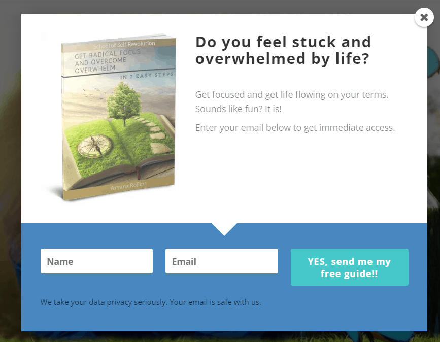
And another one has a visual of the e-book you’re being offered. It’s more enticing to the visitor and more likely to convert. The color schemes are also good.
A great call-to-action
Every form of marketing copy you create should contain a call to action (CTA). Without it, you risk wasting the time of your visitors. While users are already accustomed to popups and intend to get them to sign up, it still doesn’t hurt to include a CTA.
This can help give them the nudge they need to complete whatever action you want them to complete. For example, “Sign up to receive a free e-book!” and “Complete the form to learn to boost your sales!”
Now, there are different ways you can place your CTA. The key is to make it noticeable. Some will bolden and enlarge the CTA. And others will place the CTA on or above the button. You can play around with different variations to see what works the best.
Take a look at this example. The text is large and emboldened, asking visitors if they know their female archetype. Then you quickly notice the button, which contains the CTA “Find Your Archetype.”
Those who take the time to read the rest of the exit intent popup will find another enticing question and CTA. This is a brilliant setup and will likely get its fair share of conversions.
Why You Should Add Exit Intent Technology To Your Marketing Strategy
If you’re not using exit popups as part of your marketing efforts, it’s time to start. An exit popup is one of the highest converting methods because it plays on the behaviors of your audience. It acts as a trigger to get your visitors to work before they leave your site. And if the messaging is correct, it could prevent them from going to your site forever.
However, if you’re already using popups for your marketing strategy, you may make some of the mistakes mentioned above. Try switching things up to see if you can improve your conversion rates.
If you’re looking for expert help in tweaking your marketing strategy, you can test out more than 100 growth mentors willing to offer a free consultation.
And if you need a platform to build exit intent popups fast and easy, check out Poptin today!