Ever feel like your email campaigns are great, but just not getting the clicks you deserve? The culprit might be your call to action email button. Don’t worry, it happens to the best of us. But the good news is, a few tweaks to your CTA button design can make a world of difference.
Why should you care about this? The numbers speak for themselves:
According to various email marketing statistics, email is the most effective tool to boost sales and influence the conversion of your marketing campaigns. While some insist that “no one reads emails these days,” it remains the #1 communication channel for 85% of adults and the #1 source of ROI for 59% of marketers.
More than that, email drives more sales than social media:
61% of consumers say they buy after getting a marketing email, and 49% admit they wait for emails with deals from a brand.
With all that, don’t you want to turn this power to your advantage?
Personalized and targeted, your email has all chances to engage consumers and get them interested in purchasing from you. And its CTA is among the things you need to optimize for better conversion.
How to do that to impact your email marketing ROI?
Keep on reading to find out.
5 Tricks to Design the Clickable Email CTA Button
Below are the five practical tips for designing your email CTA button in the best way possible. And while some may seem obvious for experienced email marketers, all five are among the most common mistakes they make when it comes to practice.
1) Make sure there’s an email button
When you write cold emails, you focus on subject lines, preheaders, and email body copies to persuade targets to click. And while calls to action also matter there, this part of your marketing message becomes even more critical when sending welcome emails, newsletters, or e-commerce messages.
Why?
Because it influences a user’s decision, motivating to proceed and continue relationships with your brand or reject your offer, close the email, and move it to a Trash bin.
When using email marketing platforms for campaigns, you have a few options for designing your CTA: make it a link, a picture, or an HTML email button. To influence a user’s decision and persuade them to click, ensure you choose a button option:
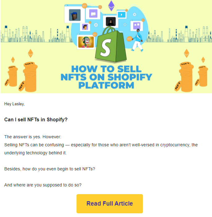
According to statistics, it creates a 45% boost in clicks.
A few reasons for that:
- Psychological: Most people still consider links in emails spam, so your targets may simply ignore your link CTA.
- Technical: Some of your prospects won’t see a CTA if you make it a picture because they disable images in emails.
- Convenient: HTML-based email CTA buttons are easier to design and control, editing their size, color, and location in the email body.
So, the first trick to consider if you are willing to influence your email conversion is to design its CTA like a button for more prospects to pay attention and decide to click.
A fun fact about email button HTML is that while you might see a fancy button with rounded corners and a gradient in an email, the actual HTML code for the button itself is very basic. It’s just a regular button element with styling applied using CSS.
2) Consider its color and size
The big chances are that you’ve heard about color psychology and its role in your brand identity and evoking particular emotions from consumers. The same goes for a CTA button in emails: Consider its color when designing to resonate with your brand palette and be bright enough for a consumer to see where to click.
Because of the mentioned color psychology, experts specify the two best colors for CTA buttons in emails: orange and green.
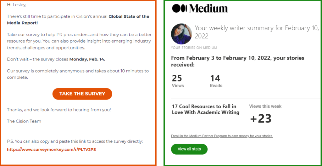
Orange is for friendliness, and green is for peace, making both colors perfect for building trust and evoking positive emotions about clicking. Plus, both colors are bright enough for a CTA to stand out in the email body.
Some insist that the red color is also great to use because it’s about excitement and desire, while others consider it aggressive and inhibiting performance. Still, everything depends on context here.
Whatever color you choose, depending on your brand identity and emotions you want to evoke, remember about the contrast and a button’s size too:
Yes, it needs to stand out, regardless of your marketing goal: to grow your email list, turn subscribers into leads, or sell a product directly via your email. But the trick is to make it eye-catching, not distracting.
Bigger doesn’t equal better: Find a sweet spot between big and small, and don’t make a CTA aggressively prominent in the hope of more interest and clicks.
The best practices here are:
- Choose CTA button colors that match your brand identity.
- Keep those colors consistent in every email for subscribers to associate them with actions and quickly recognize what to click.
- Make your CTA button more prominent than the email’s text, but go easy: It should also be touch-friendly for users reading your emails on mobile devices.
- Make it bright enough to identify: Allow it to have high contrast to the mail background.
3) Remember about the text on it
Another critical element of your email button design is the persuasive and argumentative text you write on it. As a marketer, you can’t underestimate it:
While the color, size, and location of a CTA in email serve to catch a user’s attention and evoke an emotion, the text is what helps them understand if it’s worth clicking. For your CTA text to work, please design it as follows:
- Make it action-oriented: readers should understand what to do and what benefits they’ll get by clicking.
- Use compelling verbs like “get,” “try,” “shop,” “reserve,” “download,” “buy,” and others. Avoid those dull “click here” or “submit,” which are just general instructions and have nothing to do with your specific order.
- Keep the text short: two or three words; well, five words maximum.
- Make the font size large enough to read easily.
- Consider different CTA text for different customer segments in your sales funnel. It stands to reason that a “Buy now” email button will look arrogant and ill-timed in a welcome newsletter, where a “Tell me more” variant would work better.
Another trick to try is to write your email CTA button text in the first person if your brand tone of voice allows: Use “me” and “my” instead of “you” in a button copy. For example:
- “Give my book,” not “Get your book”
- “Yes, I want content,” not “Take your content”
- “Send me the kit,” not “Try your kit”
- “Show me how,” not “Learn how”
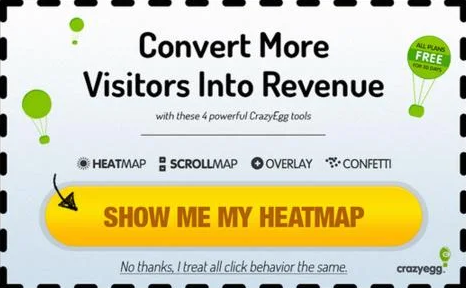
Such personalization once resulted in a 90% click increase for Unbounce, so why not test it and give it a new lease of life now?
4) Locate your email CTA properly
The first rule of the email marketers club is: You do not put more than one CTA in one email. The second rule of the email marketers club is: You DO not put more than one CTA in one email.
The third rule of the email marketers club is: To ensure your CTA is eye-catching but not distracting, locate it correctly.
First, as for the number of CTA buttons in an email:
The “more options, more chances to choose and click” doesn’t work here. Your numerous CTAs can confuse or overwhelm a user. Please remember about an attention ratio in marketing: It should be 1:1 of what a person can do on a page vs. what you want them to do.
The more options you give, the more likely you will lose their attention. Plus, you risk triggering any of these effects of having many options:
- Choice paralysis: The more options we have, the more challenging or even demotivating it’s for us to make a decision.
- Buyer’s remorse: The more options we have, the easier we’ll regret the decision, thinking it might be wrong.
So, if you want a user to decide and take action, provide them with one direct CTA to consider.
But, as it often happens in marketing, there are a few exceptions to the rule:
- Feel free to place several calls to action if they lead a user to the same page.
- Consider a few CTAs in an email if it’s about e-commerce promoting several products/services. If that’s the case, design your email accordingly: separate it into sections, each with a different call to action. It will make it more comfortable for users to scan your email and understand what every area is about.
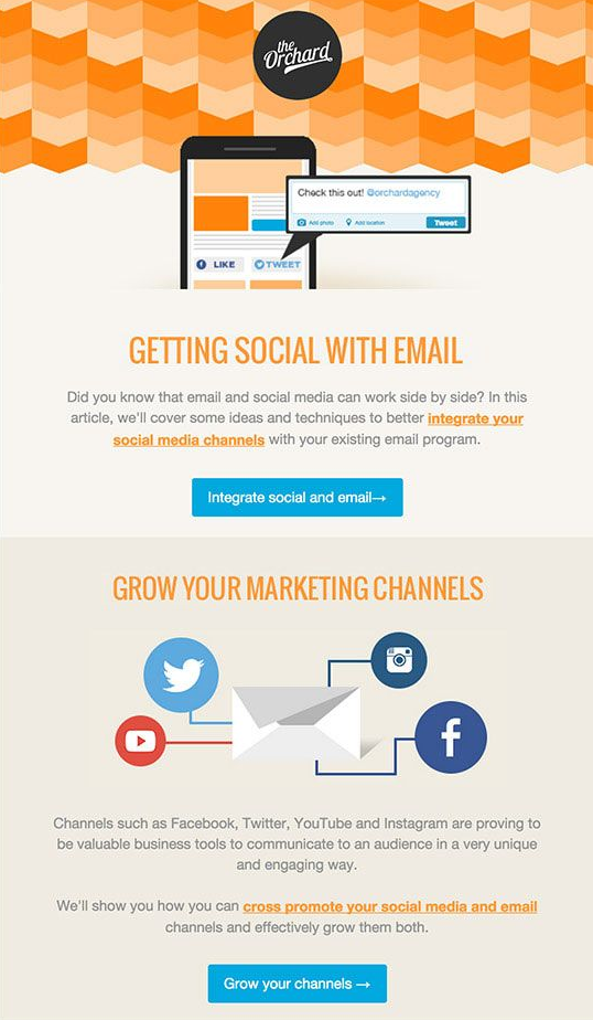
And now, for an email CTA location:
The best practice would be to place it “above the fold” for readers who don’t like scrolling to see it anyway. Other tips depend on the device your targets prefer for reading emails:
- For desktop users: Place a CTA right-hand of email text and images.
- For mobile users: Place a CTA front-and-center or consider the upper left-hand corner of your email as some Android apps display only this part.
The proper location of your email CTA button is a guarantee that all contacts will see it, regardless of their device and reading habits.
5) Add white space
Adding white space around a CTA button in emails is a good practice: It separates it from text and other elements, creating a visual focus for readers and making the button stand out.
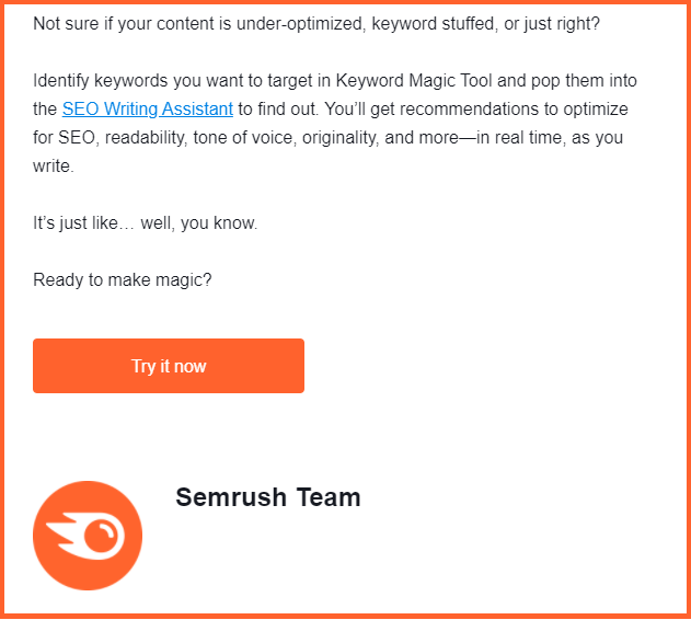
And speaking of mobile users, white space also has a more practical function: It creates an extra area around the text, making it easier for fingers to click.
Wrapping Up
When it comes to an email click-through rate, every detail matters, and the design of your CTA email button is not the least of these: Its color, size, location, and text can make the difference for your overall marketing campaign.
The best practices here:
- Design it as a button, not a link or a picture.
- Consider your brand identity, color psychology, and contrast when deciding on a button’s color and size.
- Use action-oriented, compelling, and short text for your CTA button.
- Choose a proper place for it in your email body: Ensure it looks and works well on desktop and mobile devices.
- Add white space to separate a CTA from other elements of your email and make it stand out.
If you are willing to take a step further in email design, you can also try interactive email elements and animated CTA buttons. This latest email marketing trend can help you engage subscribers, trigger actions, and get feedback from them.
And once you have a developed content strategy, you can automate emails with the help of online marketing tools and choose those working best for you.
Author’s Bio

Lesley Vos
Lesley is a professional copywriter and guest contributor, currently blogging at Bid4Papers, a platform helping students and authors with writing solutions. Specializing in data research, web text writing, and content promotion, she is in love with words, non-fiction literature, and jazz.
