
Email popups are ubiquitous in the online world. Almost every website you visit seems to have one, eager to capture your email address in exchange for a discount, newsletter, or other incentives. While they can be a powerful tool for building your email list and boosting conversions, poorly designed popups can quickly turn visitors away.
Unfortunately, many popups fall short of this mark. Intrusive timing, irrelevant offers, and clunky designs can quickly turn visitors from potential subscribers into frustrated click-awayers. Poorly designed popups can damage your brand image and hinder your lead generation efforts.
However, well-designed popups can be powerful tools. By offering clear value, appearing at the right moment, and respecting user experience, popups can effectively capture leads and grow your email list. In this article, we will equip you with the knowledge and strategies to design email popups that not only convert but also leave a positive impression on your visitors.
Reasons Why Most Poorly-Designed Popups Annoy Visitors
Intrusive timing and appearance
This is a common reason that most users fail to consider before creating an email popup. For example, hitting visitors with a spin-the-wheel popup before they’ve even seen your website disrupts their browsing flow and feels intrusive. So also is showcasing a popup the second someone lands on your page. This comes off as aggressive and dismissive of their intent. It prevents them from exploring your content and understanding your value proposition before you ask for their email.
Websites that use large popups that block the content users are trying to access are disruptive and impede their progress. This forces users to take an unwanted detour by closing the popup before they can continue their intended task, causing frustration and slowing them down.
Furthermore, popups that overlap essential buttons, menus, or calls to action make it difficult or impossible for users to interact with the website as intended. This disrupts the natural flow of their experience and hinders their ability to achieve their goals.
Lack of relevance and value
Most popups annoy visitors because they fail to offer value in exchange for their precious attention and email addresses. There are three key ways a popup lacks relevance and value, leading to visitor annoyance.
Showing Generic Offers: These don’t cater to individual needs. For instance, a generic video popup on an online clothing store, with a 10% discount on dresses doesn’t appeal to someone specifically interested in a shirt, hat, or shoe.
Sometimes, these offers often feel impersonal and spammy. They suggest a lack of effort to understand the visitor’s interests. Also, too many generic options can overwhelm visitors and make them less likely to engage.
Stating unclear benefits: Offers that don’t communicate the value proposition effectively can annoy a visitor easily. Visitors need to understand what they’re getting in exchange for their email addresses. If the benefit is unclear, visitors might question the legitimacy of the offer.
Also, if it requires increased mental effort required to engage, visitors might close their tabs quickly. A mobile popup that can’t be deciphered easily is likely to get closed by a visitor who’s doing multiple things on their phone.
Mismatch with content: A popup about unrelated content interrupts the visitor’s focus on the page they’re actively engaged with. It often feels irrelevant and out of place. For instance, a popup offering a discount on shoes on a blog article about gardening creates a jarring disconnect. This sort of dissonance between content and popup messages suggests a lack of attention to detail and personalization and undermines trust and credibility in the brand.
Difficult to dismiss popups
Having to click through multiple layers of website popups or go through a multi-step process just to close them feels like being trapped in a maze. It’s unnecessary and time-consuming, adding to the feeling of being forced into something you don’t want.
Some popups have multiple buttons, with some disguised as “fake” close buttons that lead to further actions you didn’t intend.
Imagine being engrossed in an article when a popup appears, only to have a tiny “X” hidden in the corner, forcing you to hunt for it while trying not to misclick and trigger the action you’re trying to avoid. It’s a frustrating interruption that feels like a game of hide-and-seek, putting you in a reactive, frustrated state. No one wants to experience that.
Excessive popup frequency
Humans have limited cognitive resources. Constant popups overload our attention, leading to fatigue and frustration. When popups appear frequently, especially with aggressive close buttons or multiple steps, visitors can feel trapped. The excessiveness of the popups screams desperation, diminishing the website’s credibility and professionalism. Visitors might perceive them as a tactic to force information collection, eroding trust and potentially harming reputation.
Essential Principles For Creating User-Friendly Popups
Non-annoying popups are designed to enhance user experience and engagement without disrupting or irritating visitors. Here are some principles to follow when implementing non-annoying popups:
1 – Timing
Display popups at appropriate times using targeting rules such as exit intent. This allows you to show a popup only when the user has spent a certain amount of time on the site or when they are about to leave. Interrupting the user’s browsing experience with an immediate popup can be annoying.
2 – Relevance
Ensure that the popup’s content is relevant to the user’s current activity or interests. Use what you know about your audience to personalize the offers they see. Personalize the message based on user behavior or demographics to increase its relevance.
3 – Value Proposition
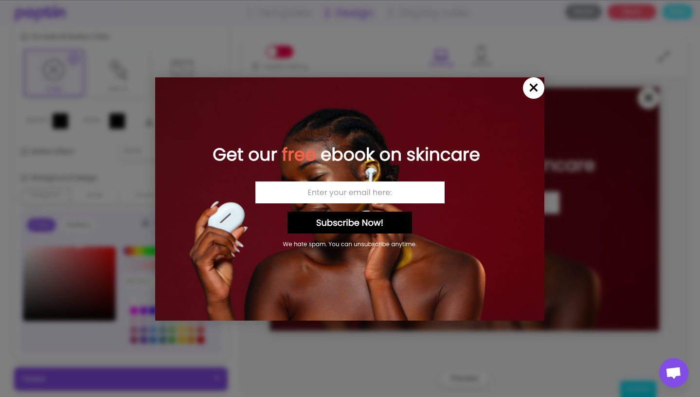
Communicate the value proposition of the popup in clear terms. There’s no need for ambiguity or unclarity. Let users know what they will gain by engaging with the popup, whether it’s a discount, exclusive content, or useful information.
4 – Ease of Dismissal
Make it easy for users to dismiss the popup if they’re not interested. This shows that you respect their time even if they didn’t engage with your popup. Include a clear and prominent close button, and ensure that users can easily find it.
5 – Frequency
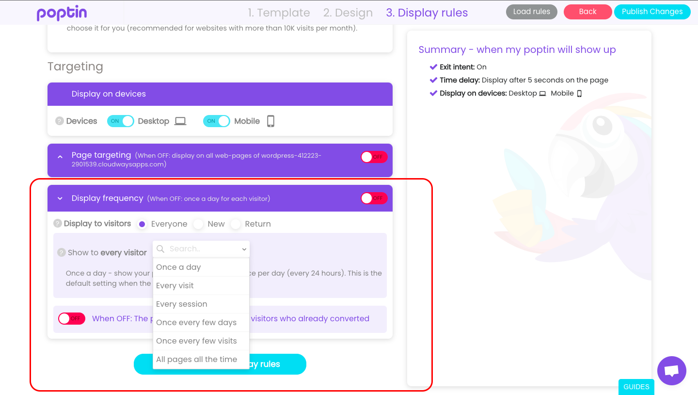
Limit the frequency of popups to avoid overwhelming users. For example, if you’ve designed a popup in Poptin, you can set your display frequency to show only once a day, once every few days, or all the time. It all depends on the strategy you adopt but remember, displaying popups too frequently can frustrate visitors and lead to a negative perception of the website.
6 – Aesthetic Appeal
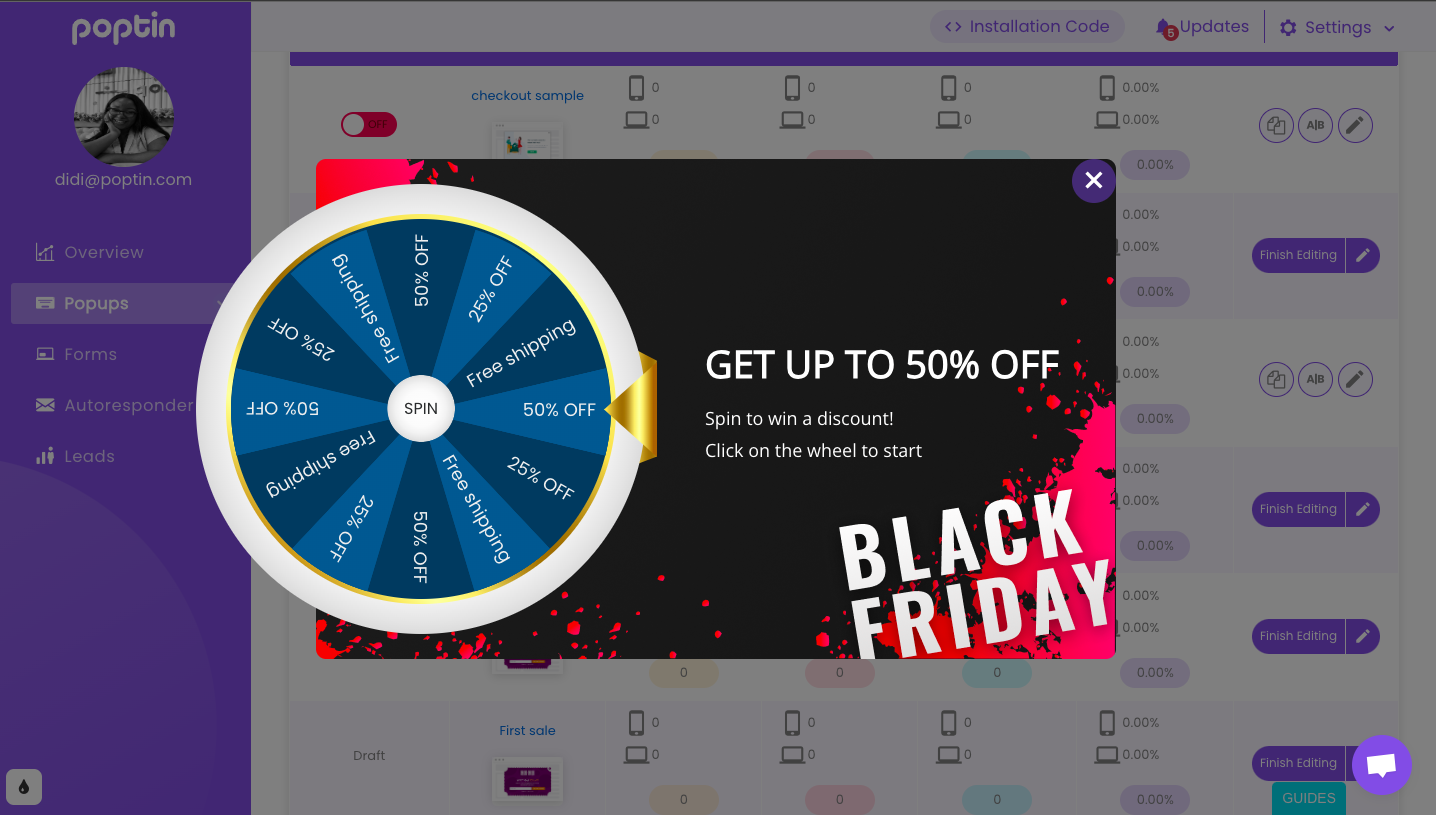
Design popups that are visually appealing and in line with the overall aesthetic of your website. Many popup builders offer full customization options, so you can use high-quality images, fonts, and colors to make the popup visually engaging.
7 – Mobile Optimization
Ensure that your popups are optimized for mobile devices. Mobile users have limited screen space, so it’s essential to design popups that are responsive and unobtrusive on smaller screens.
8 – Testing and Optimization
Continuously test different popup designs, timing strategies, and messaging to identify what works best for your audience. Use A/B testing to compare the performance of different variations and optimize accordingly
9 – Respect User Preferences
Respect user preferences regarding popups. Provide an option for users to opt out of seeing popups in the future if they find them intrusive.
10 – Compliance
Ensure that popups comply with relevant regulations, such as GDPR or CCPA, particularly regarding data collection and user consent. Be transparent about how user data will be used if collected through the popup.
Popup Design & Content Best Practices To Follow
1- Timing is key
Avoid bombarding users with popups immediately upon landing on your website. Allow them some time to engage with the content first. Delay the appearance of popups until users have spent a reasonable amount of time on the page or have scrolled down a certain percentage.
2 – Exit intent triggers
Use exit-intent technology to display popups when users are about to leave your website. This can be less intrusive since it doesn’t interrupt their browsing experience.
3 – Provide value
Ensure that your popup offers something of value to the user, such as a discount, exclusive content, or a helpful resource. Communicate the benefit they will receive by engaging with the popup.
4 – Clear and concise messaging
Keep the content of your popup brief and to the point. Communicate the purpose of the popup and what action the user needs to take. Avoid using excessive jargon or unnecessary information.
5 – Use attractive design
Design your popups to be visually appealing and consistent with your website’s branding. Use high-quality images, colors, and typography to grab attention without being obnoxious.
6 – Make them easy to dismiss
Provide users with a clear and easily accessible option to dismiss the popup if they’re not interested. This could be a prominent close button or a subtle “X” icon in the corner.
7 – Consider mobile use
Ensure that your popups are optimized for mobile devices. They should be responsive and easy to interact with on smaller screens without obstructing the user’s view.
8 – Test different elements
Experiment with different variations of your popups to see which ones perform best in terms of engagement and conversion. Test different designs, messaging, and triggers to optimize performance.
9 – Set target rules
Limit the frequency at which popups are displayed to users to prevent them from feeling overwhelmed or annoyed. Set rules to control how often a popup is shown to the same user within a certain period.
Conclusion
Remember, email popups are a powerful tool for lead generation, but wielding them effectively requires respect for your visitors’ experience. By following the principles and best practices outlined above, you can create popups that not only capture valuable leads but also leave a positive impression on your audience.
And if you’re ready to start designing popups right away, you can get started here.


