A free trial can be your best sales pitch, because once the customer gets interested with your product, it’s easier to upsell.
Sounds easy, right?
But, there is a catch.
How do you make visitors book those free trials?
The plan is to make them sign up and upsell, but the challenge is to make them book the free trial in the first place.
Well, had it been that easy, the internet won’t have been full of guides on how to increase your free trial sign-ups.
The challenge is real and you must pull your socks up.
All set? Let’s get started with grasping five proven strategies to increase free trial sign-ups.
Five Proven Strategies to Increase Free Trial Sign-Ups
Video Landing Pages
You want visitors to sign up for your free trial. However, the fact is that no matter if it’s your free trial or the most expensive plan, visitors will sign up for value.
If they see some solid value proposition, they will sign up. This implies that your efforts must be directed towards conveying your product’s value proposition rather than being overly promotional.
Once the visitor lands on your landing page, your job is to not let them go back. Even if you’re not able to sell, you must be able to plant your product’s value proposition in their mind, so that they give it a thought, maybe later some time.
For this, your landing pages must scream value. However, don’t end up making them way too lengthy and textual in the process.
This is another challenge. How do you convey your value proposition and showcase what your product can do without being too textual?
Well, the answer is simple. Videos!
It’s true that a landing page can’t convey it all and may not look convincing enough, but including videos can be a game-changer.
Statistics have shown that 84% of people were convinced to buy a product by watching a brand’s video.
When you insert a video on your landing page, you’re doing a lot more than conveying your value proposition.
Videos instantly humanize your sales pitch. Compared to a long paragraph about your USPs, a video can do the job more engagingly.
When your visitors see a human being introducing them to the product, they instantly get reassured that they’re dealing with a credible brand
Eager to experiment with videos?
The free screen recorder by StoryXpress can help you get the perfect start. Use the screen recording Chrome extension to quickly create webcam and screen recorded videos for your prospects.
No need to invest in fancy (and expensive) video-making tools such as a DSLR or tripod stand, especially if you’re a beginner. Be it creating a quick sales video for your cold lead, or following-up with an already engaged lead, tools like that have got you covered.
The real game-changer here? You can even add CTAs to your videos. This means that while your prospect is super engaged with your video, you can direct them to your sign-up page from within the video using a button.
Or, you could insert your calendar in the video and let them book a session with you, again while watching the video.
Finally, you can embed your videos in emails or your landing pages using lightweight embed codes that don’t slow down your website.
Pop-Ups That Are Impossible to Resist
A lot of marketers consider pop-ups to be annoying. Well, pop-ups can be annoying but ONLY when you don’t know how to use them.
Green Banana, a business from Israel, achieved a 400% increase in conversion rate just by adding pop-ups on their website. Impressive?
No matter what the self-proclaimed marketing experts say, pop-ups do work, it’s just that you must know how to use them and not allow them to ruin the user experience.
One way to make sure that you don’t go overboard with pop-ups is to thoroughly study and analyze your visitor’s behavior.
For instance, you can display the pop-ups only to the returning visitors who’ve indirectly expressed their interest by visiting you again.
Another popular way of using a pop-up to increase your free trial sign-ups is to show them to people who are about to leave and grab their attention.
But, if a visitor is reading a blog post, and in the middle of it a pop-up springs up asking them to book a free trial, most likely they will close the window.
Timing matters the most with pop-ups.
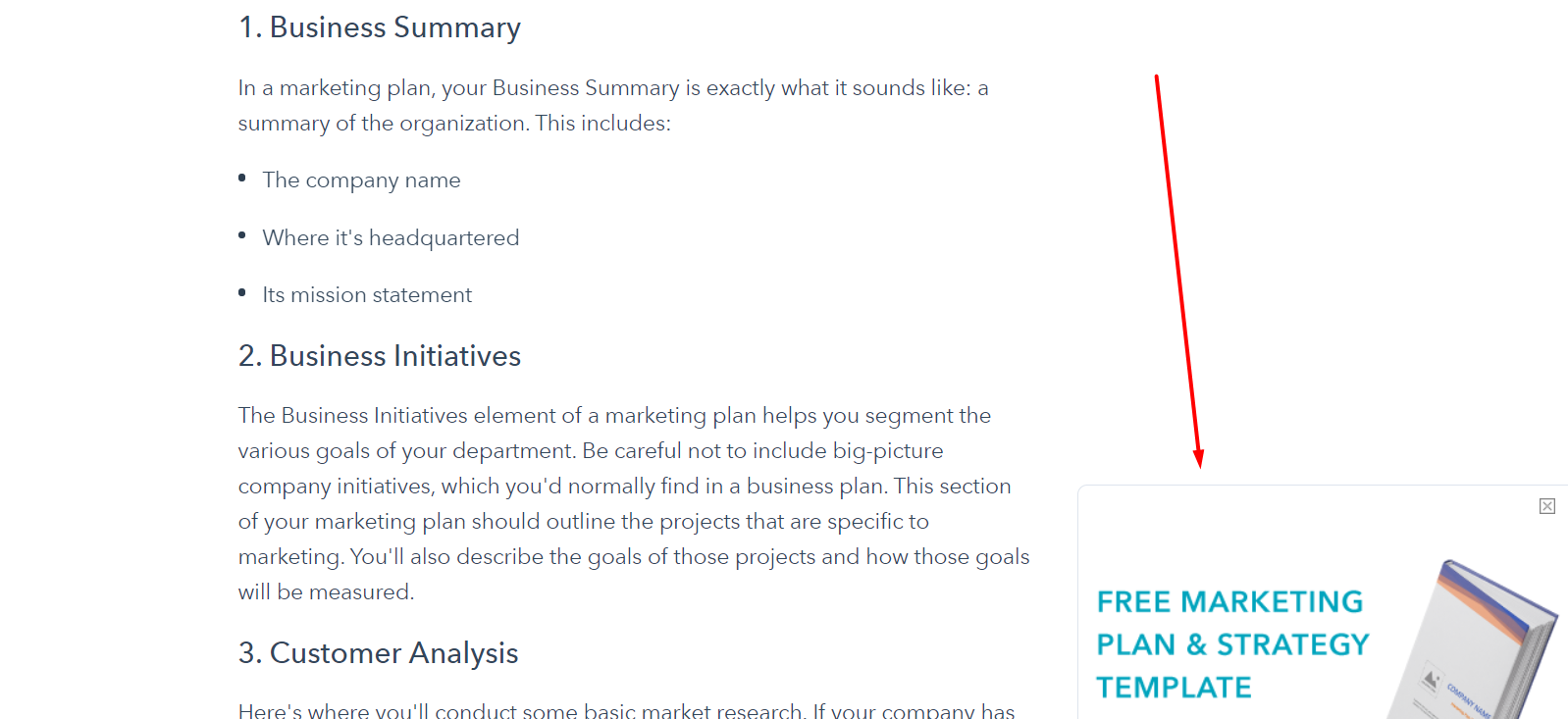
HubSpot can be a great source if you need some quick pop-up inspiration.
See this blog post. The pop-up doesn’t show up immediately as you land on the blog post, rather it shows up only after you have read almost half of the post or scrolled down till there.
Even after it shows up, it doesn’t obstruct the user experience, rather it peacefully sits in a corner, and thus doesn’t annoy anyone.
Wondering how to create engaging pop-ups for your website within minutes? Check this out.
Smoothen the Sign-Up Flow
At times, it happens that a visitor wants to sign up but the super complicated sign-up form stops them.
Yes, that’s a thing.
The last thing a visitor would appreciate while signing up for something new is filling in a long-form that “seems to ask confidential information” or “is just too much to deal with”.
If your goal is to just make them sign up for your product, you should refrain from asking anything that can anyway be asked later. Make the sign-up form as easy and simple as possible. The idea is to lower the psychological barrier to entry as much as possible.
Don’t know what qualifies as easy and simple? Think about it from a visitor’s point of view. Does it take more than five minutes to fill the form? If yes, maybe you should shorten it a bit.
A good-to-go sign-up form for a SaaS product should collect the email address, their preferred username, and a password.
Here, you could also allot a random username with an option to change it later, leaving your sign-up form with just an email address field and a password field.
Have a look at how Pipedrive does it:
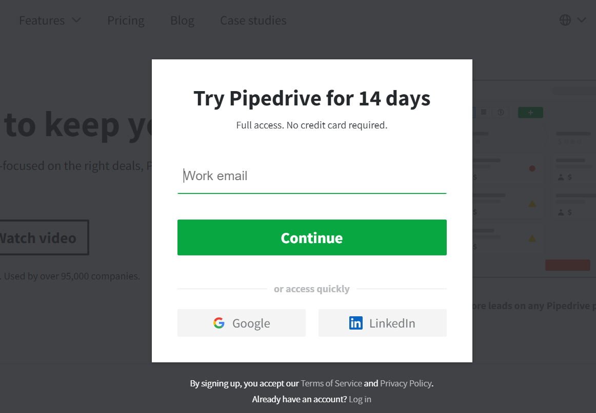
Isn’t that the simplest sign-up form ever?
Also, did you notice the option to sign up using Google and LinkedIn accounts?
This one-click sign-up is easier and saves your visitors from typing the email address, thus simplifying the process further.
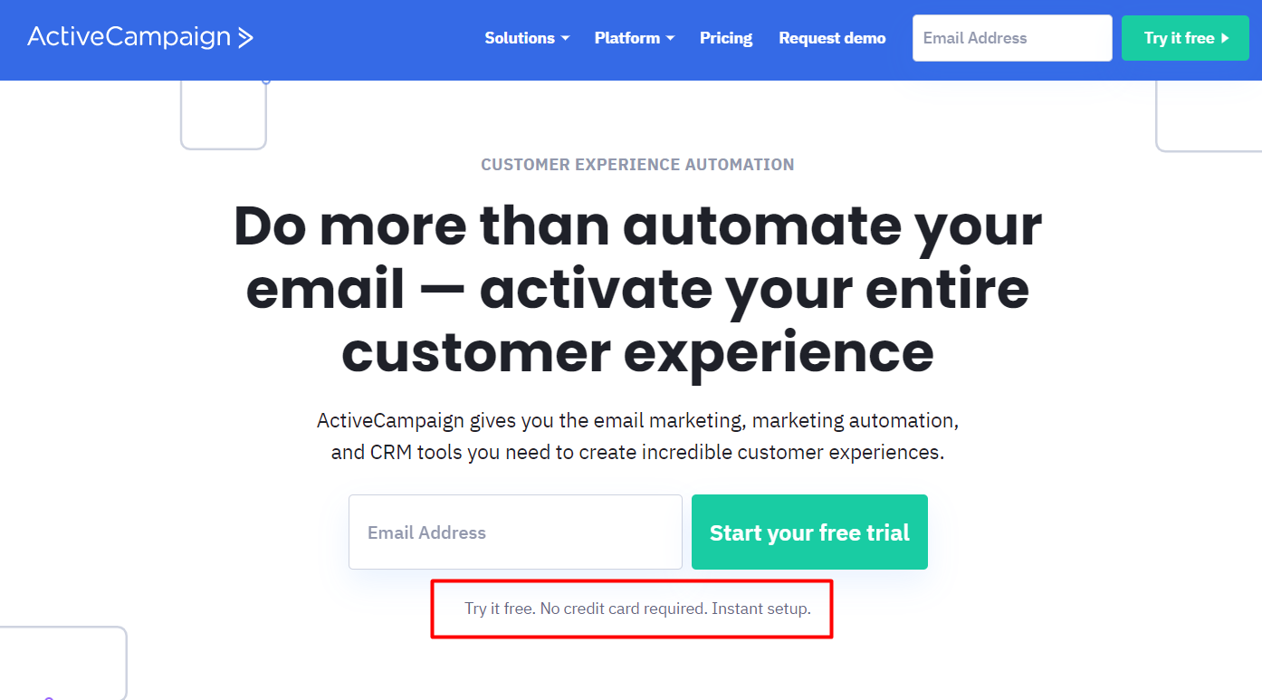
A lot of businesses ask for credit card details while signing up.
However, studies have shown that when you don’t ask for credit card details at the first step, you come across as someone who’s not reaching out for the wallet of your subscribers and are interested in providing value.
Let them fall in love with your product, you could always collect the card details later when they choose to upgrade the plan. It’s a free trial anyway, right?
Here’s the idea in action:
Tweaking Your CTAs
If you want your visitors to sign up for the free trial of your product, you must make it obvious.
Don’t leave them clueless regarding what to do next once they have landed on your landing page or have gone through your best sales pitch.
Your CTA is the star element of your signup page. Make sure it doesn’t get lost amongst everything else. It must be visible yet nicely blended into the background.
CTAs that are awkward and too salesy can be a turn-off. Those differentiated from the rest of your page concerning the color, font, and positioning often work.
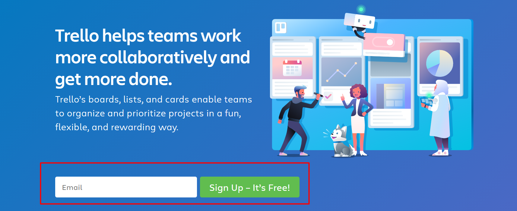
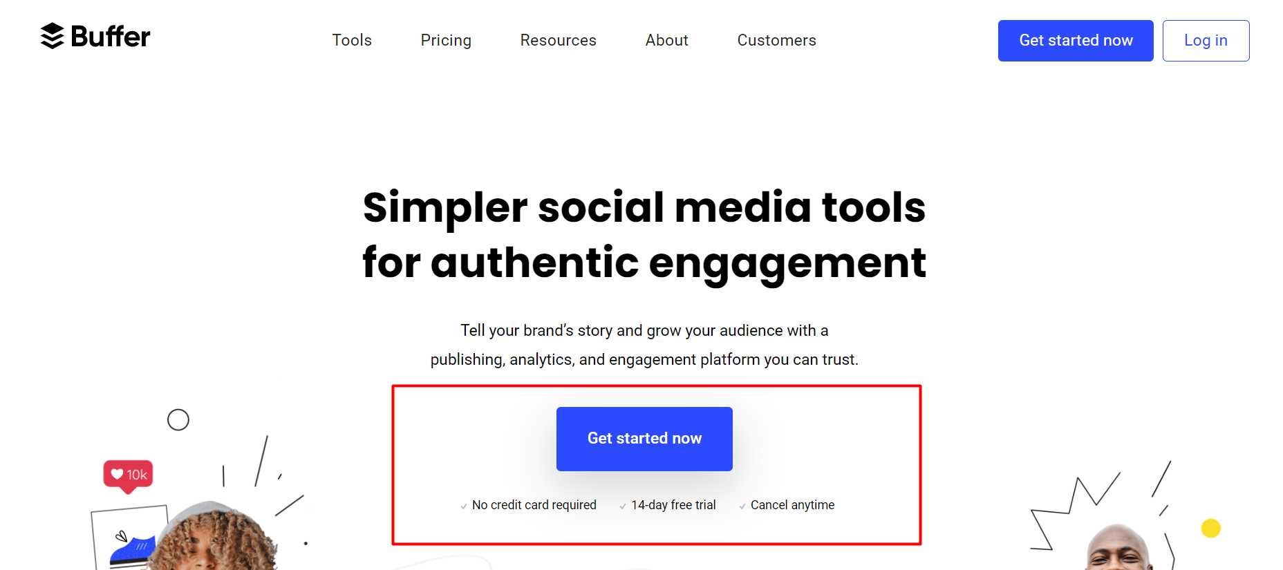
Another interesting insight that may come in handy while optimizing your CTAs is that you don’t have to explicitly mention “Book Your Free Trial Now” for visitors to book it.
You can simply request the visitors to “Get Started” or “Check Out the Product Now” or “Sign Up for a Demo” or write anything that sounds interesting to you.
Trello uses “Sign Up – It’s Free!”
Buffer uses “Get Started Now”:
Don’t Be Annoying
One of the most under-estimated tricks for making visitors sign up for a free trial is not to be annoying.
At times, businesses try too hard to increase the trial sign-up rate and in the process, they forget that they have ruined the user experience resulting in negative outcomes.
Groove is a good example here. They seemingly had a very comprehensive and innovative pricing model and were under the impression that they had cracked the code and were being smart.
However, they were wrong and could only figure it out when they experimented.
This case study published on the Groove blog talks at length about how simplifying their pricing model took their conversion rate from 1.11% to 4.15%!
Here, it’s also evident that simplifying your pricing model can be a standalone strategy to increase the number of free trial sign-ups.
While visitors sign up for your free trial, they also like to have an idea of what approximately it’d cost them in case they like it.
When they see it’s in their budget, they are more likely to sign up for the trial.
Caution! – This doesn’t mean that you lower your prices just to fit in their budget. Not talking about unqualified leads here.
The idea is to just make it clear what they are signing up for, how long the free trial will last and what it will cost after the trial, and if there are any terms and conditions or not.
This brings us to the end of this post. We hope that this guide will help you identify the loopholes in your marketing strategy and get more free trial sign-ups.
Just remember that the key is not to be annoying. Even the bare minimum should work if your product adds value to your prospect’s business and you convey your message nicely.
Cheers and good luck!
Want to start creating sign-up forms but don’t know how to start? Sign up with Poptin now!
Author Bio: An avid marketer, Suchita has been helping B2B brands with content marketing for over three years. She loves penning down complex concepts in a way that doesn’t make readers scratch their heads.
